Mixing up Math (part 1)
According to a number of psychologists, we’ve been teaching math the wrong way. Instead of hammering away at the same topic for weeks, learners of math should mix up, or interleave, the concepts they practice. In a 2019 study, Doug Rohrer and colleagues claim to show that interleaved practice can have an effect size of no less than 0,8 (compared to standard blocked practice). For educational research this is a spectacular effect size. So let’s dive into the details of the study and see if we can replicate the results.
Research Design
The study consists of a so called field experiment. That means that the study was not performed under controlled conditions in a university room, but in an everyday setting - in this case at several schools in Florida. One group of seventh grade kids received interleaved practice questions, while the other group received blocked practice questions. The questions were the same for both groups, so that only the ordering differed between them. After practicing for about three months, the same surprise test was taken by all students.
In order to clearly identify what the critical issues with the study design are, we introduce some standard notation on causality. An annoying but fundamental fact for the purpose of an analysis of causality is that we only ever observe one outcome of an event. If we are dealing with a suspected cause that we call treatment \(T_{i}\), then for individual \(i\) we may only observe \(Y_{i}(1)\) and not \(Y_{i}(0)\). That is, for person \(i\) we may only observe the effect of \(T_{i}=1\) at any one point in time. We could measure the outcome at a later point in time, where we could make sure that \(T_{i}=0\), but then not all the conditions will be exactly the same. So we can never solve the fundamental problem of what would have happened if things would have been different.
At this point one can either give up, or carry on pragmatically and take the average of many responses to \(T_{i}=1\) and \(T_{i}=0\). This give us the average treatment effect that we will here simply write as \(Y(1)-Y(0)\).
This approach leaves us with two problems.
There are confounders. These variables are causes that hide in the treatment group and make us falsely think that the treatment is the cause. Confounders can either be observed or unobserved. We write the observed confounders as \(X\) and the unobserved as \(U\). With this notation in hand we can now repeat ourselves by saying that if the treatment \(T_{i}=1\) goes together with \(X\) or \(U\), we can mistakenly conclude that \(T\) is doing the causal work.
Even if we established that there is a cause in a sample, we are unsure if it exists in the population.
Confounders can thus cause error at two stages. The first occurs when a sample is taken and is denoted as \(\Delta_{S}\) and the second arises from assigning the treatment and is hence written as \(\Delta_{T}\). In both cases there are two types of confounders, so that what we are minimizing is
\[Estimation\ error=(\Delta_{S_{X}}+\Delta_{S_{U}}) + (\Delta_{T_{X}}+\Delta_{T_{U}})\] With regard to the sample part of the error, the authors of the interleaving study have made no effort to select a random sample of the US or even Florida population. They persuaded five schools within a 30 min drive from their university to participate in the study, and excluded schools that were low performers. The effect may also hold only for the four math topics in the experiment that we will discuss shortly, and not for others. In both cases it seems reasonable to assume that the results generalize to a wider population, because math is it’s own language and because the math questions seem representative of math curricula around the world.
The second part of the error concern treatment assignment. Here the authors took care to assign treatments randomly. In this case the treatment was not assigned to individuals, but to classes. From a logistics perspective, this is reasonable. The randomization assures that \((\Delta_{T_{X}}+\Delta_{T_{U}})\) goes to 0 in the limit. But for every finite sample, confounders could be unevenly distributed between the groups. The researchers therefore used a blocked design, which means that the confounder Teacher was evenly divided between the two groups. In practice, only teachers that taught several classes of the same level were included and evenly assigned blocked and interleaved classes. Read more on the advantages of blocked randomization here.
This means that \(\Delta_{T_{X}}\) has been set to exactly 0 by design for \(X\) = teacher effects. There can of course still be other confounders \(U\). The expected value of the difference in \(U\) between the two groups is 0, but not that many units have been assigned randomly. No less than 787 students participated in the study, but only 54 classes were assigned randomly to the two conditions. We will explore the consequences in part 2, where we turn to inference.
The data
Let’s confirm these numbers by looking at the structure of the data set that is shared publicly here.
# Classes are distributed per teacher
rohrer %>% group_by(School,Teacher, Class, Group) %>%
  summarize(n = n()) %>%
  print(n=10)
## `summarise()` regrouping output by 'School', 'Teacher', 'Class' (override with `.groups` argument)## # A tibble: 54 x 5
## # Groups: School, Teacher, Class [54]
## School Teacher Class Group n
## <chr> <dbl> <dbl> <chr> <int>
## 1 A 1 1 inter 7
## 2 A 1 2 block 20
## 3 A 1 3 block 19
## 4 A 1 4 inter 4
## 5 A 2 1 inter 19
## 6 A 2 2 block 12
## 7 A 2 3 inter 17
## 8 A 2 4 block 13
## 9 A 3 1 block 6
## 10 A 3 2 inter 14
## # ... with 44 more rowsThe table below demonstrates that students are distributed more or less equally among the groups.
# students per Group
rohrer %>% group_by(Group) %>%
  summarize(n=n())
## `summarise()` ungrouping output (override with `.groups` argument)## # A tibble: 2 x 2
## Group n
## <chr> <int>
## 1 block 389
## 2 inter 398After three months of practicing the math questions, a surprise test was taken. It contained 16 questions on 4 topics:
- writing proportional formulas
- algebra with parentheses
- solving inequalities
- calculations on circles
Below, we create new variables with the total number of points scores for each of the four topics as well as the sum total on all questions.
# summing individual scores into total and standardize. Also summing partial scores
rohrer <- rohrer %>% mutate(total = rowSums(.[grep("[A-Z]+[1-4]", names(.))]),
                            stand_total = (total - mean(total))/sd(total),
                            prop_formula = rowSums(.[grep("[G]+[1-4]", names(.))]),
                            inequality = rowSums(.[grep("[I]+[1-4]", names(.))]),
                            parentheses = rowSums(.[grep("[E]+[1-4]", names(.))]),
                            circle = rowSums(.[grep("[C]+[1-4]", names(.))]))

# rename levels of the factor Group (for readability graphs)
rohrer <- rohrer %>% mutate(Group = as.factor(Group),
                            Group = fct_recode(Group,
                                               "blocked" = "block",
                                               "interleaved" = "inter"))
Visual Exploration
We first inspect the results of students in the two groups per school in histograms, so that no data points are lost and the distribution of the scores is preserved.
# Results total by School and Group in a histogram; alpha can be adjusted to make colors appear;
# beware though, as they distract
rohrer %>% ggplot(aes(x=total)) +
  geom_histogram(binwidth=1, color="black", fill="grey") +
  facet_grid(rows= vars(Group), cols= vars(School), labeller = label_both) +
  geom_rect(data=subset(rohrer, Group == "blocked"),
            aes(xmin=-Inf, xmax=Inf, ymin=-Inf, ymax=Inf),
            fill="red", alpha=0.0015) +
  geom_rect(data=subset(rohrer, Group == "interleaved"),
            aes(xmin=-Inf, xmax=Inf, ymin=-Inf, ymax=Inf),
            fill="blue", alpha=0.0015) +
  theme_classic() +
  theme(
    panel.border = element_rect(colour = "black", fill=NA, size=1),
    strip.background = element_rect(
      color="black", fill="white", size=1.5, linetype="solid")) +
  ylab("number of students") +
  xlab("points scored") +
  ggtitle("The effect of interleaving per school")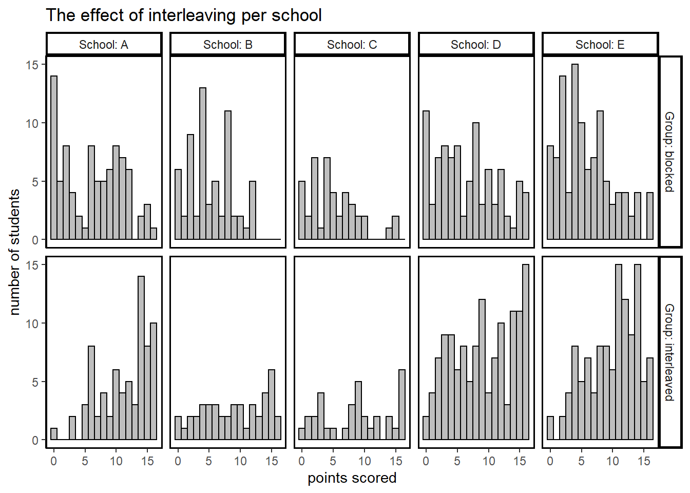
We observe a dramatic difference in performance among the two groups in all schools.
Zooming in, we compare students that were taught by the same teacher, but were either in the blocked or interleaved group.
# row and col names have to be assigned manually because automatic ones don't fit
Teach1 <- c("Teacher 1", "Teacher 2","Teacher 3","Teacher 4","Teacher 5")
names(Teach1) <- c("1", "2", "3", "4", "5")
Teach2 <- c("Teacher 6", "Teacher 7","Teacher 8","Teacher 9","Teacher 10")
names(Teach2) <- c("6", "7", "8", "9", "10")
Teach3 <- c("Teacher 11", "Teacher 12","Teacher 13","Teacher 14","Teacher 15")
names(Teach3) <- c("11", "12", "13", "14", "15")
Group1 <- c("block", "inter")
names(Group1) <- c("blocked", "interleaved")

# facet_grid cannot cut up the grid, so we write a function to do it ourselves
# arguments in function: l = left bound, r = right bound, t = teacher names
teach_graph <- function(l,r,t){
  rohrer %>% filter(Teacher > l & Teacher <= r) %>% ggplot(aes(x=total)) +
    geom_histogram(binwidth=1, color="black", fill="grey") +
    scale_y_continuous(breaks=seq(0,10,5)) +
    facet_grid(rows= vars(Group), cols= vars(Teacher), labeller = labeller(Group = Group1, Teacher = t)) +
    theme_classic() +
    theme(
      panel.border = element_rect(colour = "black", fill=NA, size=1),
      strip.background = element_rect(
        color="black", fill="white", size=1.5, linetype="solid")) +
    xlab(NULL) +
    ylab(NULL)
}

# Create three histograms
p1 <- teach_graph(0,5,Teach1)
p2 <- teach_graph(5,10,Teach2) +
  ylab("number of students") +
  xlab(NULL)
p3 <- teach_graph(10,15,Teach3)+
  xlab("points scored") +
  ylab(NULL)

# We use patchwork to glue them together in the order that we desire
p1/ p2/ p3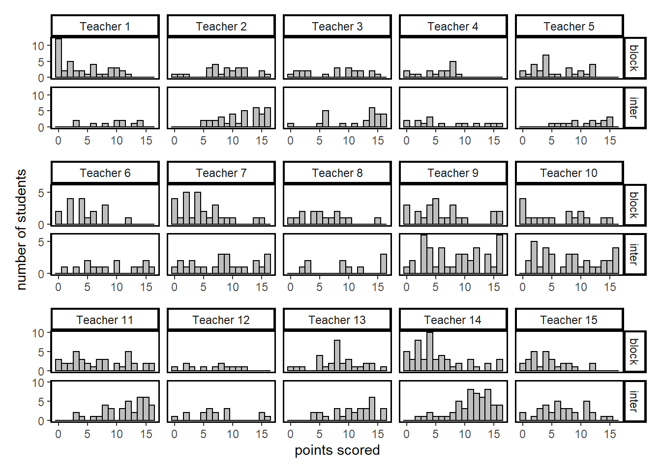
Here the results are more ambiguous. For some teachers we observe the same stark difference in test results in favor of the interleaved group. But for others the results seem quite similar, at first glance. The size of the difference between the two groups seems to depend on the teacher them. This topic will be explored in depth in the analysis in part 2.
So far we have looked at the total score on the surprise test. We now split up the scores in the four topics that were covered. The order matters here. In the blocked condition, students first completed questions on formulas for proportional relations, they solved inequalities in the second block, etc. Moving chronologically from left to right and starting at the top, we notice a clear pattern.
# Write a function for making a histogram based on input data
hist_scores <- function(data){
  ggplot(rohrer) +
  geom_histogram(binwidth=1, color="black", fill="grey", aes(y=data)) +
  coord_flip() +
  facet_grid(vars(Group)) +
  theme_classic()
}

# Histograms for the four types of questions
h1 <- hist_scores(rohrer$prop_formula) + ylab("proportional formulas")
h2 <- hist_scores(rohrer$inequality) + ylab("solving inequalities")
h3 <- hist_scores(rohrer$parentheses) + ylab("removing parentheses")
h4 <- hist_scores(rohrer$circle) + ylab("calculations on circles")

# patching them together from left to right in two rows
patch2 <- (h1+h2) / (h3+h4)

patch2 + plot_annotation(
  title = 'The effect of interleaving declines for recently blocked topics',
)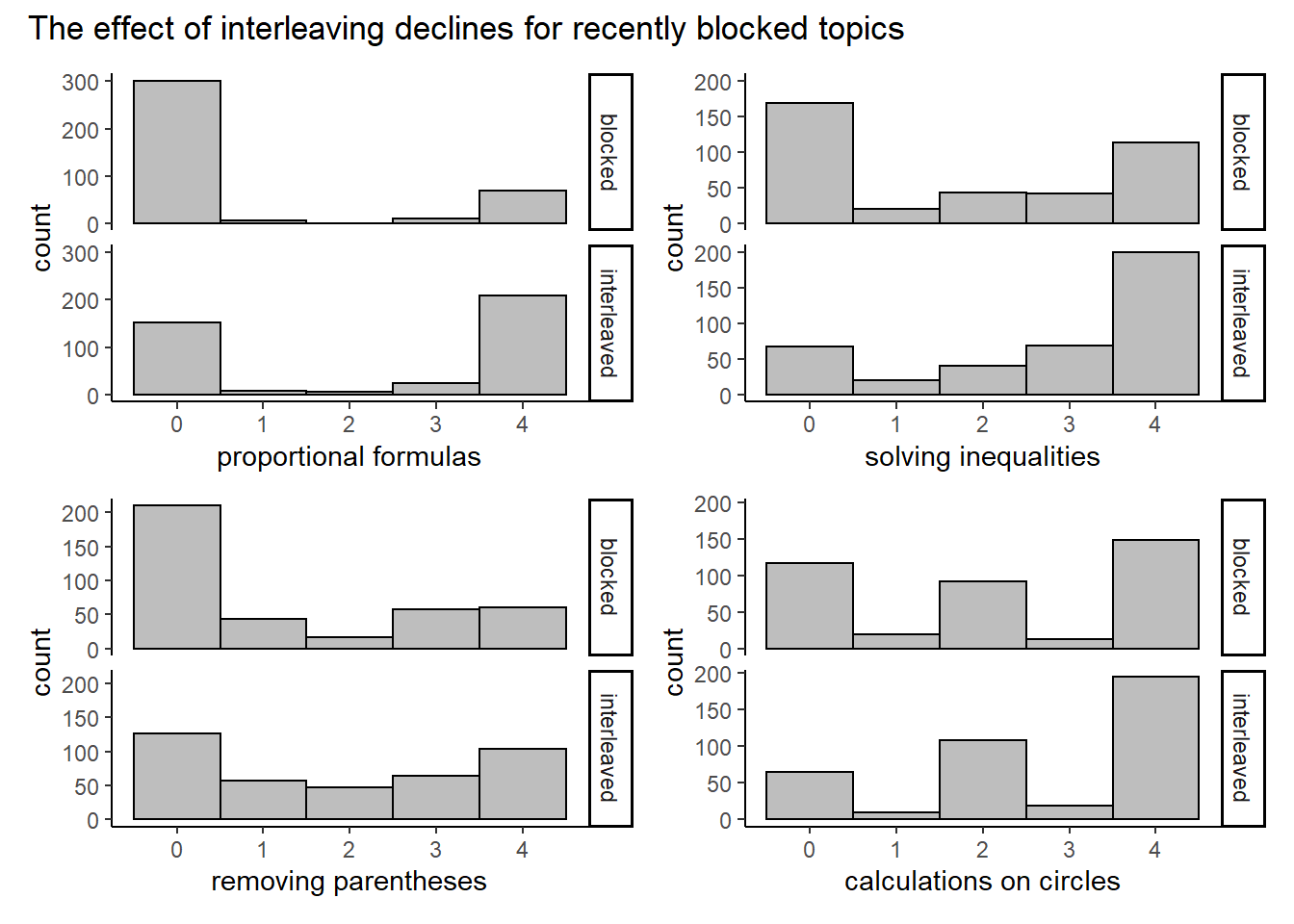
The difference in performance seems to decline for topics that were covered more recently in the blocked group. This is unsurprising. More interestingly, the interleaving group seems to do better even for the questions on circles that were just covered in the blocked group.
If we artificially make the discrete data jump around a little, we can pretend it is continuous and make a scatterplot. We also calculate the means for the two conditions and draw a line between them.
# Write function for plotting scores per math topic
scores_topic <- function(topic) {ggplot(rohrer, aes(x=factor(Group))) +
  geom_jitter(aes(y=topic), width=0.05, alpha=0.1) +
  stat_summary(aes(y = topic,group=1), fun=mean, colour="red", geom="line",group=1, size=1) +
  theme_classic()
}

# plug in the scores per topic
s1 <- scores_topic(rohrer$prop_formula) +
  ylab("points") + xlab(NULL) + ggtitle("formulas")
s2 <- scores_topic(rohrer$inequality) + xlab(NULL) + ylab(NULL) + ggtitle("inequalities")
s3 <- scores_topic(rohrer$parentheses) +
  ylab("points") +  xlab(NULL) + ggtitle("parentheses")
s4 <- scores_topic(rohrer$circle) +  xlab(NULL) + ylab(NULL) + ggtitle("circles")

# order the graphs
patch3 <- (s1 + s2) / (s3+ s4)
patch3 + plot_annotation(
  title = "Points scored per math topic"
)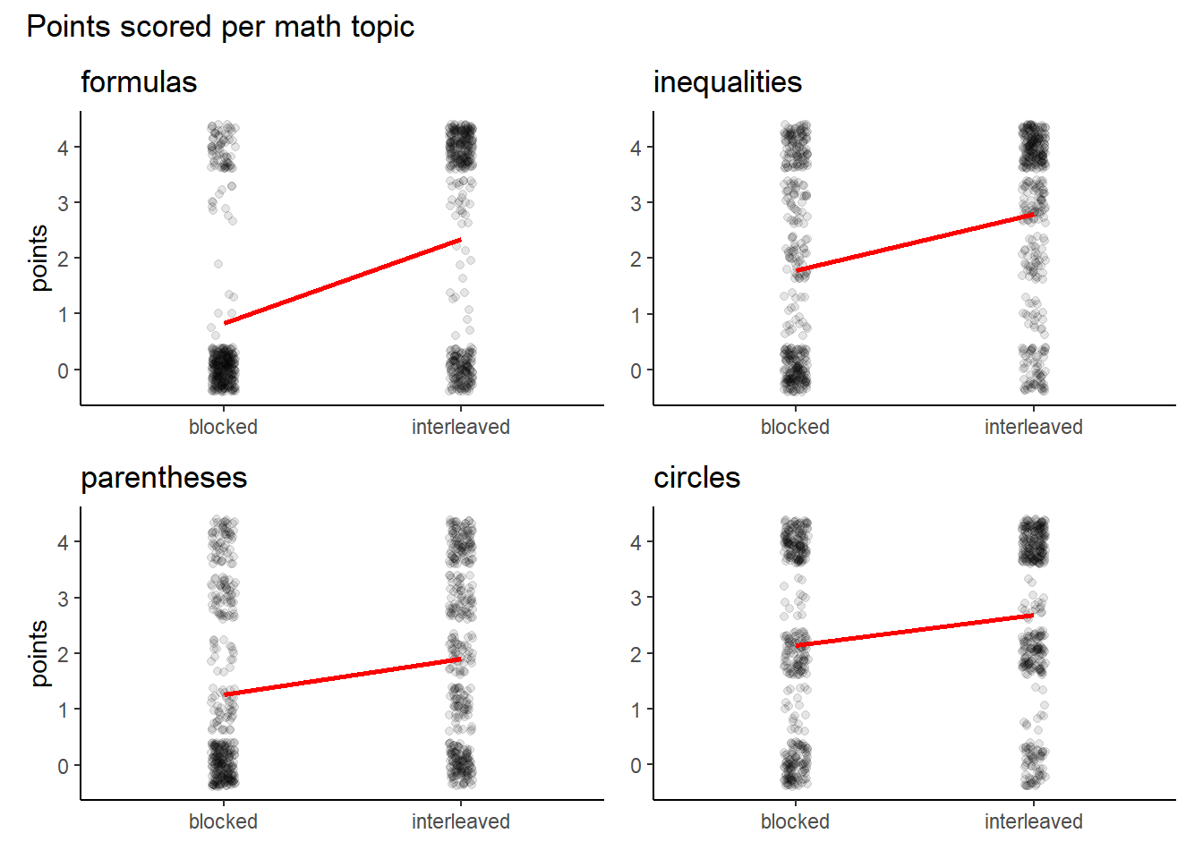
The slope of the lines give us a sense about the rate of increase in math performance by interleaving questions. It more clearly indicates that the effect of interleaving declines for topics that have been practiced in the blocked group more recently.
We also note that the mean for points scored on questions about formulas is living in empty space. With regard to this topic the mean gives a poor summary of what is going on. It would seem that for this topic students either get it or not. We see that the interleaving condition moves students away from the ‘0 points’ group to the ‘4 points’ group. This binary nature would suggest that a proportion (of students who got 3 or 4 questions correct) would be a better way to describe the data than the mean. However, for the other questions the mean seems to be a fine summary. And when we add up the points on all topics, we see the points are quite evenly distributed.
# input total points scored into the scores_topic function
scores_topic(rohrer$total) + xlab(NULL) + ylab("points") +
  ggtitle("points on math test in total")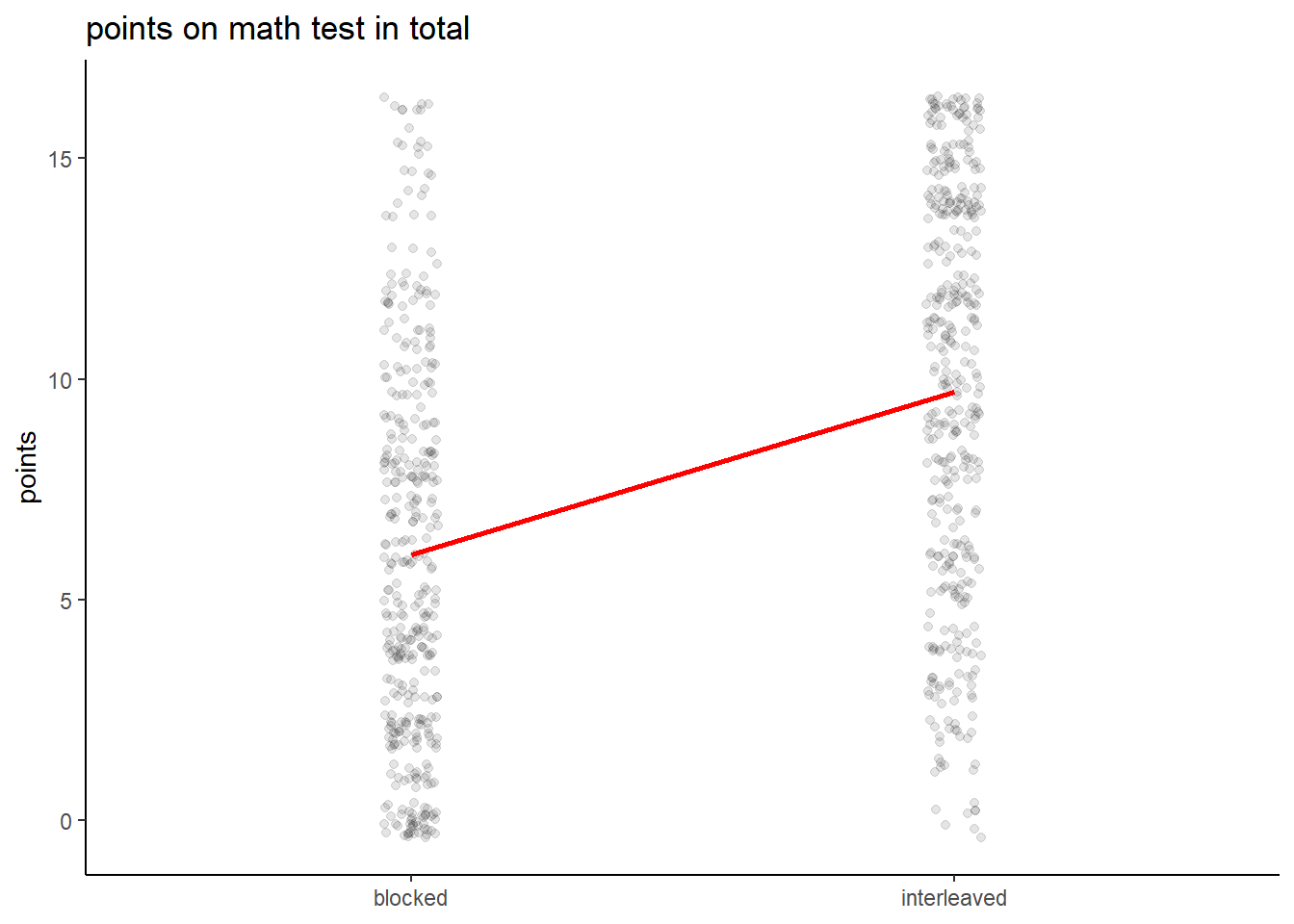
We will stick with the mean then when we turn to inference in part 2.
Edi Terlaak
I like to tell stories about statistics.