Do Schools Discriminate Against Night Owls? Inference on Clustered Data (part 3)
We continue to look at the results of the observational study at a secondary school in Coevorden, where we this time focus on the relation between chronotype and grades. First, we analyze the data visually, to get a feel for what is going on. We then impute missing data - this time with the Amelia 2 package - and push the imputed data sets through a bunch of multilevel models as well as through a fixed effects model with robust standard errors.
Visual Exploration
We start of course by loading the data and cleaning it up.
library(tidyverse)
library(lme4)
library(Amelia)
library(naniar)
library(broom.mixed)
library(arm)
library(merTools)
library(ggplotify)
library(patchwork)
library(broom)
library(sandwich)
library(lmtest)

setwd("C:/R/edu/chronotypes")
scores <- read_tsv("Grades_and_attendance.txt")

# rename variables, types and some levels; as.data.frame is required to work with Amelia 2 later
scores <- scores %>%
  rename( stud_ID = `student ID`,
          late_13_14=`LA 1st 2013-2014`,
          sick_freq_13_14 = `Sick frequency 2013-2014`,
          removed_13_14 = `Removed 2013-2014`,
          years_in_sample = `. of years in sample`,
          LA_later_13_14 = `LA later 2013-2014`,
          sick_dur = `Sick duration 2013-2014`,
          sick_days_no_consec = `Sick days 2013-2014 no consecutive`,
          late_14_15 = `LA 1st 2014-2015`,
          LA_later_14_15 = `LA later 2014-2015`,
          removed_14_15 = `Removed 2014-2015`,
          sick_freq_14_15 = `Sick frequency 2014-2015`,
          sick_dur_14_15 = `Sick duration 2014-2015`,
          subject_area = "subject area",
          academic_year = "Academic year") %>%
                mutate_at(c("MCTQ_year", "Class", "Topic", "subject_area", "Level", "sex"),
                          funs(factor(.))) %>%
                    mutate_at(c("late_14_15", "LA_later_14_15", "sick_freq_14_15", "sick_dur_14_15"),
                              funs(as.integer(.))) %>%
                          mutate(sex=fct_recode(sex,
                                                "female"="0",
                                                "male" = "1")) %>%
  as.data.frame()
Let’s first check some unconditional relations in the data. Sleeping longer hours is associated with higher grades, while a later natural mid point of sleep (late chronotype) is associated with lower grades. This is all as expected.
# Longer sleep corr with higher grades
p1 <- scores %>% ggplot(aes(SD_w,Grade)) + geom_jitter(alpha=0.03) +
  geom_smooth(method="lm", color="orange") + labs(x="average hours of sleep")

# Plot relationship between MSF and grades
MSF_Gr_p <- scores %>% ggplot(aes(MSFsc,Grade)) + geom_jitter(alpha=0.03) +
  geom_smooth(method="lm", color="pink", size=0.5) + labs(x="chronotype score")

patch <- p1 + MSF_Gr_p
patch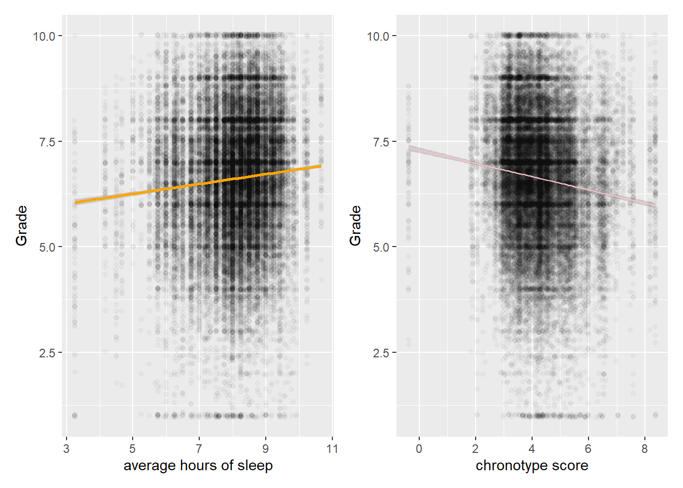
We clearly do not capture much of the variation in grades by looking at sleeping patterns, because the spread is huge. Fitting anything other than a line through these sample data seems bold.
We continue the analysis for chronotype scores (instead of the length of sleep) and grades, because theory suggests chronotype should have the biggest impact (which it has). According to the authors of the study, there is evidence that chronotype affects fluid intelligence more than crystallized intelligence. They furthermore assume that STEM subjects appeal to fluid intelligence more than the other subjects. I’m not so sure about that, but we look at this possible pattern in the data anyway. That is, we will look at the relation within Topic, where the topics (subjects, such as geography or physics) are arranged from more to less exact. So math comes first, while history comes last. From glancing at the data below, we do indeed see steeper downward regression lines for STEM (the first row) than for non-STEM subjects (the second row).
# rearrange levels for Topics from more exact to less exact
neworder <- c("mathematics","physics","chemistry", "biology", "English", "Dutch", "geography", "history")
score_arr <- arrange(transform(scores,
                  Topic=factor(Topic,levels=neworder)),Topic)
# Plot scores by Topic
score_arr %>%
  ggplot(aes(MSFsc,Grade,color=Topic)) + geom_jitter(alpha=0.03) +
  geom_smooth(method="lm", color="black", size=0.5) + labs(x="chronotype score") +
  facet_wrap(vars(Topic), nrow = 2) +
  theme(legend.position="none")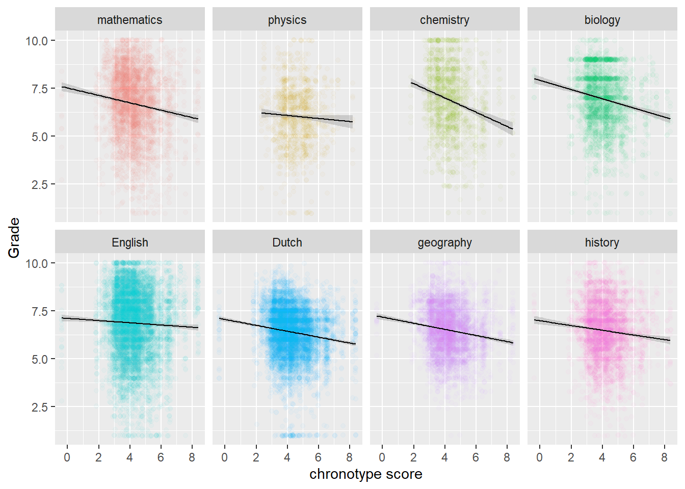
Physics is the odd one out. There are far less data for physics though, because it is only taught for one out of the three years that are in the study. Hence also the wider confidence interval band. However, the same goes for chemistry, which does follow the pattern of the other STEM-subjects.
# by year and by topic
# The odd one out is English third year
MSF_Gr_p +
  facet_grid(rows = vars(Year), cols = vars(Topic))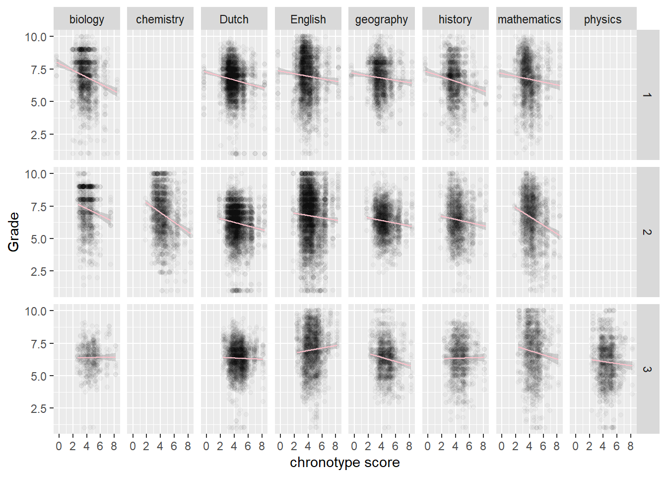
We also observe that chemistry is taught in the second year, while physics is taught in the third year. More generally, something is going on in the third year. Biology, Dutch, history and physics have almost flat regression lines, while English is even going up! In other words, those who naturally sleep later do better in English in the third year. So the odd behavior of physics may be due more to the year of the student than to the subject.
Let’s drill a little deeper into the behavior of students in year three, by looking at the role of age. There may be some biological process going on where students adapt to dealing with early starting hours, that kicks in at a later age. For an alternative explanation, we take the level of the student (havo or vwo) into account, because there are strong differences in class norms between havo and vwo. These could play some role as well.
# by year and age: something is going on with doublers (and in havo 3, which is flat)
scores %>% filter(age < 16) %>%
  ggplot(aes(MSFsc,Grade)) + geom_jitter(alpha=0.02) +
  geom_smooth(method="lm", aes(color=Level), size=0.5) +
  facet_grid(rows = vars(Year), cols = vars(age), labeller = label_both) +
  scale_colour_manual(values = c("havo" = "khaki", "vwo" = "cyan"))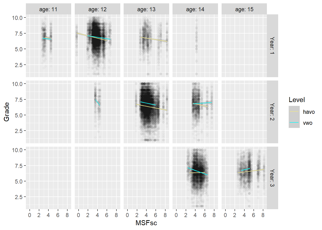
We observe that the average age for year one is 12, for year two 13 and for year three 14. Older students in the same year may be repeating a school year. So 14-year olds at vwo year 2 show a different pattern from the 13-year olds at vwo year 2. This difference is even stronger for 15-year olds in year three.
Also, when we compare graphs vertically, we note that 14-year olds in year 2 of vwo show a different trend from 14-year olds in year 3 of vwo. This suggests that the moderated impact of chronotype on grades is not just about age.
We also note that the line for regular 14-year olds in havo flattens out in year 3, but not the one for regular vwo students in year 3. The fact that 15-year old vwo students, who may repeat a year, show the same trend as havo students their age, may point to the role of a lack of motivation. That is, vwo students who repeat a year may display the same low levels of motivation as regular havo 3 students (which have a reputation in this regard). The explanatory idea here is that if nobody is paying much attention or making much of an effort in class, then chronotype will play less of a role. Whether or not it is because of their motivation, the flattening regression lines of chronotype and grades in year 3 seem to be due to the havo students. Let’s look at the role of student level (havo or vwo) in the odd behavior of physics directly.
# by Topic and Level
score_arr %>%
  ggplot(aes(MSFsc,Grade)) + geom_jitter(alpha=0.03) +
  geom_smooth(method="lm", aes(color=Level), size=0.5) + labs(x="chronotype score") +
  scale_colour_manual(values = c("havo" = "khaki", "vwo" = "cyan")) +
facet_wrap(vars(Topic), nrow = 2) 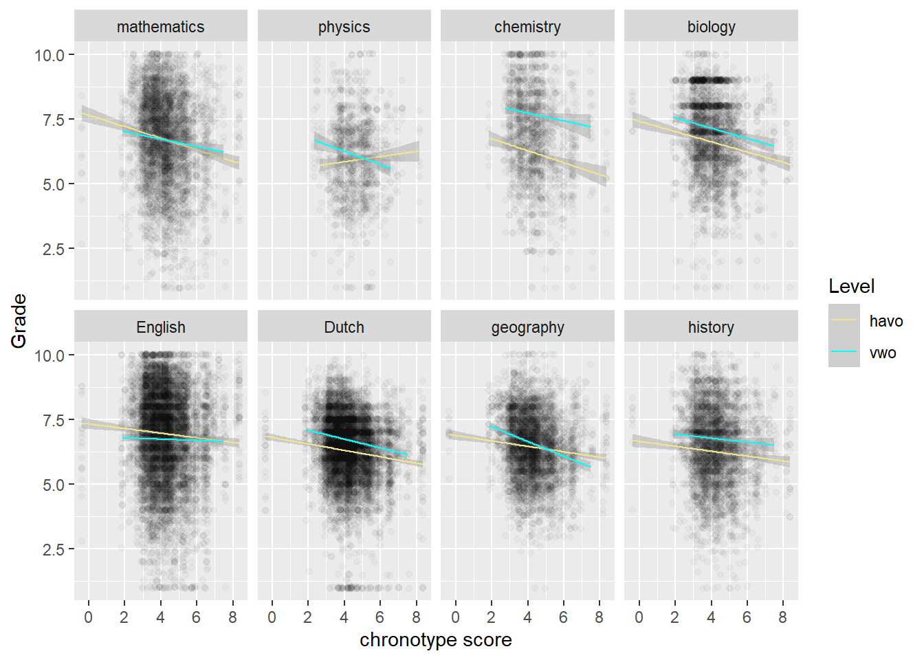
We see that it’s the havo-students bucking the trend in physics.
We can get more insight into these assumptions by taking into account the role of class dynamics. If chronotype has less of an effect in the third year of havo because there is a weak culture of learning inside the classroom, then this should be reflected in trends per classroom. For starters, the supposed lack of a culture of learning is not reflected in the grades of havo 3 or their spread.
scores %>% group_by(Level, Year) %>%
  summarize(mean = mean(Grade),
            sd = sd(Grade))
## # A tibble: 6 x 4
## # Groups: Level [2]
## Level Year mean sd
## <fct> <dbl> <dbl> <dbl>
## 1 havo 1 6.73 1.47
## 2 havo 2 6.35 1.65
## 3 havo 3 6.39 1.44
## 4 vwo 1 6.88 1.47
## 5 vwo 2 6.88 1.60
## 6 vwo 3 6.58 1.56However, teachers may calibrate their tests with the help of the students they face and not some outside standard of what is the appropriate difficulty level.
Let’s also look at the classrooms individually, per level.
# Check per class, mixed picture
h1 <- scores %>% filter(Level=="havo") %>%
  ggplot(aes(MSFsc,Grade)) + geom_jitter(alpha=0.03) +
  geom_smooth(method="lm", color="khaki", size=0.5) + labs(x="chronotype score") +
  facet_wrap(vars(Class)) +
  ggtitle("Havo classes")

v1 <- scores %>% filter(Level=="vwo") %>%
  ggplot(aes(MSFsc,Grade)) + geom_jitter(alpha=0.03) +
  geom_smooth(method="lm", color="cyan", size=0.5) + labs(x="chronotype score") +
  facet_wrap(vars(Class)) +
  ggtitle("Vwo classes")

patch_level <- h1 + v1
patch_level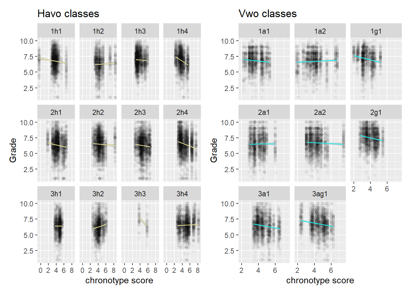
Here the third year of havo doesn’t jump out in terms of the flatness of the slopes. Yes, it’s flatter than other years, but vwo year 1 en 2 are pretty flat as well. It could be that there is some other mechanism by which the effect of chronotype is moderated, or it could be that we are looking at noise. We probably need more data to make progress on this front, but we will see how far inference takes us in the next section.
A more general question we may ask if whether the variation in slopes is driven more by subject area (humanistic vs scientific) or by classroom dynamics. We split the graphs out by level (havo/vwo), because they have different classroom norms. We look at havo first.
# Here it may be worth writing a function for plotting
plot_level_subject <- function(level,area) {scores %>% filter(Level==level & subject_area ==area) %>%   ggplot(aes(MSFsc,Grade)) +
  geom_jitter(alpha=0.03) +
  geom_smooth(method="lm", color=ifelse(level=="havo", "khaki", "cyan"), size=0.5) +
  labs(x="chronotype score") +
  facet_wrap(vars(Class)) +
  ggtitle(paste(level,area,sep=" : "))
}

h1_h <- plot_level_subject("havo", "humanistic/linguistic")
h1_s <- plot_level_subject("havo", "scientific")
v1_h <- plot_level_subject("vwo", "humanistic/linguistic")
v1_s <- plot_level_subject("vwo", "scientific")

patch_lev_h <- (h1_h + h1_s)
patch_lev_h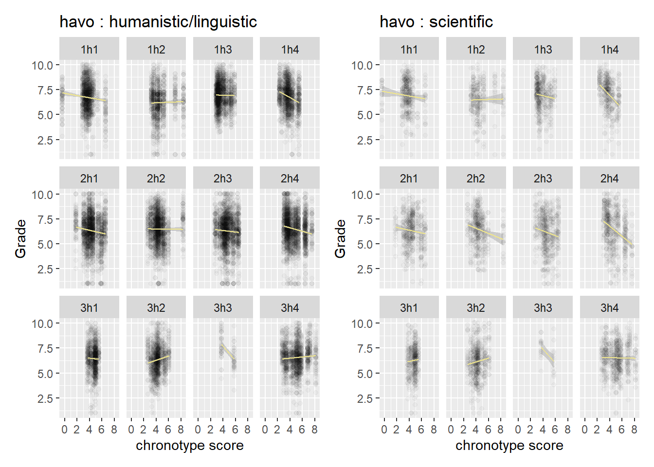
If we look inside a class, we have to make an effort to spot differences in slope between the two subject areas. The same goes for vwo, so there is not a huge difference between the levels in this regard.
patch_lev_v <- (v1_h + v1_s)
patch_lev_v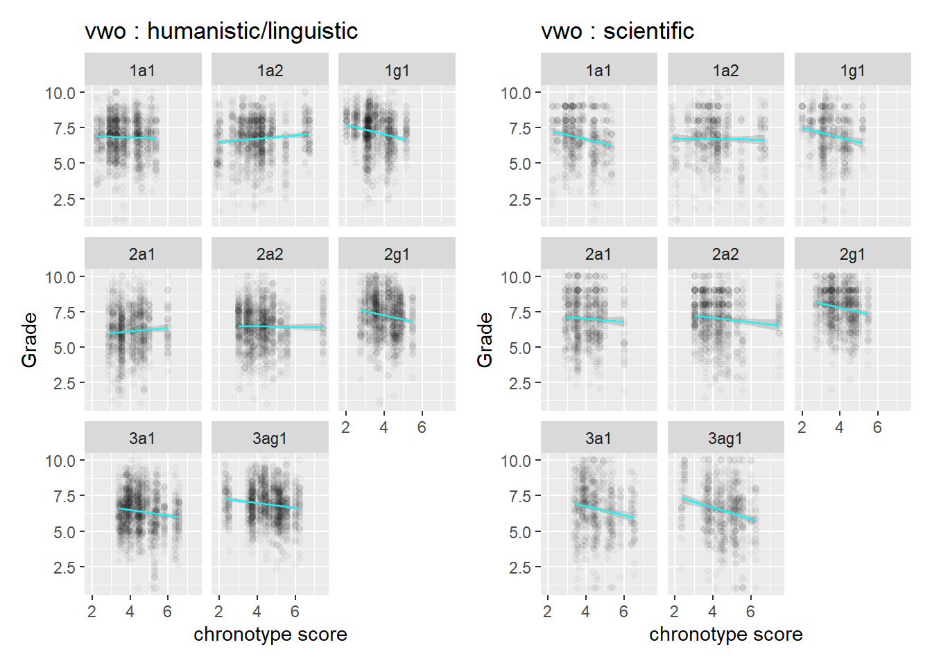
Finally, we look at the role of gender. The grades of female students seem to be affected more by chronotype than those of male students.
# stronger for females than for males
na.omit(scores) %>% ggplot(aes(MSFsc,Grade)) + geom_jitter(alpha=0.03) +
  geom_smooth(method="lm", aes(color=sex), size=0.5) + labs(x="chronotype score") +
  facet_wrap(vars(sex)) +
  scale_colour_manual(values = c("female" = "hotpink", "male" = "skyblue"))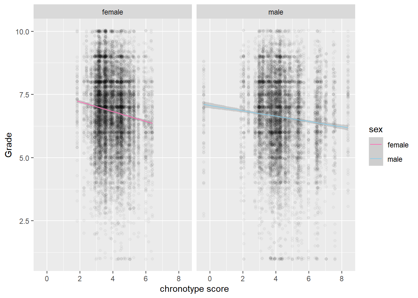
However, these effects do not play much of a role in explaining the difference between STEM topics and non-STEM topics.
# no Topic jumps out where women do much worse than men
score_arr %>%
  ggplot(aes(MSFsc,Grade)) + geom_jitter(alpha=0.03) +
  geom_smooth(method="lm", aes(color=sex), size=0.5) + labs(x="chronotype score") +
  facet_wrap(vars(Topic), nrow = 2) +
  scale_colour_manual(values = c("female" = "hotpink", "male" = "skyblue"))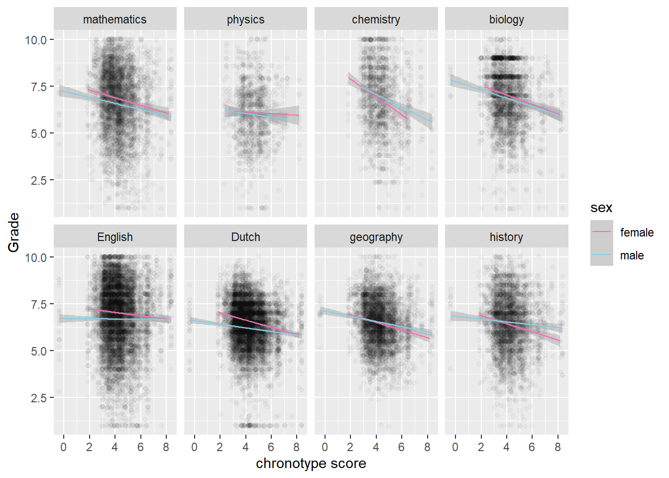
Before we can turn to inference, we need to assess the nature of the missing data.
Missing data
The helpful naniar package allows us to quickly assess how many data points are missing per variable. Its absenteeism and chronotype scores that are well over the 10% missing threshold beyond which imputation is typically advised.
print(miss_var_summary(scores), n=28)## # A tibble: 29 x 3
## variable n_miss pct_miss
## <chr> <int> <dbl>
## 1 late_14_15 13453 32.9
## 2 LA_later_14_15 13453 32.9
## 3 removed_14_15 13453 32.9
## 4 sick_freq_14_15 13453 32.9
## 5 sick_dur_14_15 13453 32.9
## 6 MSFsc 7521 18.4
## 7 MSFsc_groups 7521 18.4
## 8 MSFsc_two_groups 7521 18.4
## 9 SJL 7521 18.4
## 10 SD_w 6435 15.7
## 11 MCTQ_year 3717 9.09
## 12 age 3717 9.09
## 13 sex 3717 9.09
## 14 sick_days_no_consec 3411 8.34
## 15 stud_ID 0 0
## 16 Level 0 0
## 17 Class 0 0
## 18 Year 0 0
## 19 Topic 0 0
## 20 subject_area 0 0
## 21 academic_year 0 0
## 22 Period 0 0
## 23 Grade 0 0
## 24 years_in_sample 0 0
## 25 late_13_14 0 0
## 26 LA_later_13_14 0 0
## 27 removed_13_14 0 0
## 28 sick_freq_13_14 0 0
## # ... with 1 more rowFor missing data imputations the major R packages are mice and Amelia 2. We already used mice a bunch of times, so let’s give Amelia 2 a shot. For a guide on how and when to use mice, check out this article. A big advantage of Amelia 2 is that one of it’s authors, Gary King, has given an almost two hour long accessible exposition about the algorithm, so that we can figure out how the imputation process proceeds without much effort.
We impute then, and graphically check the difference with existing values.
# Amelia imputation; count as ordinal, see vignette; greyed out because we load result from disk
# nom_vars = c("Topic",  "Level", "Class")
# ord_vars = c("late_14_15", "LA_later_14_15", "removed_14_15", "sick_freq_14_15", "sick_dur_14_15", "sex")
# a.out <- amelia(scores, m = 5, noms = nom_vars,
#ords = ord_vars,
#idvars = c("academic_year", "MCTQ_year",  "subject_area", "years_in_sample", "Year"))

# save(a.out, file = "imputations.RData")
setwd("C:/R/edu/chronotypes")
load("imputations.RData")

# make plots for the 3 count vars (note that 13_14 and 14_15 recorded per student) and MSFsc
# Note the ~ that we insert into as.ggplot
ggp <- list()
for (i in 24:26){
  ggp[[i-23]] <- as.ggplot(~ plot(a.out, which.vars = i))
}

ggp[[4]] <- as.ggplot(~ plot(a.out, which.vars = 5))

patch <- (ggp[[1]] + ggp[[2]]) / (ggp[[3]] + ggp[[4]]) + plot_annotation(
  title="Missing data imputed in red")
patch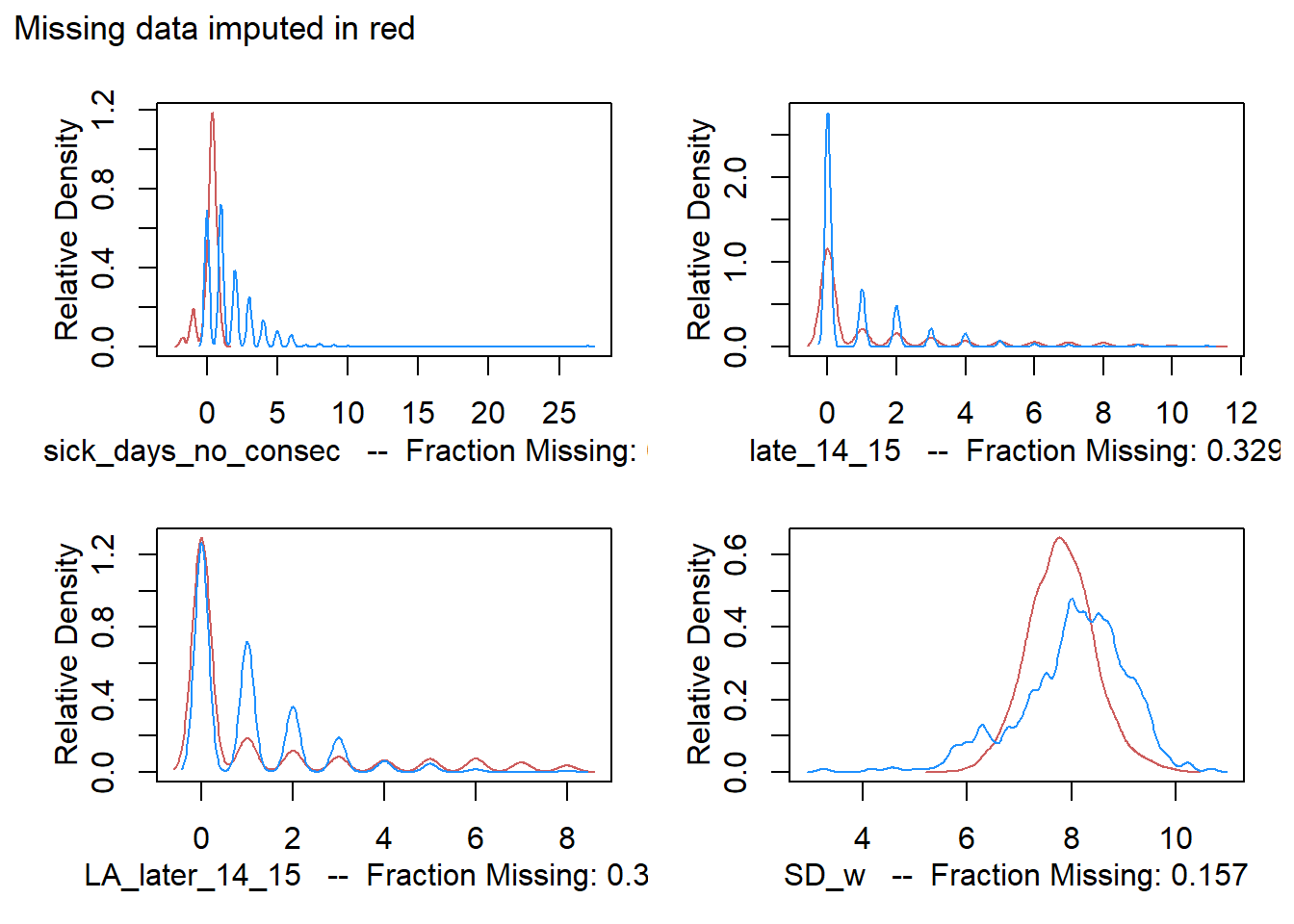
For absenteeism, the imputation doesn’t reflect existing data entries well. This is suspicious, but we can never be sure if missing entries follow a different pattern. The crucial MSFsc variable matches existing data fairly well, which instills some confidence.
Inference for clustered data
Looking at graphs is insightful, but doesn’t necessarily tell us what is going on in the population or super-population. To that end, we will do some frequentist inference.
The authors of the paper were interested in estimating the effect of chronotype on grades. To that end, one idea is to simply run an OLS model withstud_ID and Class as indicator variables as well as a bunch of variables that one suspects could have some influence. We pick the variables that the authors eventually settled on (more on that later).
fit_lm <- lm(Grade ~ 1 + MSFsc + late_13_14 + removed_13_14 + sick_dur +
               sex + age + Topic + Class + Period + stud_ID, data=a.out$imputations[[1]])
summary(fit_lm)
##
## Call:
## lm(formula = Grade ~ 1 + MSFsc + late_13_14 + removed_13_14 +
## sick_dur + sex + age + Topic + Class + Period + stud_ID,
## data = a.out$imputations[[1]])
##
## Residuals:
## Min 1Q Median 3Q Max
## -6.3551 -0.9007 0.1038 1.0142 4.4112
##
## Coefficients:
## Estimate Std. Error t value Pr(>|t|)
## (Intercept) 1.277e+01 1.123e+00 11.372 < 2e-16 ***
## MSFsc -5.642e-02 7.588e-03 -7.436 1.06e-13 ***
## late_13_14 -6.253e-02 5.090e-03 -12.285 < 2e-16 ***
## removed_13_14 -8.358e-02 5.917e-03 -14.126 < 2e-16 ***
## sick_dur -1.748e-02 1.388e-03 -12.599 < 2e-16 ***
## sexmale -1.242e-01 1.570e-02 -7.911 2.61e-15 ***
## age 6.976e-02 1.818e-02 3.837 0.000125 ***
## Topicchemistry 1.376e-01 4.468e-02 3.081 0.002068 **
## TopicDutch -3.756e-01 3.038e-02 -12.365 < 2e-16 ***
## TopicEnglish 1.234e-01 3.024e-02 4.079 4.53e-05 ***
## Topicgeography -2.329e-01 3.331e-02 -6.991 2.78e-12 ***
## Topichistory -3.327e-01 3.407e-02 -9.765 < 2e-16 ***
## Topicmathematics -1.009e-01 3.360e-02 -3.002 0.002686 **
## Topicphysics -7.069e-01 4.913e-02 -14.388 < 2e-16 ***
## Class1a2 -1.241e-01 5.168e-02 -2.400 0.016380 *
## Class1g1 2.616e-01 5.294e-02 4.941 7.82e-07 ***
## Class1h1 -1.344e-01 5.025e-02 -2.676 0.007462 **
## Class1h2 -4.183e-01 5.407e-02 -7.736 1.05e-14 ***
## Class1h3 4.629e-02 4.935e-02 0.938 0.348298
## Class1h4 5.022e-03 5.054e-02 0.099 0.920843
## Class2a1 -4.869e-01 5.400e-02 -9.017 < 2e-16 ***
## Class2a2 -2.128e-01 5.175e-02 -4.112 3.92e-05 ***
## Class2g1 4.137e-01 5.302e-02 7.802 6.23e-15 ***
## Class2h1 -5.662e-01 5.098e-02 -11.106 < 2e-16 ***
## Class2h2 -3.619e-01 5.148e-02 -7.030 2.09e-12 ***
## Class2h3 -5.996e-01 5.156e-02 -11.629 < 2e-16 ***
## Class2h4 -3.459e-01 5.277e-02 -6.555 5.63e-11 ***
## Class3a1 -5.582e-01 6.199e-02 -9.005 < 2e-16 ***
## Class3ag1 -3.030e-01 6.323e-02 -4.792 1.66e-06 ***
## Class3h1 -6.153e-01 6.474e-02 -9.505 < 2e-16 ***
## Class3h2 -6.612e-01 6.179e-02 -10.701 < 2e-16 ***
## Class3h3 -7.263e-01 6.995e-02 -10.382 < 2e-16 ***
## Class3h4 -4.322e-01 6.860e-02 -6.300 3.00e-10 ***
## Period -4.812e-02 6.688e-03 -7.195 6.34e-13 ***
## stud_ID -4.881e-05 8.049e-06 -6.064 1.34e-09 ***
## ---
## Signif. codes: 0 '***' 0.001 '**' 0.01 '*' 0.05 '.' 0.1 ' ' 1
##
## Residual standard error: 1.495 on 40855 degrees of freedom
## Multiple R-squared: 0.08121, Adjusted R-squared: 0.08044
## F-statistic: 106.2 on 34 and 40855 DF, p-value: < 2.2e-16We note first of all that only about 8% of the variance in grades is explained by all these variables. That is not a huge amount. Chronotype in particular can expect to explain only 1% of the variance (not shown here). That doesn’t seem like much. However, if we leave genetic factors out of the equation, then results in education are the sum of many small factors. So the small impact of chronotype on grades is not a reason to abandon the investigation.
A more pressing problem of the above model is that it assumes that the grades are independent. But they aren’t, because if you know one grade of a student, you have information about another grade from the same student. The same goes for grades from students from the same class - these grades turn out to be correlated as well.
We can correct for this influence in two ways. We discuss each one below.
- We can use clustered standard errors to patch up the standard errors that are too small in the OLS model.
- We can build a multilevel model to reflect the multilevel nature of the process that generated the data.
Clustered Standard errors
One of the assumptions of the linear regression model is that the observations are independent and that the error term is constant across observations. These assumptions are reflected in what the variance covariance matrix \(\Sigma\) should look like. Independence of observations means that the observations are uncorrelated with each other so that the off-diagonal elements are zero. The constant error term (or homoscedasticity) implies that terms on the diagonal are the same.
\[\Sigma = \begin{bmatrix} \sigma & 0 & 0\\ 0 & \sigma & 0 \\ 0 & 0 & \sigma \end{bmatrix}\]
If these assumptions are not met, our model will be misspecified. A common way to proceed is to not fix the problems in the model, but to carry on with the misspecified model and patch it up by using robust standard errors. These are also known as sandwich estimators for the standard errors, because a key trick in estimating the robust standard error is to use the accompanying matrices to reduce the n by n matrix \(\Sigma\) to a k by k matrix, where k is the number of variables. That means far less parameters need to be estimated. We forgo a discussion here of how this is done.
The whole approach sounds dodgy. Why not fix the problems in the model instead of carrying on with a misspecified model? Moreover, if the assumptions of independence and homoscedasticity are not met, what else could be wrong with the model? Indeed, often a lot more is wrong with the model, which can lead to radically different estimates of the independent variables in the model. See here for an example. Patching up standard errors does nothing to change these estimates. Indeed, some argue for using robust standard errors as a diagnostic device. If they differ too much from classical standard errors, it signals problems in model specification, that must be fixed.
In the case of multilevel data structures, robust standard errors can be used to correct for the correlation between observations. These do not necessarily bias the estimation of the explanatory variables in the model. However, robust standard errors shouldn’t be used to fix other specification problems in the model or if the researcher cares about effects at the group level.
A bunch of simulations described by Bosker and Snijders in Chapter 12 of the 2nd edition of their Multilevel Analysis book confirm that the standard errors for fixed effects in otherwise well specified models can be estimated adequately with robust standard errors. This sounds dodgy, but from these simulations it appears that if there are around 40 clusters, which are not correlated among themselves and fairly balanced in size, it is okay to carry on with the misspecified classical linear model to estimate fixed effects. It must be mentioned though that using robust standard errors reduces the efficiency of the estimation.
Applying robust standard errors in our case to estimate the effect of chronotype is iffy. To do so, we should take the highest level of the multilevel into account. Arguably, that is the level of the students (havo or vwo). However, these are just two clusters, which are not even well balanced. Alternatively, we can use classes as the highest level of clustering, which brings us up to 20 well balanced clusters, and adjust for the level (havo/vwo) in the model specification.
m1coeffs_std <- data.frame(summary(fit_lm)$coefficients)
coi_indices <- which(!startsWith(row.names(m1coeffs_std), 'Class'))

m1coeffs_cl <- coeftest(fit_lm, vcov = vcovCL, cluster = ~Class)
m1coeffs_cl[coi_indices,]
## Estimate Std. Error t value Pr(>|t|)
## (Intercept) 12.7677699513 2.772980e+00 4.6043502 4.150006e-06
## MSFsc -0.0564239655 2.428547e-02 -2.3233626 2.016456e-02
## late_13_14 -0.0625315624 2.027324e-02 -3.0844379 2.040732e-03
## removed_13_14 -0.0835816275 1.760564e-02 -4.7474346 2.067101e-06
## sick_dur -0.0174821718 3.793230e-03 -4.6087825 4.062569e-06
## sexmale -0.1242332652 4.511758e-02 -2.7535445 5.897981e-03
## age 0.0697627483 4.606825e-02 1.5143348 1.299487e-01
## Topicchemistry 0.1376305381 2.136292e-01 0.6442496 5.194172e-01
## TopicDutch -0.3756184337 7.653118e-02 -4.9080445 9.234285e-07
## TopicEnglish 0.1233631008 1.235213e-01 0.9987196 3.179364e-01
## Topicgeography -0.2328525962 9.440785e-02 -2.4664537 1.364991e-02
## Topichistory -0.3327347013 7.102643e-02 -4.6846606 2.813259e-06
## Topicmathematics -0.1008544870 1.090878e-01 -0.9245258 3.552181e-01
## Topicphysics -0.7068510556 1.051582e-01 -6.7217900 1.818598e-11
## Period -0.0481227796 2.003387e-02 -2.4020713 1.630697e-02
## stud_ID -0.0000488132 2.026035e-05 -2.4092970 1.598768e-02Note that the standard errors have increased across the board by about an order of magnitude, as expected. We will compare these results with those of the multilevel model.
Multilevel models
A more principled way to model the data is to have levels in the model that match the levels in the data generating process. That is, we treat grades as the smallest unit in the analysis, students as a first level and classes as a second level, where students are nested inside classes.
One approach is to set up models for the group means: the mean score of each student could be modeled based on chronotype, age, sex and so on and the mean scores of each class could be modeled based on its level, for example. After running these two models we could set up models inside each group to estimate for example the grades inside a class. This way we are already doing a kind of multilevel analysis. We are taking the correlations inside classes and for individuals into account after all, by setting up a model for each one of them. But we can do better.
If we are willing to assume that the classes are drawn from some (super-)population, then we can set up a probability distribution for them. Say, a normal distribution. We can learn from the data what the mean and the standard deviation of this distribution is. What good is there in setting up this distribution? The answer is that it allows us to learn something about the class mean we expect by moving from class to class. If we get an exceptional result for one class sample, we can ‘regularize’ it based on the distribution for class means we learned from the other classes. This makes intuitive sense from a Bayesian point of view - where a so called prior plays this role - but for those unfamiliar with this way of thinking I refer to the formula I discussed here. The same goes for the groups of individual students (confusingly, because grades are the lowest level of analysis, individual students are also groups).
The starting point for multilevel modeling is sometimes called the null model. We use lmer to run a basic model with two levels on the imputed data sets.
null_fml <- "Grade ~ 1 + (1 | stud_ID)"
fit_null <- lmerModList(null_fml, data = a.out$imputations)

fastdisp(fit_null)
## lmer(formula = Grade ~ 1 + (1 | stud_ID), data = d)
## estimate std.error
## (Intercept) 6.60 0.03
##
## Error terms:
## Groups Name Std.Dev.
## stud_ID (Intercept) 0.62
## Residual 1.43
## ---
## number of obs: 40890, groups: stud_ID, 523
## AIC = 146788---We observe that the standard deviation of grades between students is 0.62 and within students 1.43. So most of the spread in grades happens ‘inside’ a student (because of the amount of learning or the topic, we may assume).
We must make a reservation here. If we turn the sd’s into variances, it would be tempting to add them up and call the sum the total variance. This is what the law of total variance in probability theory says after all, which we loosely rephrase as:
- total variance = variance within groups + variance between groups
We are not dealing with population variances however, but with samples, so that there is uncertainty. Some of the variance between groups could be due to factors at the individual level that are distributed unevenly among the groups. Since this is a sampling problem, it goes away as the size of the sample goes to infinity. For the formula for the total variance in the case of a sample, see Snijders and Bosker 2012, p. 20.
What all of this means is that the numbers we just gave for the spread of grades inside students and between students are conditional on a bunch of individual level variables that could mask the true variances in the population.
We can do yet more justice to the data generating process by adding a level for classes as well.
fit_null_tl <- lmerModList(Grade ~ 1 + (1 | Class/stud_ID),
                 data = a.out$imputations)
fastdisp(fit_null_tl)
## lmer(formula = Grade ~ 1 + (1 | Class/stud_ID), data = d)
## estimate std.error
## (Intercept) 6.61 0.07
##
## Error terms:
## Groups Name Std.Dev.
## stud_ID:Class (Intercept) 0.29
## Class (Intercept) 0.55
## Residual 1.43
## ---
## number of obs: 40890, groups: stud_ID:Class, 528; Class, 20
## AIC = 146719---In order to arrive at the author’s model we add a forth level, consisting of the Level (havo/vwo) of the students. It is debatable whether these levels are exchangeable though. That is, we need to believe clusters are similar, so that it makes sense to set up a probability distribution for them (i.e. to treat them as ‘random’, in the frequentist lingo). Of course, this objection would apply to treating classes as exchangeable just as much.
We also include the explanatory variables that the authors settled upon. These variables were featured in a model that was the winner of a competition of nine models, that was decided by looking at their AIC scores. Fitting several models is better than one model. But why nine models and not ten or twenty? In response to these questions, a new trend in running regressions is to specify all possible models and look at the specification curve of tens of thousands of specifications. I hope to pursue this line of analysis in a future post.
# Author's model; Four levels as authors, with Level havo/vwo as highest level - but only two categories!
fit_null_fl <- lmerModList(Grade ~ 1 + sex + MSFsc + late_14_15 + removed_14_15 + sick_dur + Period + subject_area + (1 | Level/Class/stud_ID),
                    data = a.out$imputations)
fastdisp(fit_null_fl, digits=3)
## lmer(formula = Grade ~ 1 + sex + MSFsc + late_14_15 + removed_14_15 +
## sick_dur + Period + subject_area + (1 | Level/Class/stud_ID),
## data = d)
## estimate std.error
## (Intercept) 7.129 0.155
## late_14_15 -0.009 0.007
## MSFsc -0.053 0.014
## Period -0.044 0.006
## removed_14_15 -0.022 0.007
## sexmale -0.138 0.036
## sick_dur -0.018 0.004
## subject_areascientific 0.066 0.016
##
## Error terms:
## Groups Name Std.Dev.
## stud_ID:(Class:Level) (Intercept) 0.233
## Class:Level (Intercept) 0.176
## Level (Intercept) 0.52
## Residual 1.43
## ---
## number of obs: 40890, groups: stud_ID:(Class:Level), 528; Class:Level, 20; Level, 2
## AIC = 146655---Across the board, we note that the coefficient estimates are quite similar to the original classical linear model that we fitted with lm. However, the standard errors are again quite a bit bigger, as in the case of the robust standard errors. Compared to the latter case, the standard errors of the four-stage multilevel model are bigger overall. So robust standard errors come close, but underestimate uncertainty a little bit, which is consistent with simulations discussed in chapter 12 of Snijders and Bosker (2012).
By adding the variables preferred by the authors, we can investigate the interaction between STEM subjects and chronotype in a multilevel model, where the influence of classes and students is taken into account.
# the difference between imputations is very small, so we take the first for convenience
fit_2 <- lmer(Grade ~ 1 + Level + sex + late_14_15 + removed_14_15 + sick_dur + Period + subject_area*MSFsc + (1 | Level/Class/stud_ID),
              data = a.out$imputations[[1]])
fastdisp(fit_2)
## lmer(formula = Grade ~ 1 + Level + sex + late_14_15 + removed_14_15 +
## sick_dur + Period + subject_area * MSFsc + (1 | Level/Class/stud_ID),
## data = a.out$imputations[[1]])
## coef.est coef.se
## (Intercept) 6.82 0.35
## Levelvwo 0.27 0.49
## sexmale -0.11 0.04
## late_14_15 -0.02 0.01
## removed_14_15 -0.03 0.01
## sick_dur -0.02 0.00
## Period -0.04 0.01
## subject_areascientific 0.59 0.06
## MSFsc -0.01 0.01
## subject_areascientific:MSFsc -0.12 0.01
##
## Error terms:
## Groups Name Std.Dev.
## stud_ID:(Class:Level) (Intercept) 0.52
## Class:Level (Intercept) 0.23
## Level (Intercept) 0.34
## Residual 1.43
## ---
## number of obs: 40890, groups: stud_ID:(Class:Level), 528; Class:Level, 20; Level, 2
## AIC = 146592We observe that the negative effect of chronotype on grade is indeed more pronounced for STEM subjects.
Analysis of Group Differences
Even though the results of the multilevel model are very similar to those of the robust standard error approach, there is an advantage to the former. By modeling the levels in the data generating process, we can investigate differences between groups. In this spirit, we fit a model with Class as the highest level, since it has a decent amount of clusters.
fit_4 <- lmer(Grade ~ 1 + MSFsc + (1 + MSFsc | Class/stud_ID),
              data = a.out$imputations[[1]])
fastdisp(fit_4)
## lmer(formula = Grade ~ 1 + MSFsc + (1 + MSFsc | Class/stud_ID),
## data = a.out$imputations[[1]])
## coef.est coef.se
## (Intercept) 6.90 0.12
## MSFsc -0.07 0.02
##
## Error terms:
## Groups Name Std.Dev. Corr
## stud_ID:Class (Intercept) 0.65
## MSFsc 0.06 -0.61
## Class (Intercept) 0.44
## MSFsc 0.04 -1.00
## Residual 1.43
## ---
## number of obs: 40890, groups: stud_ID:Class, 528; Class, 20
## AIC = 146712The usual assumptions of the linear model carry over to the multilevel version. If we wanted to make predictions from the model, we would want to check the homoscedacity of the residuals. We have no such intentions though, so we won’t. For the inference on the random parameters (the intercepts and slopes), we do need to check if it is reasonable to impose a normal distribution on them.
# for intercept random
qqnorm(ranef(fit_4)$Class[,1] )
qqline(ranef(fit_4)$Class[,1], col = "red")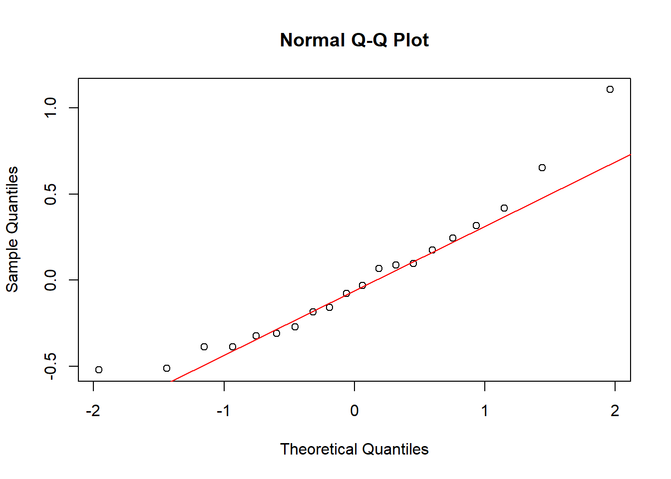
# for slopes random
qqnorm(ranef(fit_4)$Class[,2] )
qqline(ranef(fit_4)$Class[,2], col = "red")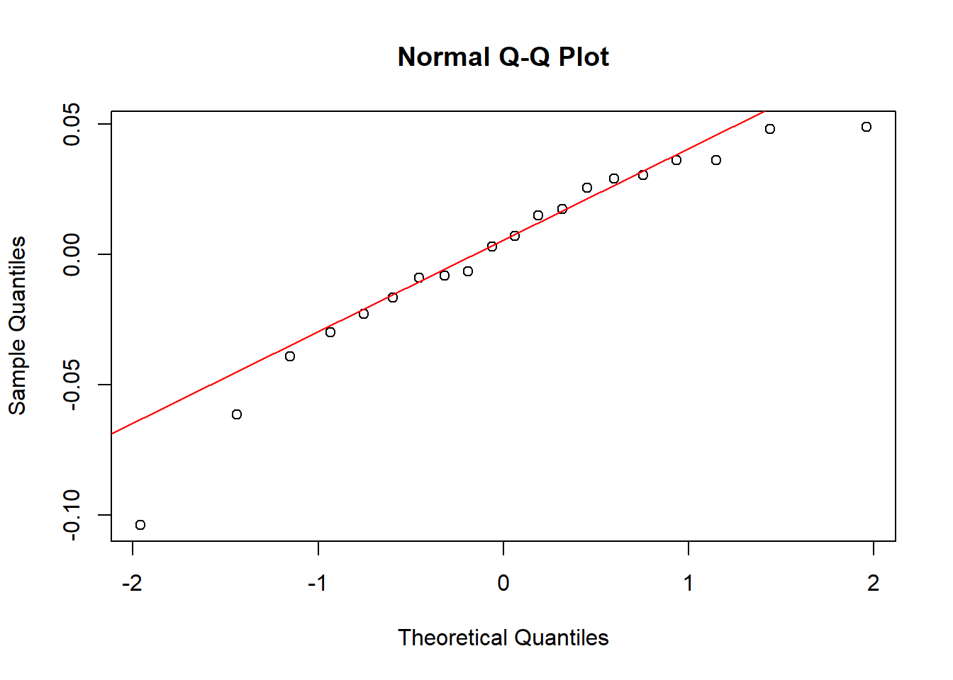
The fit is not perfect, but it seems acceptable.
We will look now at the plots of the estimated intercepts and slopes for Class and Student, according to our multilevel model with Class as the highest level.
reEx <- REsim(fit_4)
p1 <- as.ggplot(plotREsim(reEx))
p1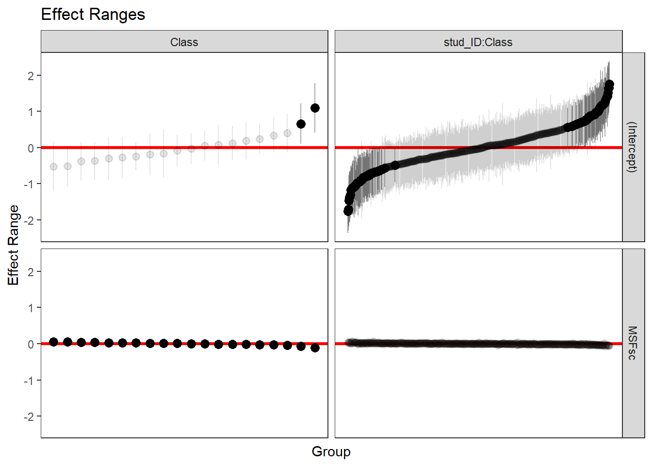
We shape of these graphs reflects that there are 20 classes and about 500 students. Grayed out confidence intervals intersect with 0. This is true for most intercepts of the classes and students. However, the slopes for chronotype are what really matters. In a way, the bottom part of the diagram is terrible, because we cannot see the differences between the slopes of the classes. We can do better if we wanted, like so.
p2 <- as.ggplot(plotREsim(reEx, facet= list(groupFctr= "Class", term= "MSFsc")))
p2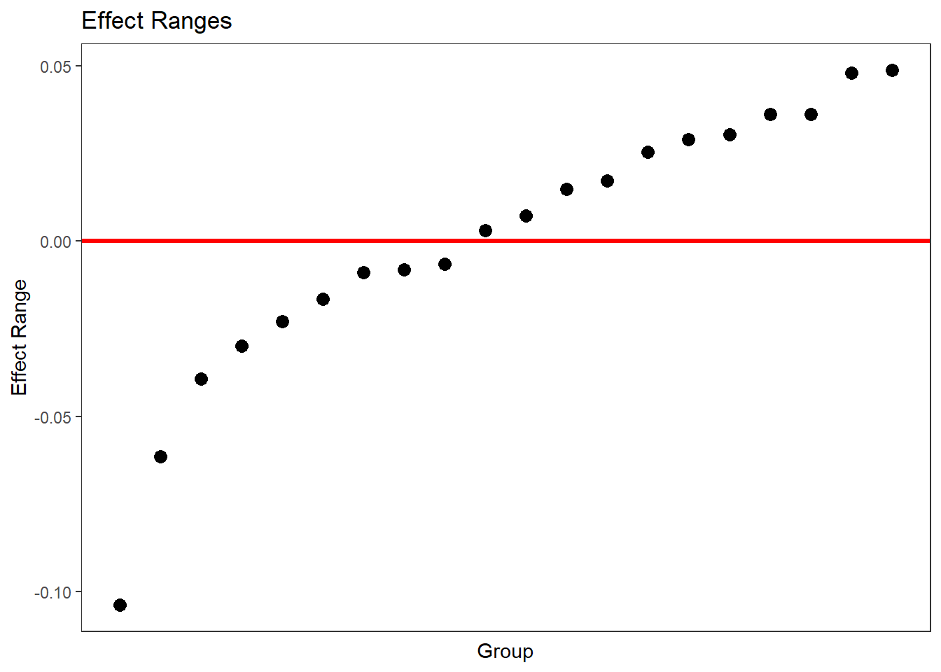
But the instructive point of the first, faceted diagram is that all the slopes are significantly different from zero (since they are black) even though they are hugging the horizontal line at 0. In other words, we have so many observations that the confidence interval is tiny, so as to be invisible.
This raises the question of how much shrinkage takes place in the multilevel model. Multilevel regression tries to find the sweet spot between pooled and unpooled regression. If there are very few observations per group, then the estimates inside the groups will be very similar to the estimates for the entire population. On the other hand, if there are a lot of observations in the groups, then the grand parameters will have a hard time pulling group parameters towards them. The latter may be the case here. Do does multilevel regression even make a difference here, given the large number of observations?
To that end we first estimate the regression lines separately for every class. We then pull the estimates of the multilevel model out of the lme4 object and add the relevant fixed and random parts together to get the multilevel estimates for the regression line per group. We won’t show uncertainty estimates here, because what we care about here is the amount of pull towards the unpooled estimates. So let’s see what happens.
# CREATE DF OF UNPOOLED REGRESSION COEFS

#function of the model
MSF_model <- function(df) {
  lm(Grade ~ 1 + MSFsc, data = df)
}
# loop over the groups
unpooled_coefs <- list()
for(i in seq_along(levels(a.out$imputations[[1]]$Class))){
  unpooled_coefs[[i]] <- a.out$imputations[[1]] %>%
    filter(Class %in% c(levels(Class)[i])) %>%
    MSF_model %>%
    tidy %>%
    filter(term %in% c("(Intercept)","MSFsc")) %>%
    dplyr::select(term,estimate)
}
# pull the class names
classes <- scores %>% pull(Class) %>% levels()
# stuff everything into a df
unpooled_coefs_df <- map_dfr(unpooled_coefs,`[`, c("term", "estimate")) %>%
  group_by(term) %>%
  mutate(row = row_number()) %>%
  tidyr::pivot_wider(names_from = term, values_from = estimate) %>%
  dplyr::select(-row) %>%
  mutate(classes = classes) %>%
  dplyr::select(classes, everything())

# CREATE A DF OF MULTILEVEL REGRESSION COEFS

#pull slopes and intercepts
class_re <- ranef(fit_4)$Class[[2]]
total_sl <- summary(fit_4)$coefficients[2]
multilevel_slopes <- total_sl + class_re

class_re_int <- ranef(fit_4)$Class[[1]]
total_sl_int <- summary(fit_4)$coefficients[1]
multilevel_intercepts <- class_re_int + total_sl_int
# add together in df
classes <- scores %>% pull(Class) %>% levels()
df_multilevel <- tibble(classes,multilevel_intercepts, multilevel_slopes)


# PLOT BOTH REGRESSION LINES PER GROUP

# some text to tell the lines apart
dat_text <- data.frame(
  label = "Multilevel",
  classes   = "1h3"
)
dat_text2 <- data.frame(
  label = "Unpooled",
  classes   = "1h3"
)
# the actual plot
  ggplot() +
  scale_y_continuous(limits=c(4,8)) +
  scale_x_continuous(limits=c(0,8)) +
  geom_abline(data=df_multilevel,aes(
    slope=multilevel_slopes,
    intercept=multilevel_intercepts),
    color="darkblue") +
  geom_abline(data=unpooled_coefs_df,aes(
      slope=MSFsc,
      intercept=`(Intercept)`), color="pink") +
    facet_wrap(vars(classes)) +
    labs(x="chronotype", y="Grade") +
    ggtitle("Multilevel and unpooled regression lines per class") +
      geom_text(
      data    = dat_text,
      color = "darkblue",
      mapping = aes(x = -Inf, y = -Inf, label = label),
      hjust   = -0.1,
      vjust   = -1
    ) +
    geom_text(
      data    = dat_text2,
      color = "pink",
      mapping = aes(x = 6, y = 7.5, label = label),
    )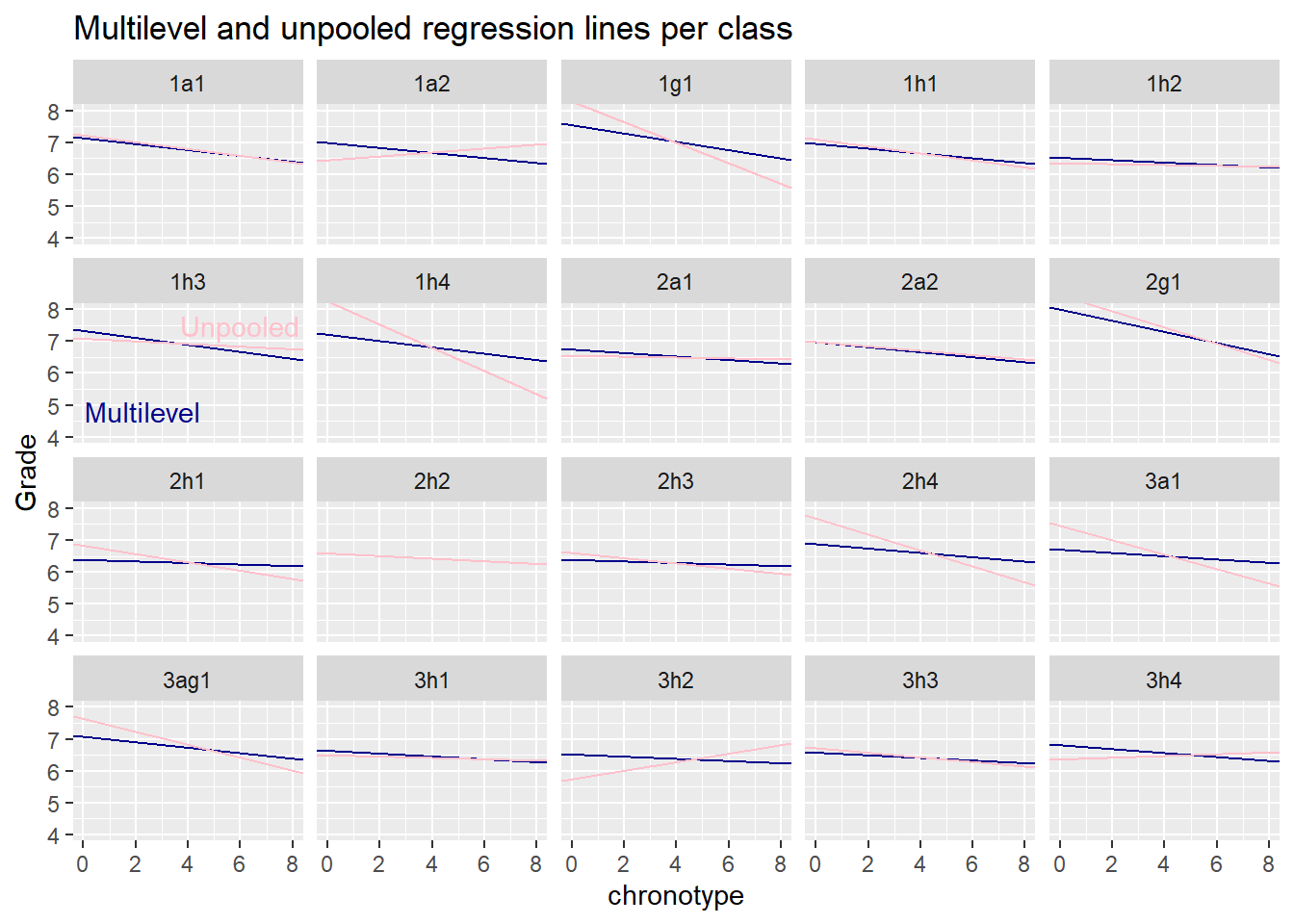
We note that the blue multilevel lines are like a sceptical version of the unpooled ‘naive’ pink lines. Whenever the separate group regressions (or pooled regression) are sloping up or down too wildly, the multilevel model regularizes the estimates towards the mean of the distribution of the slopes.
If we believe that classes are exchangeable and that the normal is an appropriate distribution of the random intercepts and slopes, then our speculations about the lack of motivation of havo 3 students seem unwarranted. However, the point of our speculations was that havo 3 classes are different from other classes in terms of motivation, so that they may not be exchangeable. So a multilevel model on its own can’t really settle the type of speculation we engaged in. One would have to measure students motivation is some way, if one though the speculation was worth pursuing. However, it isn’t, unless there is a more convincing scientific story about the effect of the interaction of motivation and chronotype on grades.
A Final Note
In the previous post, I ended by saying that the hunt for experimental evidence for the effect of chronotype on school performance should be opened. Shortly afterwards, I learned that an experiment to this effect has already been carried out in Argentina and was published in 2020. It randomly assigned about 700 students to three different starting times: the morning, the afternoon and the evening. It turned out that late chronotypes, those that go to bed late in weekends, indeed score worse for the group of students that went to school in the morning, but not for those that went to school in the evening.
These results may not carry over to Western Europe, because the rhythm of life in Argentina - where dinner is typically served at 21h - is very different from that in Western Europe. Indeed, the students had on average much higher chronotype scores than those in Western Europe. With this precaution in mind, the Argentinian study contributes strong causal evidence to the claim that night owls are at a disadvantage because of early school times.
Edi Terlaak
I like to tell stories about statistics.