Do Schools Discriminate against Night Owls? Evidence from Count Models (part 2)
We continue our journey of fitting count models to explain absenteeism based on the chronotype of students. We discussed binomial, quasi-binomial, poisson and quasi-poisson models and now move on to negative binomial, hurdle and zero inflated models. We then pause and ask how to select the best fitting model and what that even means.
Negative Binomial Regression
The name negative binomial is unfortunate, because the probability distribution is not a version of the binomial distribution, as one would expect. Rather, it is an extension of the geometric distribution, which counts the number of failures before a success occurs. The negative binomial (NB) extends this distribution in that it counts the number of failures until a specified number of successes occur.
A note of caution is in order here. There are a number of conventions and notations floating around regarding both the geometric and the NB. Depending on the problem, p can be defined as the probability of success or failure for example. For our purposes it makes sense to count the number of successes when we work with the NB. In that way, we can for example model the number of times a student called in sick.
The PDF of the NB models the number of successes y, given the probability of success p and and number of failures r.
\[ PDF(y; p, r) = \frac{(y_i + r-1)!}{y_i!(r - 1)!}p^{y}(1 – p)^{r} \] When we stare at this formula for a while, it starts to make sense. The fraction gives the combination of all sequences of success and failure until the y-th success (hence the -1 in the numerator and the denominator; we don’t count the final success since it is fixed).
Before we calculate the log-likelihood, we substitute r and p with expressions that foster interpretation. To this end we use the mean \(\mu\) of the NB. As the mean of the geometric is \(\frac{p}{1-p}\), the mean of the NB is \(\mu=r\cdot\frac{p}{1-p}\), where r is the number of failures.
This gives \(p=\frac{\mu}{\mu+r}\) and \(1-p=\frac{r}{\mu+r}\). Moreover, r is often parameterized as \(r=\frac{1}{\alpha}\), where either \(\alpha\) or \(\frac{1}{\alpha}\) is called the dispersion parameter, depending on the convention.
When we plug these parameters in the PDF, then calculate the likelihood and take the log, we get
\[ \mathcal{L}(\mu; y, \alpha) = \sum_{i=1}^{n}y_i ln\left(\frac{\alpha\mu_i}{1 + \alpha\mu_i}\right)-\frac{1}{\alpha}ln(1 + \alpha\mu_i) + ln\Gamma(y_i + \frac{1}{\alpha})-ln\Gamma(y_i + 1) – ln\Gamma(\frac{1}{\alpha})\] This required some algebra. Note that \(\Gamma\) refers to the gamma function, which gives the the factorial for any number (not just integers) minus one (for historical reasons).
How does this model help deal with the overdispersion of the Poisson? Well, the Poisson lacked flexibility in that the variance equals the mean. For the NB, the variance is equal to \(r\cdot\frac{p}{(1-p)^2}\) which can be written as \(\frac{\mu^2}{r}+\mu\). So the variance does no longer depend only on \(\mu\), but also on an additional dispersion parameter r, which goes by several names unfortunately. What follows is going to sound confusing, but is all due to the profusion of notations in count models.
In the formula above, r is parameterized as \(\frac{1}{\alpha}\), but the R packages we will use for our calculations spit out r as the dispersion parameter and call it \(\theta\). The R packages are unique in this regard. Other software packages use the direct parameterization \(\frac{1}{\alpha}\). The story behind this historical accident can be read here.
Let’s finally run the NB model and see if it gets us anywhere. There is no reason to believe that the number of days one calls in sick would be particularly well described by counting the number of failures before a set number of successes occurs. However, as we set out above, the negative binomial has a separate parameter for the variance different from the mean, which allows it to deal better with overdispersed data. We run the NB for days sick here, and repeat the analysis for the other response variables later.
summary(m1_nb <- glm.nb(`Sick frequency 2013-2014` ~ MSF_sc + age + sex,
                        data = att))
##
## Call:
## glm.nb(formula = `Sick frequency 2013-2014` ~ MSF_sc + age +
## sex, data = att, init.theta = 1.182071839, link = log)
##
## Deviance Residuals:
## Min 1Q Median 3Q Max
## -1.7965 -1.4698 -0.3954 0.3332 4.0122
##
## Coefficients:
## Estimate Std. Error z value Pr(>|z|)
## (Intercept) -0.32957 0.75277 -0.438 0.6615
## MSF_sc 0.12167 0.05311 2.291 0.0220 *
## age 0.05941 0.06011 0.988 0.3230
## sex -0.20382 0.11074 -1.840 0.0657 .
## ---
## Signif. codes: 0 '***' 0.001 '**' 0.01 '*' 0.05 '.' 0.1 ' ' 1
##
## (Dispersion parameter for Negative Binomial(1.1821) family taken to be 1)
##
## Null deviance: 474.81 on 423 degrees of freedom
## Residual deviance: 463.67 on 420 degrees of freedom
## (16 observations deleted due to missingness)
## AIC: 1749.6
##
## Number of Fisher Scoring iterations: 1
##
##
## Theta: 1.182
## Std. Err.: 0.133
##
## 2 x log-likelihood: -1739.613We note that the residual deviance is pretty close to the degrees of freedom, which suggests we have better model fit than in the case of the Poisson and the Binomial. Turning to the standard errors, there may be an effect of sex on days sick, but the effect of chronotype is clearer still. Given the estimate for MSF_sc of 0.12, we exponentiate (to undo the log link) to get 1.13. This means that for every extra unit of MSF_sc the number of days sick goes up by about 13%. That in turn means that if the midpoint of one’s natural sleeping times goes up by 1 hour (MSF_sc increases by 1), a student is expected to call in sick 13% more often.
Let’s have a look at the residuals as well.
qqrplot(m1_nb)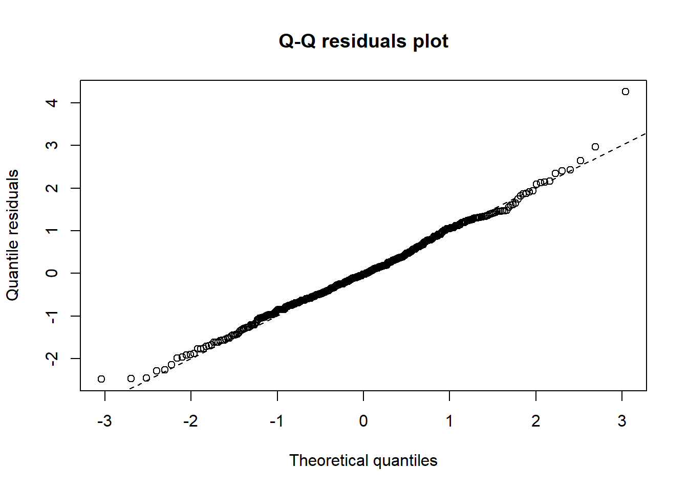
The qq-plot shows that residuals do not diverge from normality too badly, unlike for example the Poisson, for which we plotted the standardized residuals with the standard normal at the end of the previous post. We look at the other response variables later. Although we are doing better, we may increase model fit further still by considering another class of models.
Zero-inflated and hurdle models
As we explored the data visually in part 1, we noted that the response variables contain a lot of zeros. Indeed, as we visually explored the residuals of the binomial, the Poisson and the negative binomial, we noted that all these models underestimate the number of zeros in the data. For such situations, we can make use of zero-inflated or hurdle models.
Both models think that the process that generates the data has two parts to it. One part determines whether there is something to count in the first place, while the other part does the counting. The difference between the models is that hurdle models treat these two parts as strictly separate. One part models the zeros, while the other part models only strictly positive counts (this means that the probability distribution is truncated so that they exclude zero). By contrast, in zero-inflated models, the second part can still model zeros (so it isn’t truncated at zero).
For both approaches different models can be used for each part. So the {0,1} part of the model (whether there is something to count or not) could be modeled with a logistic regression model, while the second part could be modeled by a negative binomial or a Poisson.
The story of these models makes sense in the context of absenteeism in schools. At least we can make up a story where one process determines whether a student gets sick or not, and another process determines whether a students decides to stay home, given the sickness. Similarly, students may pass a kind of normative threshold where they are morally ok with being sent out of class, after which a second process determines the count of dismissals (where this second process only has an effect on dismissals after the normative threshold is passed). Something similar could be at work for being late, although the story is less convincing in that case.
We will run these models in a moment, together with the previous models. This then raises the questions of how to compare all these models. So let’s discuss that problem first.
Geocentric Model Evaluation
In one of his great metaphors Richard McElreath compares fitting GLM’s to ancient geometers determining the position of heavenly objects based on their observations from earth. Their models predicted the positions of the planets from their point of view against the night sky reasonably well. Hence McElreath refers to these models as ‘geocentric’. However, sending a rocket to their predicted coordinates would get you nowhere. So it is with GLM’s. We don’t understand the process we’re modeling, so we fit a bunch of models and look at indicators of fit until we are satisfied.
By contrast, the principled way to go about modeling is to avoid the standard link functions of GLM’s and come up with a relation between variables based on science. Another approach would be to draw out DAGs (Directed Acyclic Graphs) that chart the causal relations between variables. In our case, we don’t have a scientific theory that relates chronotype to absenteeism and there are not enough variables in the data set to draw a meaningful DAG. We will therefore be content with ‘geocentric’ modeling for now.
Broadly speaking, there are two ways to evaluate ‘geocentric’ model fit. The first looks at the data that we have and checks how well the model predicts the outcome variable. The second asks how the model would fare if we got new data from the same data generating process. We could do that by splitting up the initial data set, for example.
We will evaluate model fit then using information theory, visual inspection of model specification and finally cross validation.
AIC
The Akaiki Information Criterion (AIC) is closely related to measures of deviance we already discussed in the previous post. It adds a twist though. It takes the -2 log-likelihood that we saw already. We wanted this value to be as low as possible. The AIC adds a penalty term 2k to this value, where k is the number of estimated parameters in the model.
\[ AIC = -\ 2\mathcal{L}\ + \ 2k\] Although there is a lot more to say about this formula, it makes sense intuitively. As we add more parameters to a model so that we have one parameter for every data point, we can fit the data perfectly. That doesn’t mean the model is useful however, because if new data comes in, the model is likely to do poorly. It fits the sample, not the underlying process. It makes sense then to penalize the model for adding parameters.
Let’s cycle through all the models and see how they fare by this criterion. Note that since we use the same data for all the models, it makes sense to compare their likelihood values (via the AIC).
b_models <-list()
p_models <-list()
nb_models <- list()
zi_p_models <- list()
zi_nb_models <- list()
hnb_models <- list()

for (i in 1:3){
  b_models[[i]] <- glm(att_compl[[14+i]] ~ age + sex + MSF_sc,
                          data = att_compl, family='binomial')
  p_models[[i]] <- glm(att_compl[[i]] ~ age + sex + MSF_sc,
                       data = att_compl, family= "poisson")
  nb_models[[i]] <- glm.nb(att_compl[[i]] ~ age + sex + MSF_sc,
                data = att)
  zi_p_models[[i]] <- zeroinfl(att_compl[[i]] ~ MSF_sc + age + sex| MSF_sc + age + sex,
                            data = att, dist = "poisson")
  zi_nb_models[[i]] <- zeroinfl(att_compl[[i]] ~ MSF_sc + age + sex| MSF_sc + age + sex,
                            data = att, dist = "negbin")
  hnb_models[[i]] <- hurdle(att_compl[[i]] ~ MSF_sc + age + sex| MSF_sc + age + sex,
                     data = att, dist = "negbin")
}

AIC_scores <- list()
for (i in 1:3){
AIC_scores[[i]] <- AIC(b_models[[i]],p_models[[i]], nb_models[[i]], zi_p_models[[i]],
                       zi_nb_models[[i]], hnb_models[[i]]) %>%
                          mutate(models=c("Binomial", "Poisson", "Negative Binomial", "Zero-inflated Poisson",
                                          "Zero-Inflated Negative Binomial", "Hurdle Negative Binomial")) %>%
                              relocate(models)

}

AIC_scores[[1]]
## models df AIC
## b_models[[i]] Binomial 4 2139.656
## p_models[[i]] Poisson 4 2122.892
## nb_models[[i]] Negative Binomial 5 1749.613
## zi_p_models[[i]] Zero-inflated Poisson 8 1975.229
## zi_nb_models[[i]] Zero-Inflated Negative Binomial 9 1755.818
## hnb_models[[i]] Hurdle Negative Binomial 9 1748.674We see that for the days sick response variable, the AIC really doesn’t like the Binomial and Poisson models compared to the others. The negative binomial does very well though, while a hurdle model does slightly better.
AIC_scores[[2]] ## models df AIC
## b_models[[i]] Binomial 4 1252.417
## p_models[[i]] Poisson 4 1252.063
## nb_models[[i]] Negative Binomial 5 1145.650
## zi_p_models[[i]] Zero-inflated Poisson 8 1160.118
## zi_nb_models[[i]] Zero-Inflated Negative Binomial 9 1145.115
## hnb_models[[i]] Hurdle Negative Binomial 9 1145.255AIC_scores[[3]] ## models df AIC
## b_models[[i]] Binomial 4 1018.5935
## p_models[[i]] Poisson 4 1018.2158
## nb_models[[i]] Negative Binomial 5 839.1693
## zi_p_models[[i]] Zero-inflated Poisson 8 861.5753
## zi_nb_models[[i]] Zero-Inflated Negative Binomial 9 829.1255
## hnb_models[[i]] Hurdle Negative Binomial 9 840.3242For the late for class case, we get broadly the same picture. Now it’s the zero-inflated model that narrowly beats the negative binomial. For the dismissed from class case, the zero-inflated model outperforms the negative binomial by a bit more.
It is unsatisfactory to decide on the best model by, basically, staring at negative log-likelihoods (in the AIC). We would like to see how well the model fits data. Moreover, likelihood (and by implication the AIC) doesn’t tell us anything about model fit on its own. The number by itself is meaningless. We can compare likelihoods to see whether one model is better than another, but these could be small differences among models that are all horrible fits. For these reasons we will now also visualize model fit.
Visual check of model fit
To this end we use the countreg package, which makes interesting plots of model fit for count models.
On a technical note, Working with countreg plots is a bit annoying if we cycle through lots of models, because it produces base-R type plots. We can use the ggplotify package though to transform them into ggplot objects that we can work with more easily.
We model days sick first.
b_plots <- list()
p_plots <- list()
nb_plots <- list ()
zi_p_plots <- list()
zi_nb_plots <- list()
hnb_plots <- list()
patch <- list()

for (i in 1:3){
  b_plots[[i]] <- as.ggplot(~countreg::rootogram(b_models[[i]], ylim = c(-5, 15), xlim= c(-1,12), xlab="")) +
                      ggtitle("Binomial")
  p_plots[[i]] <- as.ggplot(~countreg::rootogram(p_models[[i]],  ylim = c(-5, 15), xlim= c(-1,12), xlab="")) +
                      ggtitle("Poisson")
  nb_plots[[i]] <- as.ggplot(~countreg::rootogram(nb_models[[i]],  ylim = c(-5, 15), xlim= c(-1,12), xlab="")) +
                      ggtitle("Negative Binomial")
  zi_p_plots[[i]] <- as.ggplot(~countreg::rootogram(zi_p_models[[i]], xlab="", main = "ZIP", ylim = c(-5, 15), max = 15)) +
                      ggtitle("Zero-inflated Poisson")
  zi_nb_plots[[i]] <- as.ggplot(~countreg::rootogram(zi_nb_models[[i]], xlab="", main = "ZIP", ylim = c(-5, 15), max = 15)) +
                      ggtitle("Zero-inflated Neg Binom")
  hnb_plots[[i]] <- as.ggplot(~countreg::rootogram(hnb_models[[i]], xlab="", main = "HNB", ylim = c(-5, 15), max = 15)) +
                      ggtitle("Hurdle Neg Binom")
  patch[[i]] <- (b_plots[[i]]+p_plots[[i]] + nb_plots[[i]]) / (zi_p_plots[[i]] + zi_nb_plots[[i]] + hnb_plots[[i]])
}

patch[[1]]  + plot_annotation(title="Days sick models",
                              subtitle="Bars are the observed counts, which are matched with the red values of the model")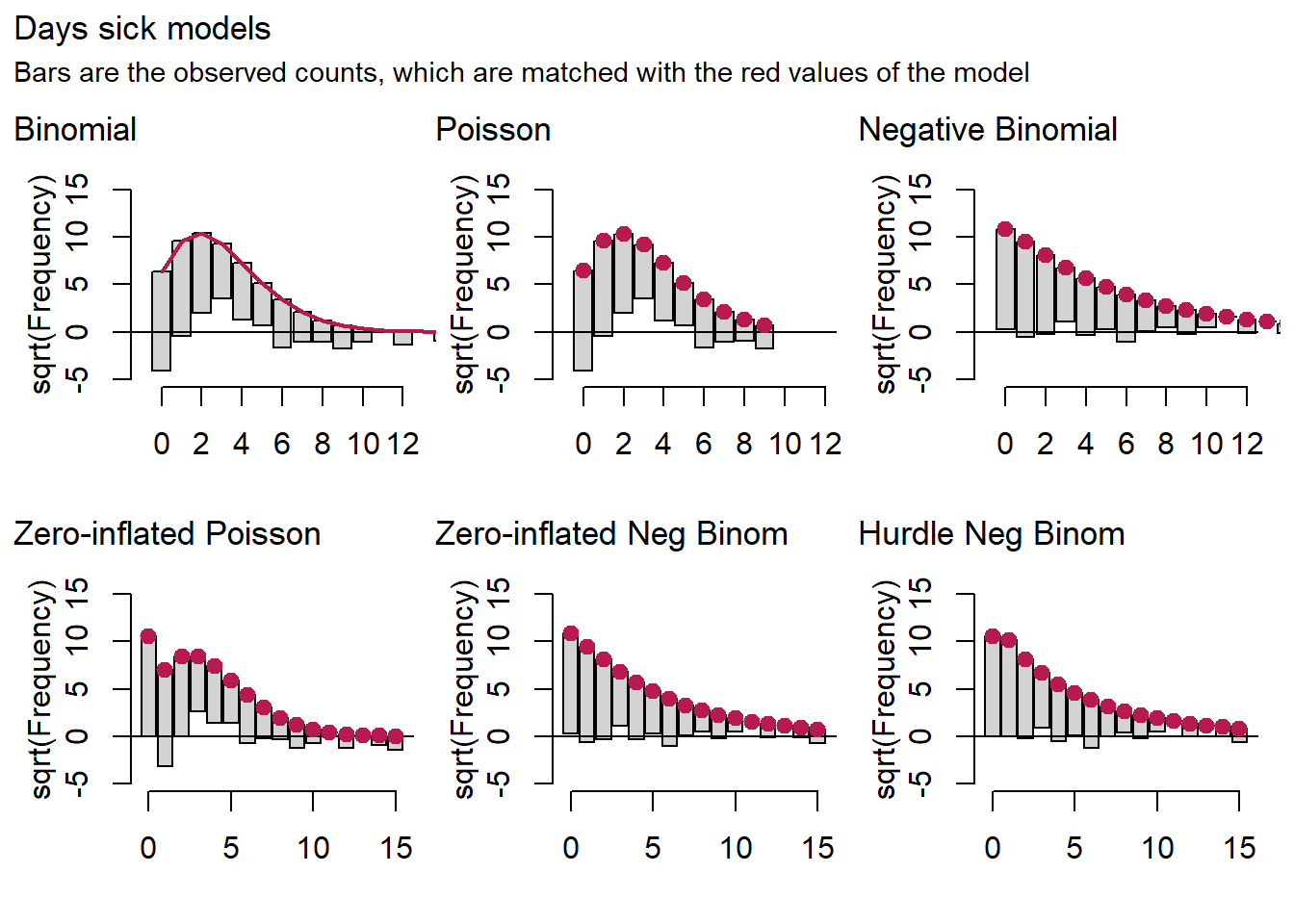
In these graphs, the red dots are the model predictions. The bars are the data that are lined up with the dots, so that they may stick out at the bottom or hover above the x-axis. These cases would indicate poor model fit.
The picture we get for the binomial and the Poisson is much the same as the one we saw in the previous post. These models overestimate medium counts and underestimate the rest. For days sick we also note that the negative binomial is doing very well, while the hurdle and zero-inflated variants do even better.
Let’s look at the models for late for class and dismissed from class all at once.
patch[[2]]  + plot_annotation(title="Late for class models",
                              subtitle="Bars are the observed counts, which are matched with the red values of the model")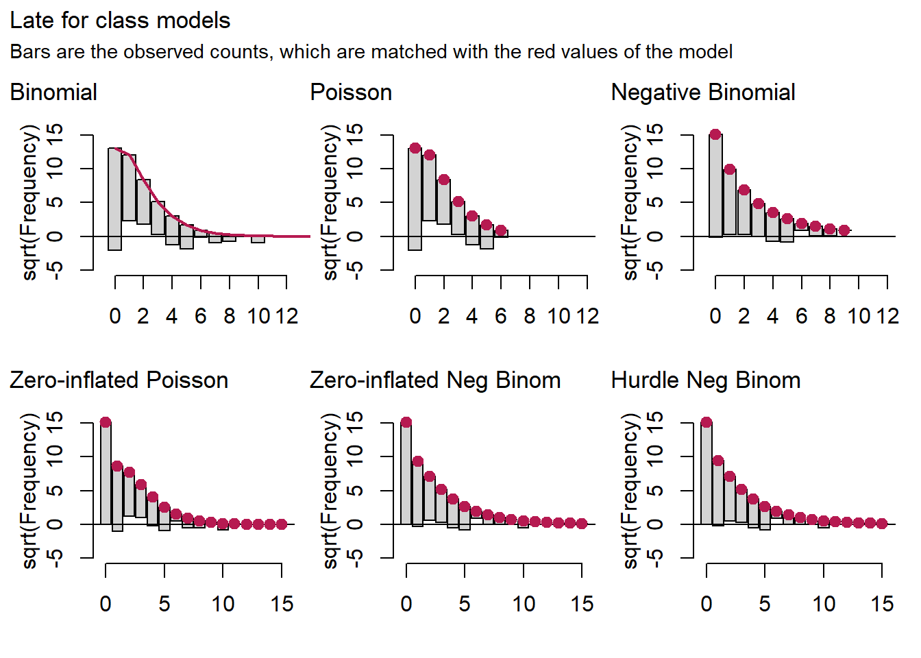
patch[[3]]  + plot_annotation(title="Removed from class models",
                              subtitle="Bars are the observed counts, which are matched with the red values of the model")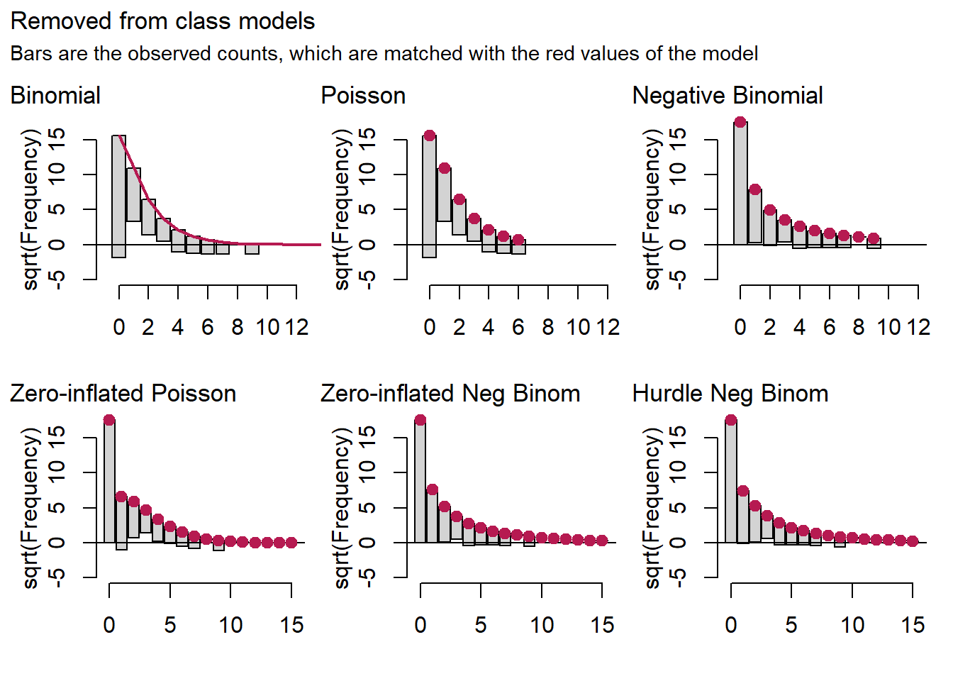
For the late for class and dismissed from class models, it is hard to detect a difference between the negative binomial model on the one hand and the zero-inflated and hurdle binomials on the other.
Cross validation
A third method check the model by splitting the data set into a training set and a test set. The model is then built on the bases of the training data and has to proof itself on the test data set it has not seen before. A method that has a good track record is leave-on-out cross validation, in which this process is repeated many times leaving out one observation each time. This take a lot of processing power and hence time, but fortunately Andrew Gelman, Aki Vehtari and colleagues have worked out an optimization algorithm that is relatively fast and still performs well. This work is laid down in the loo package. It works for Bayesian models only, so we run the same likelihood models with standard brms priors. These models take a while to run, so we restrict the cross validation to the late for class response variable for convenience.
library(brms)
library(loo)

setwd("C:/R/edu/chronotypes")

# finally give the vars reasonable names
att <- att %>% mutate(late=`LA 1st 2013-2014`,
                      sick_freq = `Sick frequency 2013-2014`,
                      removed = `Removed 2013-2014`)
# fit a negbin with brms to late for class
br_nb_1 <- brm(data = att,
              family = negbinomial,
              late ~ 1 + age + sex + MSF_sc,
              iter = 2000, warmup = 1000, cores = 4, chains = 4,
              seed = 12,
              file = "fits/neg_binomial_late")

br_pois_late <- brm(data = att,
               family = poisson(link="log"),
               late ~ 1 + age + sex + MSF_sc,
               iter = 2000, warmup = 1000, cores = 4, chains = 4,
               seed = 12,
               file = "fits/poisson_late")

br_zi_nb_late <- brm(data = att,
                    family = zero_inflated_negbinomial(link = "log"),
                    late ~ 1 + age + sex + MSF_sc,
                    iter = 2000, warmup = 1000, cores = 4, chains = 4,
                    seed = 12,
                    file = "fits/zi_nb_late")

br_hurdle_nb_late <- brm(data = att,
                     family = hurdle_negbinomial(link = "log"),
                     late ~ 1 + age + sex + MSF_sc,
                     iter = 2000, warmup = 1000, cores = 4, chains = 4,
                     seed = 12,
                     file = "fits/hurdle_nb_late")

# models have been compared with loo() and are now loaded from disk for speed
load("fits/loo_late")
loo_late
## Output of model 'br_nb_1':
##
## Computed from 4000 by 424 log-likelihood matrix
##
## Estimate SE
## elpd_loo -572.7 21.1
## p_loo 4.5 0.4
## looic 1145.3 42.2
## ------
## Monte Carlo SE of elpd_loo is 0.0.
##
## All Pareto k estimates are good (k < 0.5).
## See help('pareto-k-diagnostic') for details.
##
## Output of model 'br_pois_late':
##
## Computed from 4000 by 424 log-likelihood matrix
##
## Estimate SE
## elpd_loo -628.2 26.9
## p_loo 8.1 1.1
## looic 1256.4 53.8
## ------
## Monte Carlo SE of elpd_loo is 0.1.
##
## All Pareto k estimates are good (k < 0.5).
## See help('pareto-k-diagnostic') for details.
##
## Output of model 'br_zi_nb_late':
##
## Computed from 4000 by 424 log-likelihood matrix
##
## Estimate SE
## elpd_loo -573.0 21.0
## p_loo 5.1 0.5
## looic 1145.9 42.1
## ------
## Monte Carlo SE of elpd_loo is 0.0.
##
## All Pareto k estimates are good (k < 0.5).
## See help('pareto-k-diagnostic') for details.
##
## Output of model 'br_hurdle_nb_late':
##
## Computed from 4000 by 424 log-likelihood matrix
##
## Estimate SE
## elpd_loo -581.9 21.2
## p_loo 5.7 0.7
## looic 1163.9 42.3
## ------
## Monte Carlo SE of elpd_loo is 0.1.
##
## All Pareto k estimates are good (k < 0.5).
## See help('pareto-k-diagnostic') for details.
##
## Model comparisons:
## elpd_diff se_diff
## br_nb_1 0.0 0.0
## br_zi_nb_late -0.3 1.0
## br_hurdle_nb_late -9.3 4.3
## br_pois_late -55.5 12.0At the bottom of the loo output we see that the first model br_nb_1, which is the negative binomial model, comes out on top. This doesn’t mean much though, because the difference between the NB and the zero-inflated NB is overwhelmed by the standard error. Again, we find no reason in terms of model fit to prefer the zero-inflated or hurdle versions of the NB over the regular NB.
Interpretation
So which model do we choose? Both in terms of AIC scores and visual checks of model fit, there is not much reason to choose a zero-inflated or hurdle verion of the negative binomial over the regular negative binomial. Parsimony would suggest the negative binomial will do just fine. We could still prefer the zero-inflated and hurdle models if we found the story behind picking these models particularly convincing. But I don’t think they are.
So what does this NB model tell us about chronotypes and absenteeism? We already saw that increasing the natural midpoint of sleep by an hour increases days sick by 13%. The negative binomial estimate for late for class is 0.14, with standard error 0.069. For dismissed from class the estimate is 0.4 with standard error 0.069. This means, after exponentiating the estimates (to undo the log link), that we expect every extra hour of the natural midpoint of sleep to lead to 15% more cases of students being late for class and 50% more dismissals from class.
That seems like a lot, but we have to keep in mind that all cases of absenteeism are rare events. We need an idea of the impact of absenteeism on student welfare and grades (or a disruption of learning culture in a class) to assess whether a 50% percent increase in the number of dismissals (from rare to a bit less rare) is a lot. For perspective, let’s plot the conditional effects of chronotype of the Bayesian models, while taking average values for the other variables.
setwd("C:/R/edu/chronotypes")
br_nb_rem <- brm(data = att,
family = negbinomial,
removed ~ 1 + age + sex + MSF_sc,
iter = 2000, warmup = 1000, cores = 4, chains = 4,
seed = 12,
file = "fits/neg_binomial_rem")
br_nb_sick <- brm(data = att,
family = negbinomial,
sick_freq ~ 1 + age + sex + MSF_sc,
iter = 2000, warmup = 1000, cores = 4, chains = 4,
seed = 12,
file = "fits/neg_binomial_sick")
# plot effects of MSF
br_p1 <- plot(conditional_effects(br_nb_sick, effects="MSF_sc"), plot = F)[[1]] +
labs(x="", y= "frequency of sick") +
ylim(c(0,6))
br_p2 <- plot(conditional_effects(br_nb_1, effects="MSF_sc"), plot = F)[[1]] +
labs(x="", y= "late for class") +
ylim(c(0,6))
br_p3 <- plot(conditional_effects(br_nb_rem, effects="MSF_sc"), plot = F)[[1]] +
labs(x="chronotype", y= "removed from class") +
ylim(c(0,6))
patch_brms <- (br_p1 / br_p2 / br_p3) +
plot_annotation(title="Estimated effect of chronotype on absenteeism",
subtitle="Bands are 95% credible intervals")
patch_brms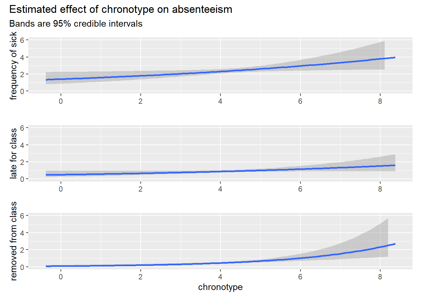 Note that the bands are credible intervals. So they mean what a lot of people think confidence intervals mean: there is a probability associated with every possible estimate of chronotype inside the band. At every x value these estimates sum to 95% probability. In any case, these graphs of the absolute difference in absenteeism rather than the relative ones present a less spectacular picture of the influence of chronotype on absenteeism, even for the case of the 50% increase in dismissals.
Furthermore, the language can be misleading here. By saying that we expect an increase of so many percent, we are implicitly making a causal claim. The research design isn’t set up for that job though. It’s the model that expects these increases in absenteeism. We need not believe this model, because it leaves out a lot. That is, many aspects of human psychology could be confounded with chronotype and absenteeism, so that our confidence in a causal link between the two should not be all that high. The results are suggestive though, so the hunt for (quasi-)experimental designs in this area should be opened.
Edi Terlaak
I like to tell stories about statistics.