Do Schools Discriminate against Night Owls? Evidence from Count Models (part 1)
A widely shared belief is that some people naturally rise early while others prosper during the night. To be precise, the belief is that this behavior is not induced by the environment, but is the expression of an innate biological clock. Researchers have captured this phenomenon with questionnaires and given it a scientific name. Instead of early birds and night owls, they speak of ‘early’ and ‘late’ chronotypes respectively.
According to recent research published in Nature by Giulia Zerbini and others, late chronotypes suffer from the early start of school. In the Netherlands, a school day starts on average at 8:30, when late chronotypes have barely booted up. Based on their research, Zerbini and colleagues go as far as saying that “early school starting times are a form of discrimination against late chronotypes.” (p. 7)
They do so based on their analysis of the impact of chronotype on absenteeism and grades. We deal with absenteeism in this post and the next, which leads us into the realm of count models. We are able to do so because the researchers have made their data available in an exemplary way here.
After taking a brief look at these data, we start thinking about how we should model it. We first come up with a natural starting point and then look for other models and adjustments, based on the nature of the lack of model fit.
The Data
The data were collected at a school in Coevorden, the Netherlands among students in the age range 11 - 16. Among the 523 students selected for the study, 426 filled in the chronotype questionnaire. Of the 20 classes in the study, 12 were HAVO (intermediate/high level) and 8 VWO (highest level). The lowest level (VMBO) was absent then. The authors do not justify this selection decision. It may well inflate a possible effect however. Earlier work, that is cited in the Zerbini article, shows that late chronotypes do worse on fluid intelligence tasks in the morning. Higher levels like HAVO and VWO presumably make greater demands on fluid intelligence, so that the impact of chronotype could be felt more severely at HAVO and VWO.
When we load the data set, we note that there are 440 observations. Among this subset, roughly 1% of the data is missing.
library(naniar)
library(tidyverse)
library(MASS)
library(pscl)
library(patchwork)
library(broom)
library(forcats)

setwd("C:/R/edu/chronotypes")
att <- read_tsv("MCTQ_and_attendance.txt")
att %>% miss_var_summary()
## # A tibble: 11 x 3
## variable n_miss pct_miss
## <chr> <int> <dbl>
## 1 MSF_sc 14 3.18
## 2 MSFsc groups 1-7 14 3.18
## 3 SJL 14 3.18
## 4 LA 1st 2013-2014 2 0.455
## 5 Removed 2013-2014 2 0.455
## 6 Sick frequency 2013-2014 2 0.455
## 7 Sick duration 2013-2014 2 0.455
## 8 SD_w 1 0.227
## 9 all student IDs for HAVO-VWO 0 0
## 10 age 0 0
## 11 sex 0 0Given that we have no information about the 523 - 440 = 83 students that are not in this data set but were selected for the study, together with the small number of missing data, the benefit of missing data imputation is not worth the effort. So we won’t bother.
Let us describe the 11 variables in the data set so that we know what was actually measured. Columns 2 to 5 contain the response variables being late for class, being removed from class, the number of times a student is sick and the duration a students is sick. Then the background variables sex and age are stored, after which we get four measures related to chronotype. The main assumption with regard to these measures is that individuals have a personal biological clock, which is revealed in the weekend (or work free days to be precise) - when they supposedly go to bed and wake up at their ‘natural’ points in time. A correction is made for sleep debt that individuals accumulated during the work week or school week. Let’s run through the four variables.
SD_wis the average sleep duration on school daysMSF_scis the midpoint between sleep onset and sleep end on free days (MSF stands for Mid-Sleep on Free days), corrected for sleep needMSFsc groups 1-7turns theMSF_scinto an ordinal variable with seven classesSJLstand for social jetlag, and is calculated as the absolute difference between the midpoint of sleep times between school days and free days
Let’s quichly inspect the variables with histograms.
# write a function that makes a hist per var
plot_for_loop <- function(df, x_var) {
    ggplot(df, aes(x = .data[[x_var]])) +
      geom_histogram()
}
# stick the col names of att into the function via map, and so make a list of plots
plot_list <- colnames(att)[-1] %>%
  map( ~ plot_for_loop(att, .x))

wrap_plots(plot_list)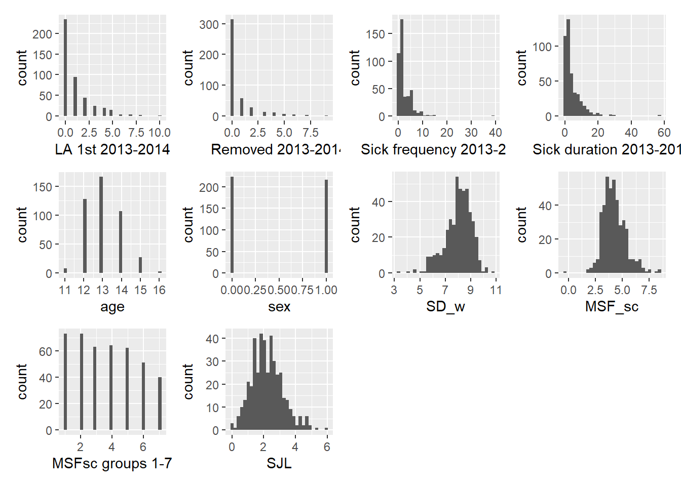
We go through some initial observations. First, the response variables are counts with lots of zeros, which we will have to deal with in the analysis. We furthermore note that the average sleep duration SD_W on school days is left skewed, but that most students report that they sleep between 7 and 9 hours. The midpoint of the supposed natural sleep cycle of a student is around 4 AM, while the social jet lag seems quite large at around 2 hours on average.
If we plot social jet lag against the mid point of natural sleep MSF_sc we see that the two variables are not perfectly correlated. Why not? Do students not all start at the same time?
# SJL vs MSF_sc
ggplot(att, aes(x=MSF_sc, y=SJL)) +
  geom_point() +
  ggtitle("Social jetlag and the midpoint of sleep on free days")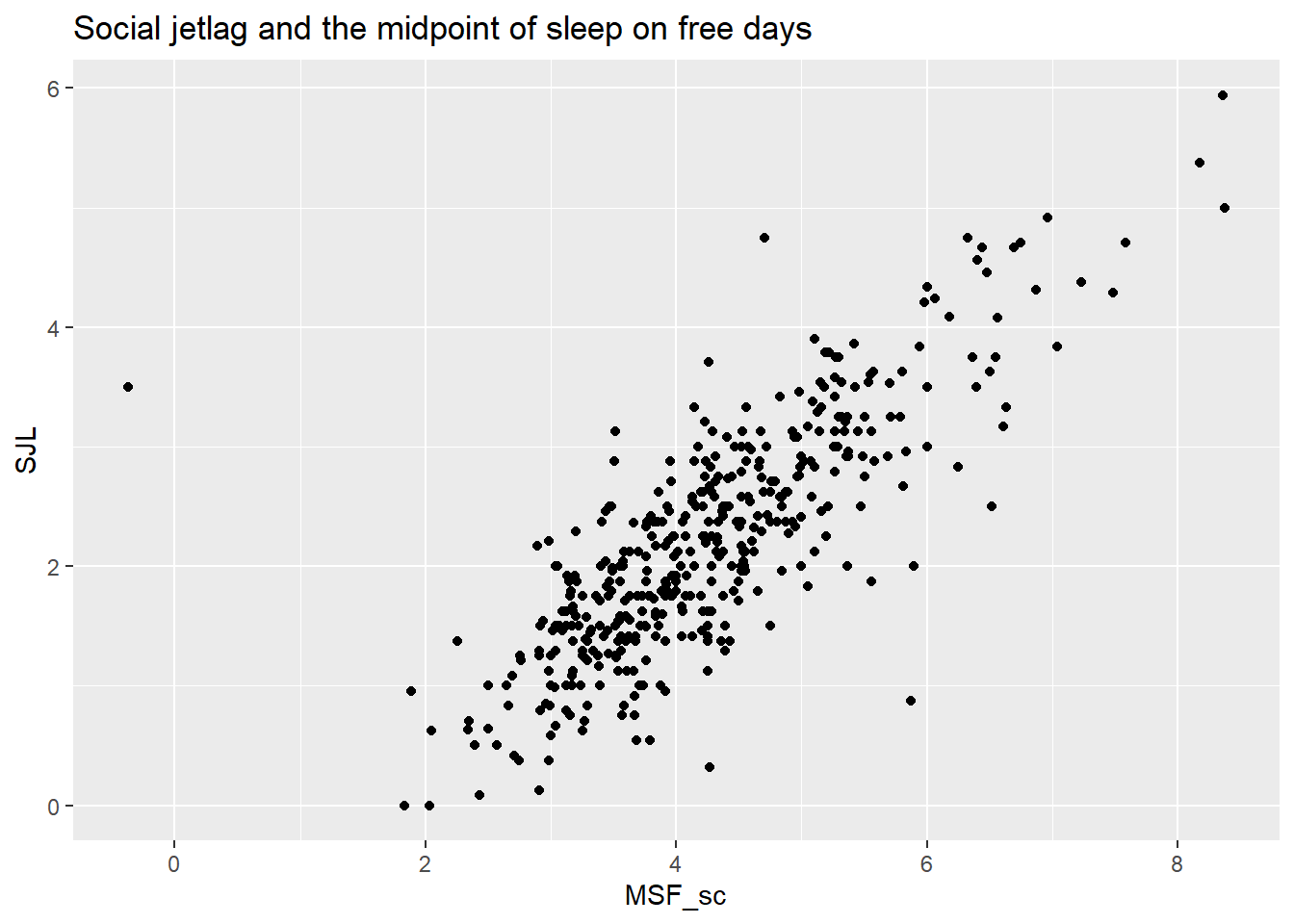
The likely reason is that students have different travel times to school and different preparation time more generally before school start.
Note also that students who have their natural midpoint of sleep at 2 AM have no or only a little social jet lag. There is one night owl with a natural midpoint of sleep of 8 AM with a massive social jet lag of 6 hours. On the other end of the spectrum, we have one early bird with a natural mid point around midnight, who suffers 3.5 hours of social jet lag (recall that social jet lag is an absolute measure). We do not have the filled in questionnaire, but there was supposedly no reason to doubt the validity of this response. In any case, the early bird is more of an outlier than the night owl.
Another interesting relation is the one between the midpoint of sleep MSF_sc and the number of hours sleep on a school day SW_w.
ggplot(att, aes(x=MSF_sc, y=SD_w)) +
  geom_point() +
  ggtitle("Hours sleep on school day and midpoint of sleep")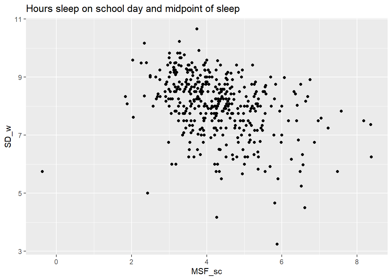
Unsurprisingly, students with a later onset of the natural sleep cycle sleep less during school days. Less obvious is the increasing variation in hours slept as we move rightward to later chronotypes. Some late chronotypes seem to be able to adjust and get their hours of sleep, while other can’t adjust. It would be interesting to investigate what the determinants of coping are. This question is practically relevant as well, because adjusting personal sleeping behavior is less dramatic than changing school times. But that requires another data set.
For now, the challenge is to estimate the effect of chronotype on the response variables regarding absenteeism, for which we turn to count models.
Count Models
What we want to explain here are counts of being late, being sick or being dismissed. The structure of the situation is such that each count is the result of a sequence of 0 or 1 events. Take the count of being sick. There are 189 legally required school days in the Netherlands (I assume the school in Coevorden stuck with this minimum). For every day, a student is either called in sick or not. (We assume a student is not sick twice a day.) The PMF that models these situations is the binomial distribution, with mean \(np\) and variance \(\sqrt{np(1-p)}\). This should therefore be our starting point.
That means that we shouldn’t automatically start modeling with the Poisson, just because we have count data. The Poisson is built for situations in which events are counted in continuous time or space. See this video by John Tsitsiklis for a refresher. If there were no limit on the number of times a student can be sick per day and his parent can call in on every moment of the day, then the Poisson would be the appropriate first choice. But that is not the case.
That being said, if the number of failures is much higher than the number of successes, then we can use the Poisson to approximate the binomial. In fact, as n goes to infinity and p goes to 0, then the binomial becomes the Poisson - see here for a derivation.
For the three cases discussed here, n is 189 for being sick per day, while it is about 1253 for both being late and for being dismissed from class (I assumed a class is 45 minutes and used that HAVO takes 4700 clock hours in a 5 year total). The Poisson approximation is more reasonable then for the latter two cases.
Below we run through a sequence of count models to hopefully fit the data and the data generating process ever better.
Binomial and Quasi-binomial regression
We start with the most natural model, which treats the events as discrete sequences of success and failure. We apply it first to the case of days sick, to get familiar with the glm function and its summary in R. We do not know the precise sequence of 0’s and 1’s, so we feed the count of successes (as days sick) and failures into the binomial regression model. We choose MSF_sc as this variables is the most valid measure of chronotype (while the others are heavily correlated) as well as age and sex.
# add the counts of successes and failures to the data set
att_compl <- att %>% mutate(not_sick = 189 - `Sick frequency 2013-2014`,
                            on_time = 1253 - `LA 1st 2013-2014`,
                            not_removed = 1253 - `Removed 2013-2014`,
                            sick_cols = cbind(`Sick frequency 2013-2014`,not_sick),
                            late_cols = cbind(`LA 1st 2013-2014`,on_time),
                            rem_cols = cbind(`Removed 2013-2014`,not_removed),
                            sex = as.factor(sex),
                            `MSFsc groups 1-7`=as.factor(`MSFsc groups 1-7`),
                            sex = fct_recode(sex, "female" = "0", "male" = "1"))  %>%
                                  relocate(`Sick frequency 2013-2014`,
                                           `LA 1st 2013-2014`,
                                           `Removed 2013-2014`)

# run a binomial regression on the proportion
bin <- glm(att_compl$sick_cols ~ age + sex + MSF_sc, data = att_compl, family = 'binomial')
summary(bin)
##
## Call:
## glm(formula = att_compl$sick_cols ~ age + sex + MSF_sc, family = "binomial",
## data = att_compl)
##
## Deviance Residuals:
## Min 1Q Median 3Q Max
## -2.6541 -1.8660 -0.6204 0.6183 11.2383
##
## Coefficients:
## Estimate Std. Error z value Pr(>|z|)
## (Intercept) -5.63875 0.43187 -13.056 < 2e-16 ***
## age 0.06485 0.03429 1.891 0.058570 .
## sexmale -0.22702 0.06421 -3.536 0.000407 ***
## MSF_sc 0.12625 0.02983 4.232 2.31e-05 ***
## ---
## Signif. codes: 0 '***' 0.001 '**' 0.01 '*' 0.05 '.' 0.1 ' ' 1
##
## (Dispersion parameter for binomial family taken to be 1)
##
## Null deviance: 1293.1 on 423 degrees of freedom
## Residual deviance: 1256.7 on 420 degrees of freedom
## (16 observations deleted due to missingness)
## AIC: 2139.7
##
## Number of Fisher Scoring iterations: 5We get a table with coefficients for the intercept and the covariates in our model. Besides them are standard errors, which do not overwhelm the estimates. We leave the interpretation of the coefficients for later, because they don’t mean much if the model doesn’t fit.
We then read: “Dispersion parameter for binomial family taken to be 1”. We discussed the dispersion parameter \(\phi\) in this post about the GLM. In the logistical model we take this parameter to be 1. We may adjust it later.
Below this line, we read about Null deviance and Residual deviance. These are a bunch of big numbers with degrees of freedom attached to them. What do they mean?
Loosely speaking, deviance is the analogue of the sum of squares for a linear model. Taking the sum of squared residuals could technically be done for a GLM-type model, but is computationally less efficient than maximum likelihood. We stay within the likelihood framework here then, where the deviance compares the likelihood of two models.
More technically, the deviance is a log-likelihood ratio of two models, which must be nested. The ratio is multiplied by 2 so that it should follow a Chi-Squared distribution with mean equal to the appropriate degrees of freedom (df of overarching model - df of the nested model).
Looking at the formulas is the fastest way of getting intuition. Below, LL stands for log likelihood and df for degrees of freedom.
- \(Null\ Deviance = 2(LL(Saturated\ Model) - LL(Null\ Model))\) with df = df_Sat - df_Null
- \(Residual\ Deviance = 2(LL(Saturated\ Model) - LL(Proposed\ Model))\) with df = df_Sat - df_Proposed
In both formulas, stuff is subtracted from the Saturated Model. This model is the one where there is a parameter for every data point. Presumably, this is the best that can be done. The Null model on the other hand has only one parameter (so no covariates), while the Proposed model has four in our case.
The Null deviance subtracts the log likelihood of the Null model from the Saturated model. If nothing remains, we can stop using the model. We won’t be able to do better than using the single parameter that the Null model uses.
The Residual deviance subtracts the log likelihood of the Proposed model from the Saturated one. We want these numbers to be close together. The closer we are to the Saturated number the better, after all. So we want the Residual Deviance to be small.
So what does the Residual deviance in the output above tell us about the fit of our model? Well, it is about 3 times as big as the degrees of freedom (and hence as the mean of the accompanying Chi-Squared distribution). Given the number of observations, we don’t need a test to see that the model doesn’t fit the data well. So there surely is a lot of unexplained variance. This could be due to a lack of covariates in our model, but of that we can never be sure. Or it could be due to dependence between successes: they could come in clusters.
A solution for the last scenario is to allows for a dispersion parameter > 1, so that the variance of the Binomial is scaled. This is called the quasi-binomial model, which leads us out of the exponential family and into the realm of quasi-likelihood theory. We will not delve into that here, but note merely that the estimates of the coefficients are the same as in the binomial model. Only the standard error is increased.
Before we do so, we inspect the coefficients together with their standard error for all three response variables.
# function that takes in data and family and spits out a list with model info
glm_model <- function(explan, fam){glm(explan ~ age + sex + MSF_sc,
                                       data = att_compl,
                                       family = fam)
}

# Loop models, already include quasibinomial to save work later
models <-list()
for (i in 15:17){
  models[[i-14]] <- glm_model(att_compl[[i]], "binomial")
  models[[i-11]] <- glm_model(att_compl[[i]], "quasibinomial")
}

# create a tibble that organizes key data into a table
table_bin <- tibble(terms = c("intercept", "age", "sex", "MSF_sc"), "coef sick" = rep(NA,4),
                    "se sick" = rep(NA,4),"coef late"=rep(NA,4),"se late"=rep(NA,4),
                    "coef removed"=rep(NA,4),"se removed" =rep(NA,4))

# loop such that the data is organized intelligible
for (i in 1:3){
  table_bin[,(2*i)] <- summary(models[[i]])$coefficients[,1]
  table_bin[,2*i+1] <- summary(models[[i]])$coefficients[,2]
}
# print
table_bin
## # A tibble: 4 x 7
## terms `coef sick` `se sick` `coef late` `se late` `coef removed` `se removed`
## <chr> <dbl> <dbl> <dbl> <dbl> <dbl> <dbl>
## 1 inter~ -5.64 0.432 -12.6 0.665 -8.89 0.853
## 2 age 0.0648 0.0343 0.364 0.0514 -0.0630 0.0672
## 3 sex -0.227 0.0642 0.165 0.0992 1.04 0.142
## 4 MSF_sc 0.126 0.0298 0.117 0.0446 0.331 0.0491Most coefficients are not overwhelmed by their standard errors. Again, this doesn’t guarantee that we have built a well-specified model though. Let’s look at all the residual deviance scores for starters.
res_bin <- tibble("sick model" = NA, "late model" = NA, "removed model" = NA)

# loop such that the data is organized intelligible
for (i in 1:3){
  res_bin[,i] <- summary(models[[i]])$deviance
}
res_bin
## # A tibble: 1 x 3
## `sick model` `late model` `removed model`
## <dbl> <dbl> <dbl>
## 1 1257. 755. 711.All three models have 420 df (they use the same three covariates), so there are problems with model fit for all three models. Let’s build some intuition by turning the counts into proportions and fitting the binomial models. This reveals that binomial regression is a lot like logistic regression (which is binomial regression with 1 trial), but that we now have proportions to work with instead of 0’s and 1’s.
# add proportions to the data set
att_compl_prop <- att_compl %>% mutate(prop_sick = `Sick frequency 2013-2014`/189,
                                  prop_late = `LA 1st 2013-2014`/1253,
                                  prop_removed = `Removed 2013-2014`/1253)

# plot binomial for all three proportions
bin_plot <- function(prop, distr, ylab){att_compl_prop %>%
    ggplot(aes(x=MSF_sc, y=prop)) +
    geom_jitter(alpha=0.3) +
    geom_smooth(method = 'glm', method.args = list(family=distr), color="pink") +
    ylab(ylab) +
    xlab("chronotype")  +
    xlim(c(1.5,8))
}

bpl_s <- bin_plot(att_compl_prop[[18]], 'binomial',"prop days sick") +
  ylim(c(0,0.1))
bpl_l <- bin_plot(att_compl_prop[[19]], 'binomial',"prop late for class")+
  ylim(c(0,0.01))
bpl_r <- bin_plot(att_compl_prop[[20]], 'binomial',"prop removed")+
  ylim(c(0,0.01))

binom_plot <- bpl_s + bpl_l + bpl_r

binom_plot + plot_annotation(
  title = "Binomial regression for absentee data"
)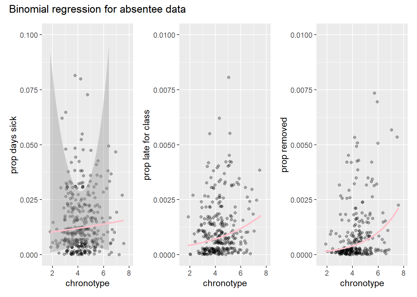
Note that the confidence interval band is much wider for the first model on days sick. This is because the n is much smaller for this model. We also observe that there seems to be a lot more variance in the data than than the model accounts for.
Although we get a better idea for what the model is doing, it is hard to evaluate model fit from these plots. To end we first look at the residuals directly by simulating from the model and comparing the results with the actual outcomes. See my post on maximum likelihood for background on simulation. Here, we will for convenience sake ignore the uncertainty in the estimation of the coefficients and only simulate the uncertainty in the stochastic component of the model. We run the three model 100 times each, and compare the simulated distribution of days sick with the observations.
# check model fit by simulation
# simulation without uncertainty in coefficients
bin_sims <- list()
for (i in 1:3){
k <- 100
bin_sims[[i]] <- as_tibble(replicate(k,
                                  rbinom(rep(1,
                                         length(predict(models[[i]], type = 'response') )),
                                         ifelse(i<2, 189, 1253),
                                         predict(models[[i]], type = 'response') ))) %>%
  pivot_longer(cols = everything(), names_to = "iteration")
}


sim_bin_s <- ggplot() +
  geom_line(data=bin_sims[[1]], aes(x=value, group=iteration), stat="density", alpha = 0.1) +
  geom_density(data=att_compl, aes(x=`Sick frequency 2013-2014`), color="#C91585") +
  geom_text(aes(x = -0.5, y = 0.2, label = "data"), color="#C91585")  +
  geom_text(aes(x = 5, y = 0.15, label = "model runs")) +
  scale_x_continuous(name ="number of days sick",
                     limits=c(-1,8),
                     breaks = seq(0,12,2))
sim_bin_l <- ggplot() +
  geom_line(data=bin_sims[[2]], aes(x=value, group=iteration), stat="density", alpha = 0.1) +
  geom_density(data=att_compl, aes(x=`LA 1st 2013-2014`), color="#C91585") +
  scale_x_continuous(name ="late for class count",
                     limits=c(-1,8),
                     breaks = seq(0,12,2))
sim_bin_r <- ggplot() +
  geom_line(data=bin_sims[[3]], aes(x=value, group=iteration), stat="density", alpha = 0.1) +
  geom_density(data=att_compl, aes(x=`Removed 2013-2014`), color="#C91585") +
  scale_x_continuous(name ="removed from class count",
                     limits=c(-1,8),
                     breaks = seq(0,12,2))

sim_b_patch <- sim_bin_s / (sim_bin_l + sim_bin_r)

sim_b_patch + plot_annotation(
  title = "Simulations from binomial model for all absentee variables"
)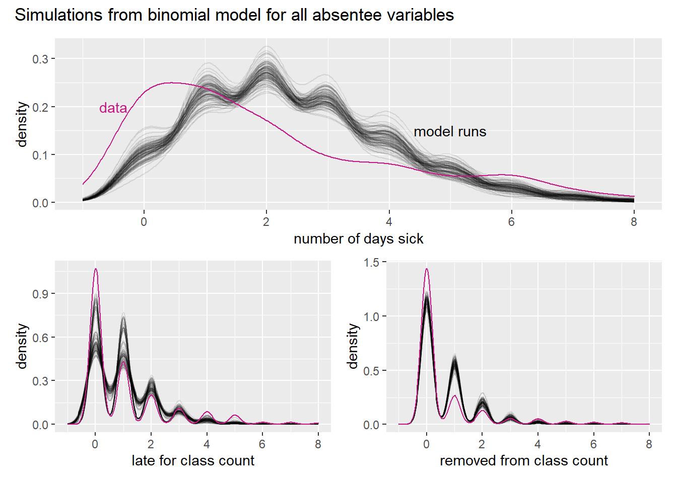
Note first that the variable is a count and thus discrete. We use smooth functions though, because it allows us to show multiple model runs. We also note that the number or zeros is badly underestimated by all the model runs, as are high counts in the tail. This must mean that the model overestimates the amount of moderate numbers, which can indeed be seen in the graphs.
To look at residuals from another point of view, we plot the standardized residuals against the explanatory variables (this arguably gives more insight than plotting against the predictions).
# drop NA's so that row lengths match; dplyr 'select' conflicts with MASS 'select'
att_drop <- att_compl %>% dplyr::select(`Sick frequency 2013-2014`:not_removed) %>% drop_na()

## plot residuals
resid_x <- list()
for (i in 1:3){
resid_x[[i]] <- tibble(y_hat = ifelse(i < 2,
                                           models[[i]]$fitted.values*189,
                                           models[[i]]$fitted.values*1253),
                            residual = models[[i]]$residuals,
                            MSF = att_drop$MSF_sc,
                            age = att_drop$age,
                            sex = att_drop$sex,
                            stand_resid = (residual-mean(residual))/sd(residual))
}

plot_resid <- function(resp_var, x_val){
  resid_x[[resp_var]] %>%
    ggplot(aes(x=get(x_val), y=stand_resid)) +
    geom_jitter(width=0.1, alpha=0.2) +
    geom_hline(yintercept=0, color="springgreen", size=0.5) +
    ylab("stand residual")
}

p1 <- plot_resid(1,"MSF") + xlab("chronotype score") + xlim(c(1.5,9))
p2 <- plot_resid(1,"age") + xlab("age")
p3 <- plot_resid(1, "sex") + xlab("sex")

patch <- p1 / (p2 + p3)

patch + plot_annotation(
  title = "Standardized residuals of days sick model",
  subtitle = "By explanatory variable"
)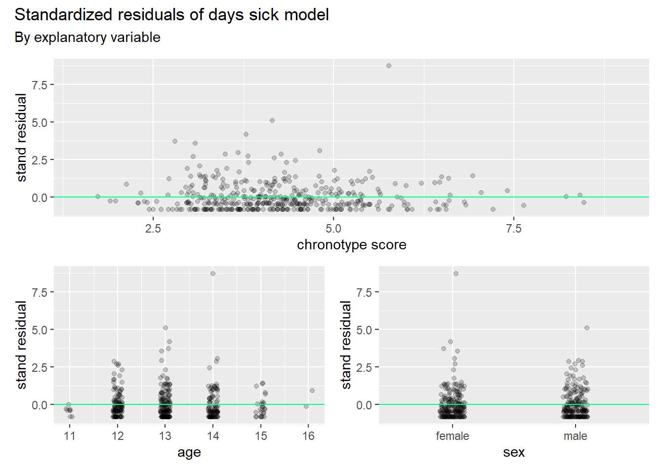
We observe from these graphs that the distribution of residuals is cut off from below. This is as expected, since the observed counts are restricted below by 0. Hence, we see residuals clumped together just below the green lines everywhere. There are no clear patterns in the spread of residuals that can be glanced from these graphs.
The same picture appears for the late for class model (and the removed from class model, which is not shown here).
## same for the response var 'late in class'
p4 <- plot_resid(2,"MSF") + xlab("chronotype") + xlim(c(1.5,9))
p5 <- plot_resid(2,"age") + xlab("age")
p6 <- plot_resid(2, "sex") + xlab("sex")

patch <- p4 / (p5 + p6)

patch + plot_annotation(
  title = "Standardized residuals of late for class model",
  subtitle = "By explanatory variable"
)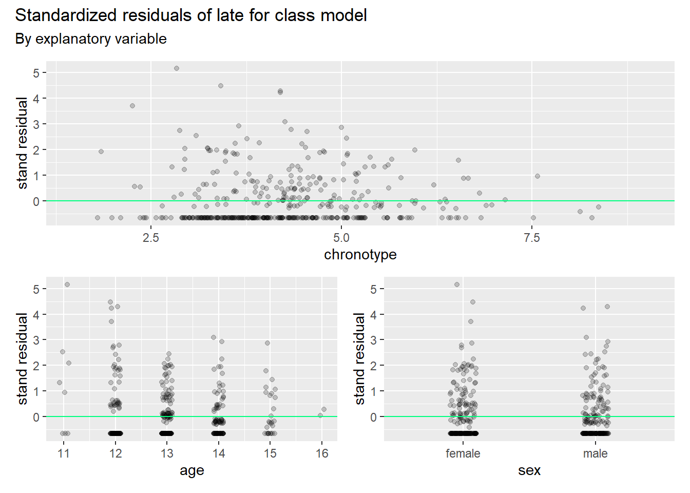
We observe that the model has too many residuals that are too big. The variance is higher in reality than the model accounts for. We already knew this by looking at the residual deviance. We say in such cases that the model is overdispersed. If so, we have a fix at our disposal, which is quasibinomial regression. This model adds a dispersion parameter \(\omega\) > 1 (it was set to 1 in the standard binomial regression) so that more of the variance is accounted for. As we already fitted the quasibinomial models in earlier code, we can check the model fit right away.
disp_qbin <- tibble("sick model" = NA, "late model" = NA, "removed model" = NA)

# loop such that the data is organized intelligible
for (i in 4:6){
  disp_qbin[,i-3] <- summary(models[[i]])$dispersion
}
disp_qbin
## # A tibble: 1 x 3
## `sick model` `late model` `removed model`
## <dbl> <dbl> <dbl>
## 1 3.70 1.96 2.36We note that the dispersion is higher than one for all three response variables. It makes sense then to account for the extra variance in the model. This has consequences for the standard errors.
# create a tibble that organizes key data into a table
table_qbin <- tibble(terms = c("intercept", "age", "sex", "MSF_sc"), "coef sick" = rep(NA,4),
                    "se sick" = rep(NA,4),"coef late"=rep(NA,4),"se late"=rep(NA,4),
                    "coef removed"=rep(NA,4),"se removed" =rep(NA,4))

# loop such that the data is organized intelligible
for (i in 1:3){
  table_qbin[,(2*i)] <- summary(models[[i+3]])$coefficients[,1]
  table_qbin[,2*i+1] <- summary(models[[i+3]])$coefficients[,2]
}
# print
table_qbin
## # A tibble: 4 x 7
## terms `coef sick` `se sick` `coef late` `se late` `coef removed` `se removed`
## <chr> <dbl> <dbl> <dbl> <dbl> <dbl> <dbl>
## 1 inter~ -5.64 0.831 -12.6 0.931 -8.89 1.31
## 2 age 0.0648 0.0660 0.364 0.0719 -0.0630 0.103
## 3 sex -0.227 0.124 0.165 0.139 1.04 0.218
## 4 MSF_sc 0.126 0.0574 0.117 0.0625 0.331 0.0753For the days sick model, standard errors have doubled, while they also increased strongly for the other models. In some cases ageand sex estimates have now been overwhelmed by their SE’s, but not MSF_sc.
Given the unsatisfying fit for even the model with the response with the lowest number of trials (days sick), we will give Poisson models a shot.
Poisson and Quasi-Poisson regression
Let’s start with some basics of the Poisson. It’s PMF is given by
\[\Pr[X = x] = e^{-\lambda} \frac{\lambda^x}{x!}, \quad x = 0, 1, 2, \ldots.\] The distribution has only one parameter, which is \(\lambda\). Famously, it is equal to both the expected value as well the variance. See this video for derivations of the basic properties by the great Joe Blitzstein.
We want to model the central parameter \(\lambda\) with a linear equation, and we use the canonical link for the Poisson, which is the log.
\[log(\lambda (x))=\beta_0+\beta_1x\]
This leads to the following likelihood model.
\[L(\beta_0,\beta_1;y_i)=\prod_{i=1}^{n}\frac{e^{-\lambda{(x_i)}}[\lambda(x_i)]^{y_i}}{y_i!}=\prod_{i=1}^{n}\frac{e^{-e^{(\beta_0+\beta_1x_i)}}\left [e^{(\beta_0+\beta_1x_i)}\right ]^{y_i}}{y_i!}\]
Taking the log gives the log-likelihood, which allows us to write the function with sums instead of products and gets rid of most of the the stacked exponentials as well.
\[l(\beta_0,\beta_1;y_i)=-\sum_{i=1}^n e^{(\beta_0+\beta_1x_i)}+\sum_{i=1}^ny_i (\beta_0+\beta_1x_i)-\sum_{i=1}^n\log(y_i!) \tag{1}\] Not all rare events are Poisson distributed of course. For a data generating process to be Poisson, the events that may lead to a count must be independent (or at most ‘weakly dependent’) and, as we mentioned, the mean and variance \(\lambda\) must be equal.
We run a poisson glm and inspect the output of summary.
## Attendance with poisson
fit_poiss <- glm(`Sick frequency 2013-2014` ~ MSF_sc + age + sex, data=att, family=poisson)
summary(fit_poiss)
##
## Call:
## glm(formula = `Sick frequency 2013-2014` ~ MSF_sc + age + sex,
## family = poisson, data = att)
##
## Deviance Residuals:
## Min 1Q Median 3Q Max
## -2.6425 -1.8623 -0.6161 0.6131 10.9067
##
## Coefficients:
## Estimate Std. Error z value Pr(>|z|)
## (Intercept) -0.39281 0.42894 -0.916 0.359793
## MSF_sc 0.12453 0.02961 4.206 2.6e-05 ***
## age 0.06399 0.03405 1.879 0.060208 .
## sex -0.22410 0.06379 -3.513 0.000443 ***
## ---
## Signif. codes: 0 '***' 0.001 '**' 0.01 '*' 0.05 '.' 0.1 ' ' 1
##
## (Dispersion parameter for poisson family taken to be 1)
##
## Null deviance: 1270.3 on 423 degrees of freedom
## Residual deviance: 1234.4 on 420 degrees of freedom
## (16 observations deleted due to missingness)
## AIC: 2122.9
##
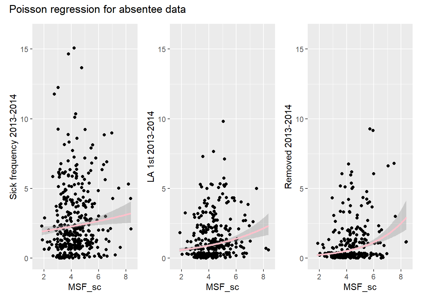
## Number of Fisher Scoring iterations: 5Because the residual deviance is again a lot bigger than the degrees of freedom, we may again be dealing with overdispersion. (The same is true for the other response variables.) Looking at the Poisson regression curve through the data points reveals that we shouldn’t be too surprised by this lack of fit.
plot_poiss <- function(y_var) {
  att_compl %>% ggplot(aes(x=MSF_sc, y=.data[[y_var]])) +
    geom_jitter() +
    geom_smooth(method = 'glm', method.args = list(family='poisson'), color="pink") +
    ylim(c(0,16)) +
    xlim(c(1.5,8.5))
}
# stick the col names of att into the function via map, and so make a list of plots
plot_list <- colnames(att_compl)[1:3] %>%
  map( ~ plot_poiss(.))

wrap_plots(plot_list) + plot_annotation(
  title = "Poisson regression for absentee data"
)
The dispersion parameters of the quasipoisson confirm our hunch.
# Loop poisson models
p_models <-list()
for (i in 1:3){
  p_models[[i]] <- glm_model(att_compl[[i]], "poisson")
  p_models[[i+3]] <- glm_model(att_compl[[i]], "quasipoisson")
}

disp_qp <- tibble("sick model" = NA, "late model" = NA, "removed model" = NA)

# loop such that the data is organized intelligible
for (i in 4:6){
  disp_qp[,i-3] <- summary(models[[i]])$dispersion
}
disp_qp
## # A tibble: 1 x 3
## `sick model` `late model` `removed model`
## <dbl> <dbl> <dbl>
## 1 3.70 1.96 2.36And so we use the quasi-poisson to estimate the standard error of our estimates.
## SE's and est
table_qp <- tibble(terms = c("intercept", "age", "sex", "MSF_sc"), "coef sick" = rep(NA,4),
                   "se sick" = rep(NA,4),"coef late"=rep(NA,4),"se late"=rep(NA,4),
                   "coef removed"=rep(NA,4),"se removed" =rep(NA,4))

# loop such that the data is organized intelligible
for (i in 1:3){
  table_qp[,(2*i)] <- summary(models[[i+3]])$coefficients[,1]
  table_qp[,2*i+1] <- summary(models[[i+3]])$coefficients[,2]
}
# print
table_qp
## # A tibble: 4 x 7
## terms `coef sick` `se sick` `coef late` `se late` `coef removed` `se removed`
## <chr> <dbl> <dbl> <dbl> <dbl> <dbl> <dbl>
## 1 inter~ -5.64 0.831 -12.6 0.931 -8.89 1.31
## 2 age 0.0648 0.0660 0.364 0.0719 -0.0630 0.103
## 3 sex -0.227 0.124 0.165 0.139 1.04 0.218
## 4 MSF_sc 0.126 0.0574 0.117 0.0625 0.331 0.0753Simulating from the Poisson shows that the model deviates from the response data for days sick in very much the same way as for the binomial.
p_sims <- list()
for (i in 1:3){
  k <- 100
  p_sims[[i]] <- as_tibble(replicate(k,
                                       rpois(nrow(att_compl), exp(predict(p_models[[i]])) ))
                             ) %>%
    pivot_longer(cols = everything(), names_to = "iteration")
}

plot_p <- function(dat, x_var, plotname) {ggplot() +
  geom_line(data=dat, aes(x=value, group=iteration), stat="density", alpha = 0.1) +
  geom_density(data=att_compl, aes(x=x_var), color="#C91585") +
  scale_x_continuous(name =plotname,
                     limits=c(-1,8),
                     breaks = seq(0,12,2))
}

sim_p_s <- plot_p(p_sims[[1]], att_compl$`Sick frequency 2013-2014`, "number of days sick") +
  geom_text(aes(x = -0.5, y = 0.2, label = "data"), color="#C91585")  +
  geom_text(aes(x = 5, y = 0.15, label = "model runs"))


sim_p_l <- plot_p(p_sims[[2]], att_compl$`LA 1st 2013-2014`, "late for class count")


sim_p_r <- plot_p(p_sims[[3]], att_compl$`Removed 2013-2014`, "removed from class count")

sim_p_patch <- sim_p_s / (sim_p_l + sim_p_r)

sim_p_patch + plot_annotation(
  title = "Simulations from Poisson model"
)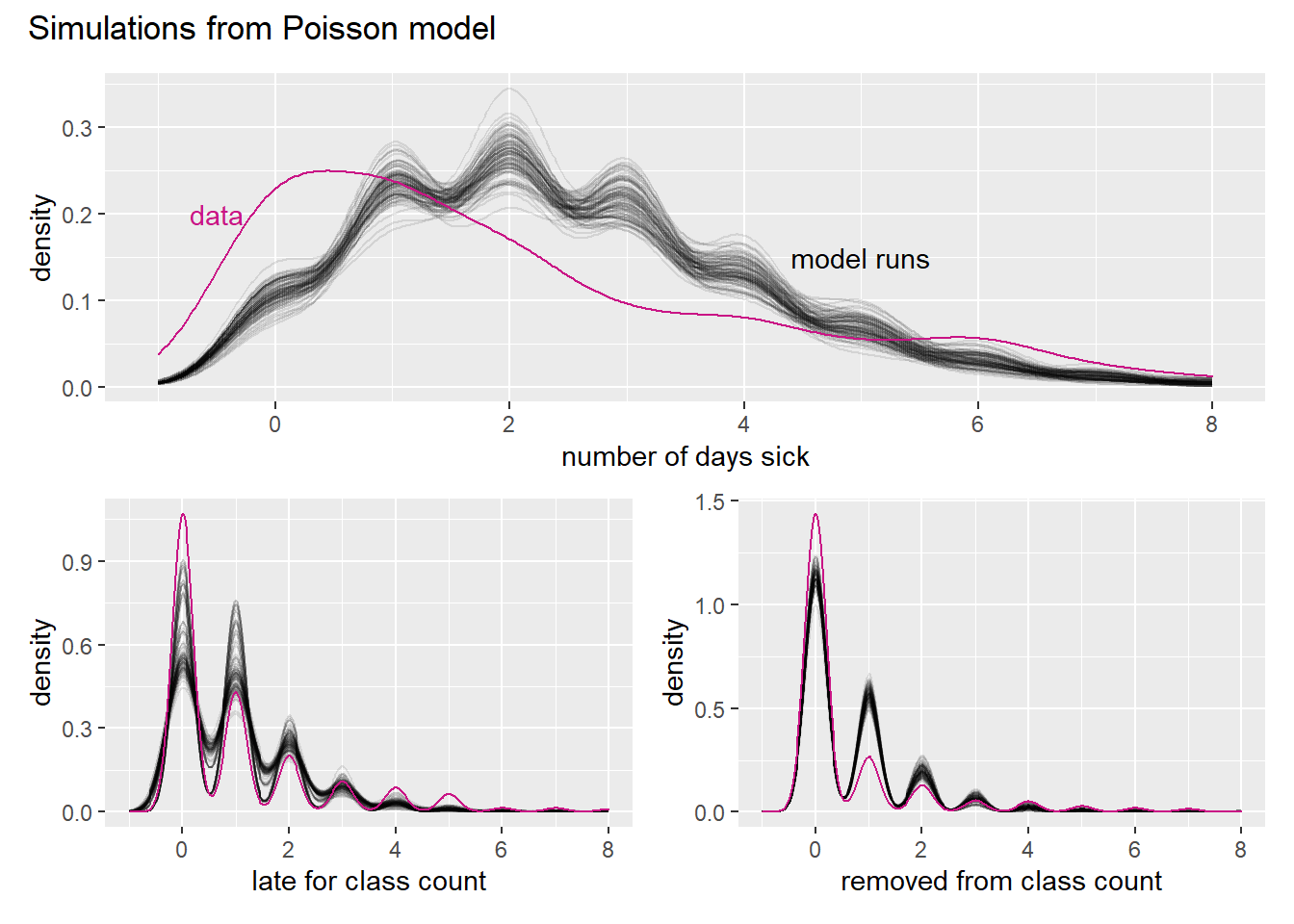
If n gets bigger and p smaller, then the Poisson becomes an ever better approximation to the binomial. We don’t really see that in the simulation though.
Let us look at the errors a little more closely. If the standardized residuals are following a Normal distribution, we wouldn’t be that concerned about the fit of our model. There is noise around our model curve, but the noise would cancel out. If the residuals deviate from normality we start to worry about our model.
plot_dist_p <- function(tib){ ggplot() +
    geom_density(data=as_tibble(tib), aes(x=value), color="pink") +
    stat_function(fun = dnorm,
                  n = 400,
                  args = list(mean = 0, sd = 1),
                  color="grey",
                  linetype = "dashed") +
    xlim(c(-6,6))
}

std_pois <- list()
y_p <- data.frame()
y_hat_p <- list()
p_dist_plot <- list()
p_dist_tib <- tibble()
for (i in 1:3){
  y_p <- att_compl[,i] %>% drop_na()
  y_hat_p[i] <- p_models[[i]]$fitted.values
  std_pois[i] <- y_p-p_models[[i]]$fitted.values/sqrt(mean(p_models[[i]]$fitted.values))

}

c <- map(std_pois, plot_dist_p)
pp1 <- c[[1]] + xlab("days sick") +
         geom_text(aes(x = 2, y = 0.3, label = " standard normal"), color="grey") +
         geom_text(aes(x = 5, y = 0.03, label = "stand residuals"), color="pink")
pp2 <- c[[2]] + xlab("late for class")
pp3 <- c[[3]] + xlab("removed from class")
patch_dist_p <- pp1 + pp2 + pp3
patch_dist_p + plot_annotation(
  title="Deviations of standardized residuals from the Standard Normal"
)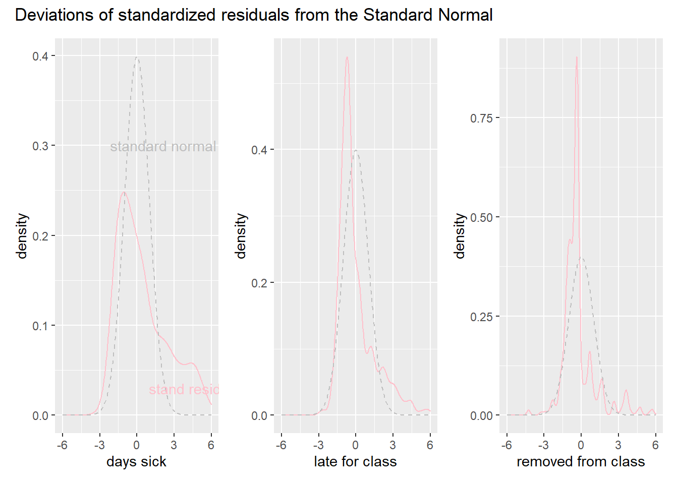
These graphs tell the same story as the residual plots for the binomial. The model overshoots more than we expect. We also note that the late for class and removed from class models, which have more trials, suffer less from this problem. The spikes to the left of zero of the Standard Normal are probably caused by the last two models missing the large amount of zeros in the data.
We therefore move on to the negative-binomial and zero-inflated models in the next post.
Edi Terlaak
I like to tell stories about statistics.