Causal Inference 4: School Autonomy and Regression Discontinuity
In this post we discuss what is perhaps the most elegant technique for doing causal inference: regression discontinuity (RD). Although it is known today as a toolkit in the econometric toolbox, it was originally developed by an education researcher in 1960. That research community didn’t follow up on it though, so that no research articles mentioning the technique are found until the 1970s, where a couple of economists used it. RD only came out of obscurity after 1999, when the economist Joshua Angrist and colleagues lifted it up a bigger stage. Since then, it has become a mainstream econometric technique. More on the fascinating history of RD can be read here.
So what does RD do? Like most of the other causal inference techniques, it looks for approximations to experiments. Specifically, RD uses decision rules that organizations (often governments) use to implement policies. Such a rule cuts the population in half, where one half benefits from the policy and the other half doesn’t. That’s not an experiment yet of course, because the assignment definitely wasn’t random. So we cannot compare outcomes for the two halves. But if the cut was made consistently (so that people couldn’t jump to their preferred side at the last moment), then it’s kind of random if you fall to the left or right of the cut. We say kind of, because technically, the distribution is random only in the limit (if the variable is continuous). But it seems reasonable to move a little to left and right. How much we can do so is actually the main theme of our replication. Anyway, these people around the cut off then can be seen as participants in an experiments.
The study we replicate is about school autonomy in the UK. From 1988 onward the Thatcher government allowed schools to organize elections, in which parents could decide whether they wanted to become independent of local government. If over 50% said yes, then the school would become “grant maintained” (gm), which meant central government would fund it and the school board would have complete control over staffing and have complete ownership of all school facilities. This is basically the situations for all schools in for example the Netherlands. Hundreds of schools, mainly in conservative districts, made us of this opportunity and became gm, until the Labour government put a stop to the procedure in 1997, but maintained the independence of gm schools.
Whether school autonomy leads to better student results is an open question. It is unlikely that governments can be persuaded to organize an RCT to that effect (although they probably should). In comes RD. Schools just under 50% are unlikely to be different from those with a vote just above 50%, yet the former would remain under control of local government, while the latter would become gm (independent). This is almost as good as an experiment. But are there enough schools in this region? And how far should we move to the left and right? These will be leading questions as we replicate the study that Damon Clark published in 2009. He concluded that there were “large achievement gains at schools in which the vote was barely won compared to schools in which [it] was barely won”.
Interestingly, the data set he assembled for his study seems to have been uploaded not by Clark himself, but by two graduate students, who replicated his study using his code (which is not publicly available) and found that Clark actually used not a small region around the 50% cutoff, but the entire range of the data! Their very brief online paper can be read here. They also claim to show that covariates are balanced only just around the 50% cutoff. Based on this work, we will scrutinize the Clark study to see if his claim holds up. A central theme in this post is of course once again that of researchers degree of freedom, of which there are many in this study.
Data Exploration
We first check if the treatment assignment was sharp or not. That is, we check if all schools with votes over 50% became independent (gm) and whether those below did not.
library(haven)
library(tidyverse)
library(panelView)
require(gridExtra)
library(broom)
library(rddensity)
library(rdrobust)
library(rddtools)
library(RColorBrewer)
library(patchwork)
gm <- read_dta("C:/R/edu/regres_disc_uk/main_data.dta")
library("ggsci")
gm %>% ggplot(aes(vote,gm_school, color=factor(gm_school))) +
geom_point(position = position_jitter(width=0, height=0.1),
alpha=0.1) +
geom_vline(xintercept = 50,
linetype="dashed") +
scale_color_npg() 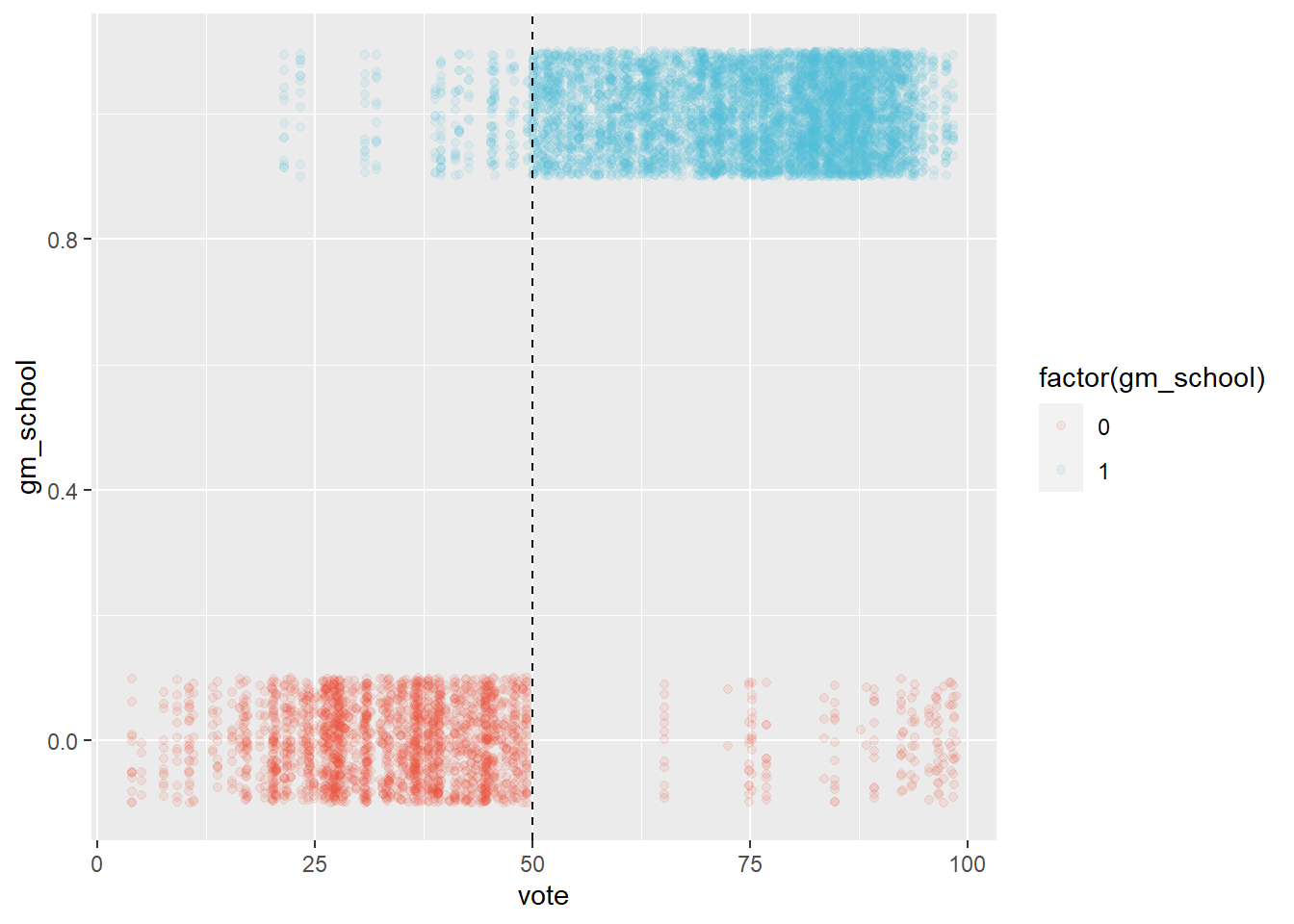 We observe that this is not the case. In the original article it is explained that election results above 50%, where the school still didn’t become gm, are due to the schools having to close. This explains the red dots to the right of the dashed line at 50%. The blue dots to the left of the line represent cases where the school board lost the election but still became gm. This is due to schools losing an election initially and being able to organize a next one two years later. So the blue points to the left of the dashed lines represent election results of schools that would eventually organize a winning election after which they became gm.
So what do we do about these consecutive elections? We can really only use results of the first election, because calling a subsequent election is an attempt by the school board to influence the decision in favor of gm (of course, no school board organized an election to give up it’s independence).
The dots the cross the 50% where they ‘shouldn’t’ means that election results didn’t determine independence. They only made becoming a gm or not more likely. So what we have then is a design that is not sharp (deterministic), but what is called ‘fuzzy’. This has implications for inference later on.
For now, let’s plot the same results as a histogram, to get a better sense of the amount of schools around the cutoff.
gm %>%
filter(year==2003) %>%
group_by(gm_school, id) %>%
summarize(first_vote = vote) %>%
ggplot(aes(first_vote, fill=factor(gm_school))) +
geom_histogram(binwidth=1, color="white") +
geom_vline(xintercept = 50, linetype="dashed") +
scale_fill_npg() 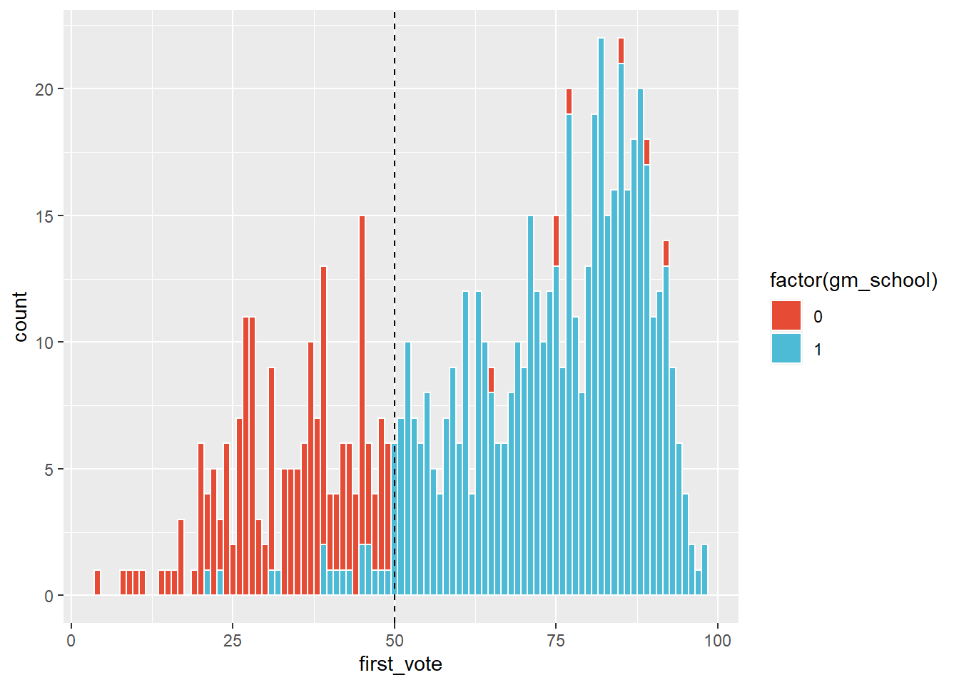 We observe that there aren’t that many schools, out of the 742 in the data set, around the cutoff. This can cause problems later on when we do inference.
To get a rough idea of the direction and size of the effect, we go on to plot the percentage of students that graduated for five gcse courses (which is the outcome variable that Clark used) against the percentage in favor in the election. For now, we pretend we are dealing with a sharp design and remove the observations that make the design fuzzy. We then fit regression lines on either side of the 50% cutoff.
We have graduation percentages for many years. Rather than taking the average or selecting one, we plot all the years, for transparency. Note also that we use raw data, without adjusting for covariates.
plot1 <- gm %>%
filter(ifelse(vote>50, gm_school==1, gm_school==0)) %>%
group_by(id, gm_school) %>%
summarize(vote = vote,
gcse = pt_gcse_5_a_c,
year=year) %>%
ggplot(aes(vote, gcse, color=factor(gm_school))) +
geom_point(size=0.4, alpha=0.4) +
geom_vline(xintercept = 50, linetype="dashed") +
facet_wrap(vars(year)) +
scale_color_npg() +
labs(color="gm school")+
ylab("% that passed 5 gcse") +
ggtitle("Different slope regressions for % gcse 5")
plot1 +
geom_smooth(method="lm") 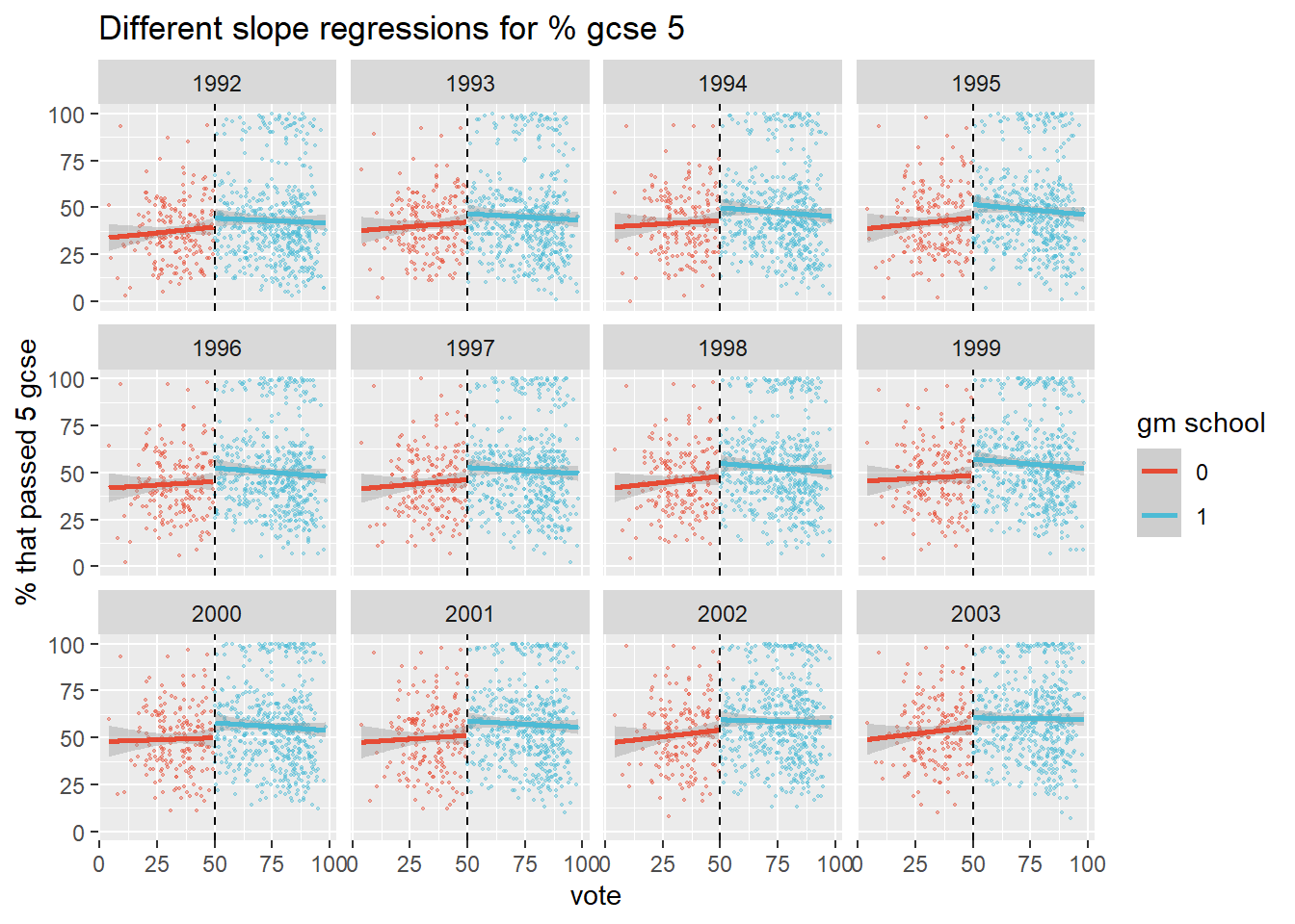 We observe a jump around the 50% cutoff, which suggests that winning the election improved test scores for school around the cutoff, which is what Clark found. Note that this is based on a linear specification of the model though.
We would like to plot the discontinuity for years before 1992 as a placebo, but we don’t have these data unfortunately. We do note though that most elections were held in 1992 and after.
gm %>%
  mutate(first_ballot_yr = as.numeric(str_sub(gm_attempt1_ballot_year_term, end=-2))) %>%
  filter(year==2003) %>%
  group_by(first_ballot_yr) %>%
  tally()
## # A tibble: 7 x 2
## first_ballot_yr n
## <dbl> <int>
## 1 1991 123
## 2 1992 280
## 3 1993 207
## 4 1994 51
## 5 1995 21
## 6 1996 21
## 7 1997 5It is unlikely that independence was granted immediately after the election. It would presumably have taken at least a year to organize the transition. Yet the discontinuity is observed for 1992 gcse results as well. There were 123 elections held in 1991 though, so theoretically these could have had an immediate and particularly strong impact. That is unlikely though. As gcse results are exam scores, they are the results of student learning over many years. It is unclear how a shock impact on exam scores could be achieved so quickly by so few schools.
It is more reasonable to hold the 1992 jump against the linear specification of the regression model. After all, it picks up on a jump before one can reasonably be expected to be measured.
If we change the specification to a quadratic one, the 1992 jump dissapears, which is a good sign. The jump remains visible for most of the later years though, which suggests there may still be an effect.
plot1 +
  stat_smooth(method = "lm", formula = y ~ poly(x, 2), size = 1)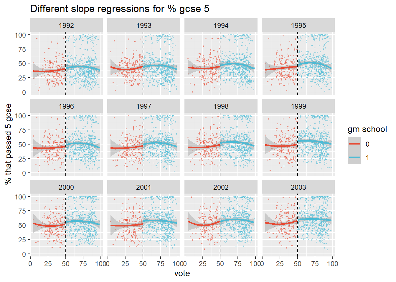
Apart from the model specification, the choice of the outcome variable is another researcher degree of freedom. Clark has chosen as his outcome measure the ‘percentage of students that passed 5 gcse exams’. It is not explained why. There is also a variable n_gcse in the data set, which seems to be the average gcse score. Clark doesn’t tell. He has calculated base values of this measure, which are required for the subsequent analysis (as he did for his eventual outcome measure), which suggests that he did consider taking n_gcse as his outcome measure.
If we run the same plots with n_gcse we get a different picture.
plot2 <- gm %>%
filter(ifelse(vote>50, gm_school==1, gm_school==0)) %>%
group_by(id, gm_school) %>%
summarize(vote = vote,
gcse = n_gcse,
year=year) %>%
ggplot(aes(vote, gcse, color=factor(gm_school))) +
geom_point(size=0.4, alpha=0.4) +
geom_vline(xintercept = 50, linetype="dashed") +
facet_wrap(vars(year)) +
scale_color_npg() +
labs(color="gm school")+
ylab("gcse") +
ggtitle("Different slope regressions for gcse")
plot2 +
geom_smooth(method="lm") 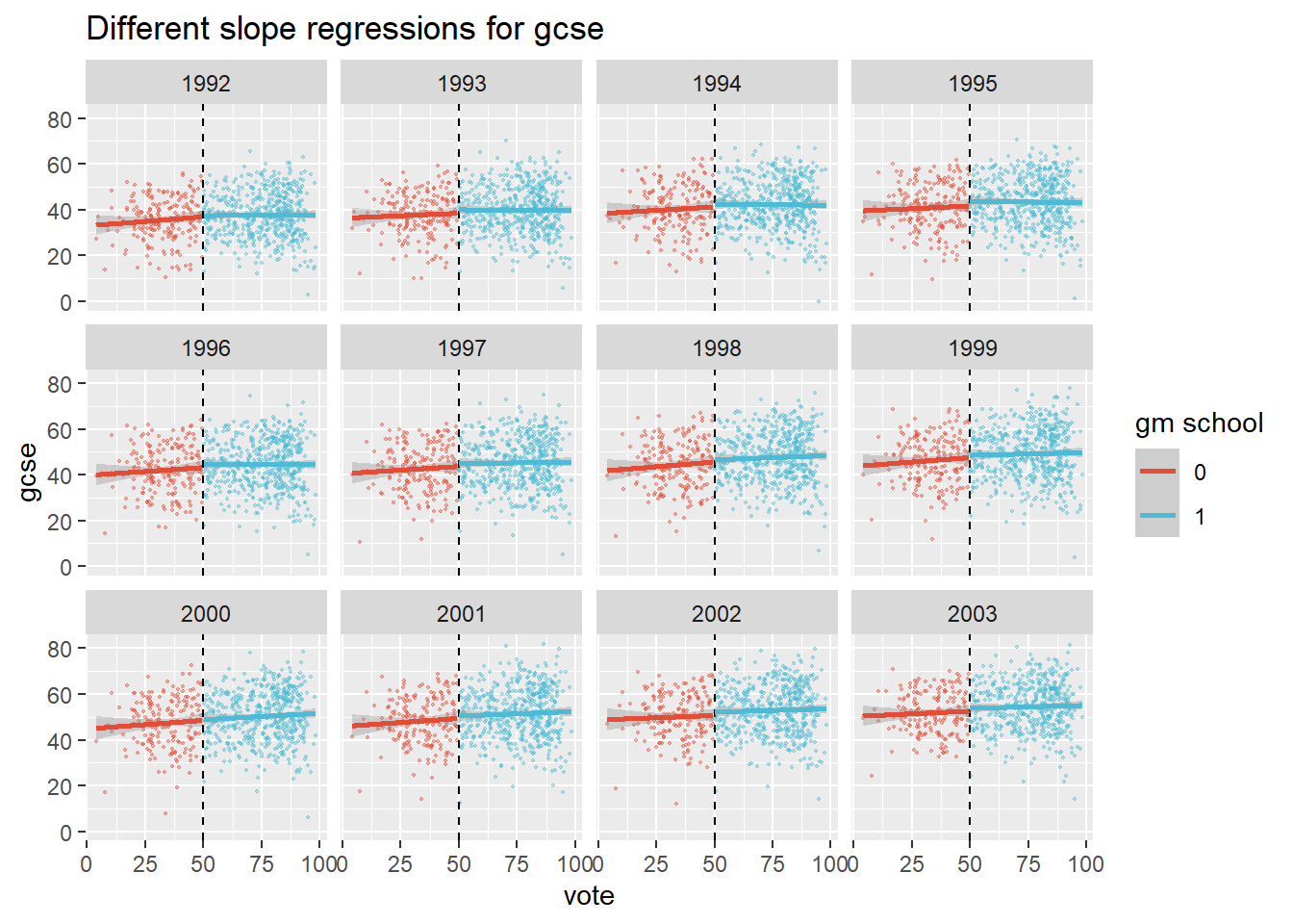 Regressing on these raw data reveals that gm schools may perform a tiny bit better around the cutoff. But what if we add quadratic terms to the regression?
plot2 +
  stat_smooth(method = "lm", formula = y ~ poly(x, 2), size = 1)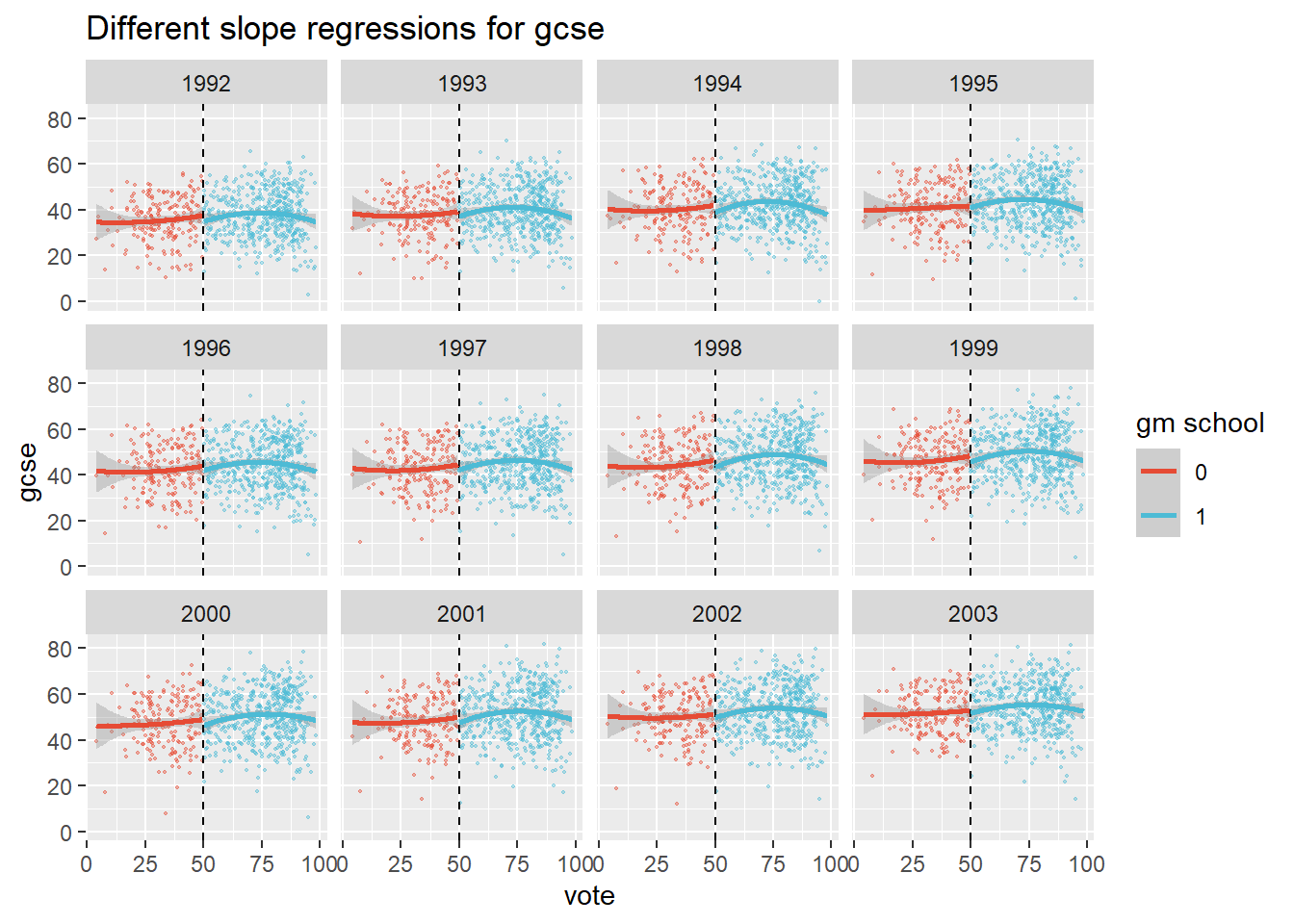
This time the schools just below the 50% mark seem to do a bit better! So with this outcome variable, the specification of the regression curve even flips the sign.
Fuzzy Regression Discontinuity
Because the election didn’t determine becoming a gm school, but only made it very likely, we have a fuzzy RD design. That means there are now two stages. In the first, we fit a regression model that predicts the probability of receiving the treatment. In the second stage, we regress this probability of receiving treatment on the outcome variable.
The quantity we are after in all this is the local average treatment effect (LATE). It is local, very local in fact, because we assume that only in the limit of the 50% cutoff are the two groups randomly distributed. Beyond that, we are doing extrapolation. The extent of extrapolation that is reasonable will be a central topic ahead.
Assumptions
There are bunch of assumptions of RDD that boil down to actors being unable to influence the so called running variable, which is the election outcome in our case. If they could influence it, the assignment would not be random. We therefore check whether the running variable is continuous at the cutoff (note the difference between a jump in the running variable, which defeats the RD design, and a jump in the outcome variable). If there is heaping just after the cutoff, then this may suggest that schools influenced election outcomes so that they would fall in the ‘right’ camp (i.e. becoming independent). The McCrary density test attempts to reject the Null Hypothesis under which there is a continuous distribution of the outcome around the cutoff. What is ‘around’ the cutoff? That can mean many things, so the rddensity package tests a bunch of intervals.
gm_cent <- gm %>% mutate(vote_cent = vote - 50) %>% filter(year==2002)

rdd <- rddensity(gm_cent$vote_cent, c=0, vce = "jackknife")
summary(rdd)
##
## Manipulation testing using local polynomial density estimation.
##
## Number of obs = 711
## Model = unrestricted
## Kernel = triangular
## BW method = estimated
## VCE method = jackknife
##
## c = 0 Left of c Right of c
## Number of obs 198 513
## Eff. Number of obs 84 94
## Order est. (p) 2 2
## Order bias (q) 3 3
## BW est. (h) 12.759 12.675
##
## Method T P > |T|
## Robust 1.3686 0.1711
##
##
## P-values of binomial tests (H0: p=0.5).
##
## Window Length <c >=c P>|T|
## 1.646 + 1.646 7 13 0.2632
## 2.881 + 2.871 14 25 0.1081
## 4.116 + 4.097 19 32 0.0919
## 5.350 + 5.322 34 40 0.5614
## 6.585 + 6.548 43 49 0.6024
## 7.820 + 7.773 50 56 0.6274
## 9.055 + 8.999 59 64 0.7185
## 10.290 + 10.224 61 74 0.3017
## 11.525 + 11.450 77 86 0.5310
## 12.759 + 12.675 84 94 0.5001There is no strong evidence for rejecting the Null. We also know that the elections were organized and monitored by an independent company, so not by the schools themselves. We see no evidence of lack of randomness around the 50% mark then, and proceed with the RD analysis.
Next, we move to the covariate balance. We said that as we move away from the cut off, we design becomes less random. We can check this danger by studying covariates. The main covariate that Clark uses in his ultimate model is graduation percentage before the election, or pt_gcse_5_a_c_base. This is the best indicator of relevant balance around the 50% cutoff, because it shown student performance per school before the impact of the intervention was felt. We therefore calculate the difference between base graduation of winners and subtract those of losers. We do this for every bandwidth, incrementing by 1%.
gcse_base_lose <- as.vector(rep(NA,50))
for (i in 1:50){
gcse_base_lose[[i]] <- gm_cent %>% filter(vote_cent > -i & vote_cent <= 0) %>%
summarize(mean = mean(pt_gcse_5_a_c_base, na.rm=TRUE)) %>% pull(mean)
}
gcse_base_win <- as.vector(rep(NA,50))
for (i in 1:50){
gcse_base_win[[i]] <- gm_cent %>% filter(vote_cent < i & vote_cent > 0) %>%
summarize(mean = mean(pt_gcse_5_a_c_base, na.rm=TRUE)) %>% pull(mean)
}
gcse_base_diff <- data.frame(diff = gcse_base_win-gcse_base_lose) %>% cbind(s=1:50)
gcse_base_diff %>% ggplot(aes(s,diff)) + geom_point() +
geom_hline(yintercept = 0, linetype="dashed") +
ggtitle("The difference in graduation % between eventual winners and losers") +
xlab("Distance in % from the 50% cutoff") +
ylab("Difference of graduation %")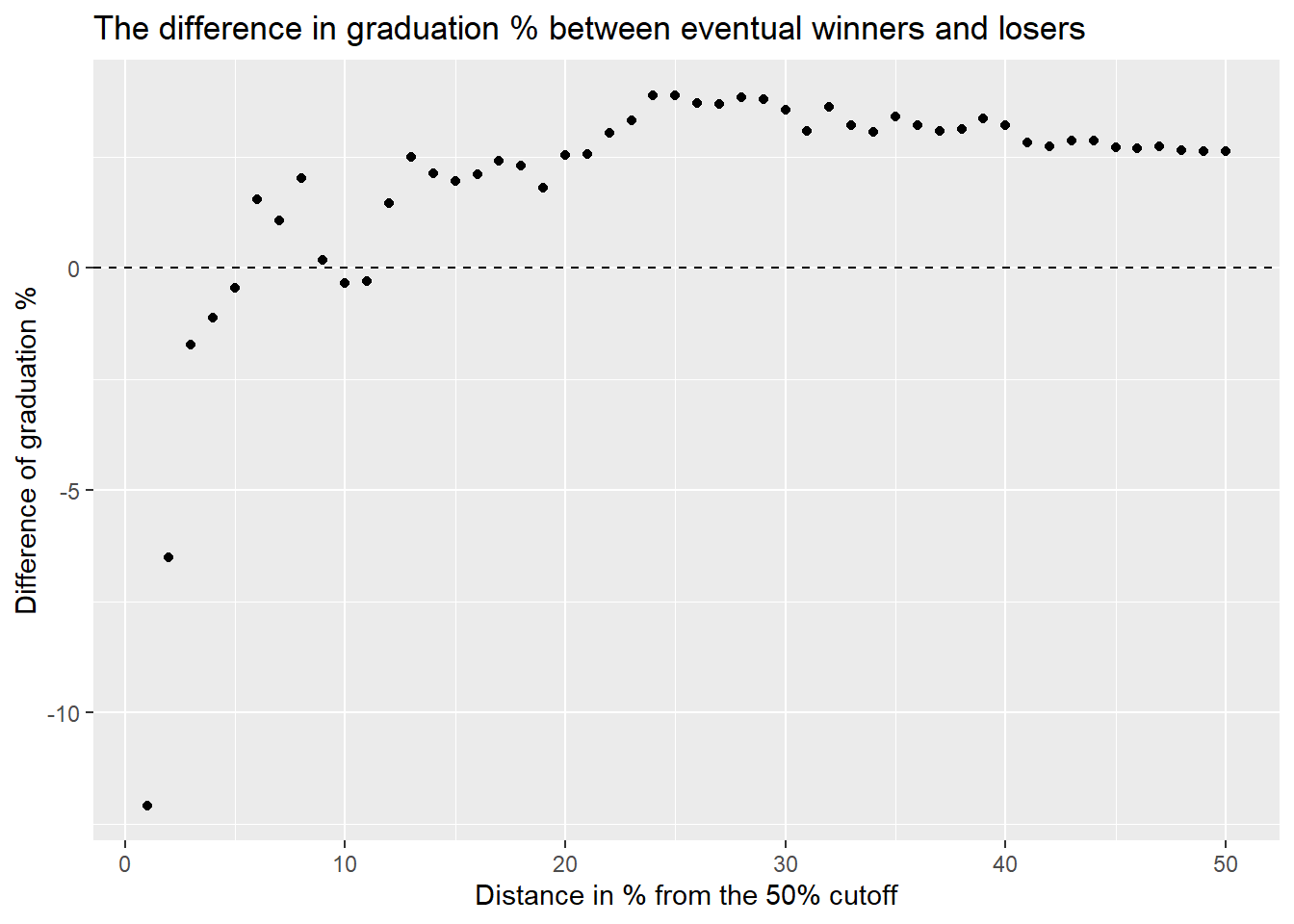 Close to the 50% cutoff, vote losers tend to have performed much better before elections than vote winners (hence the negative values). As we move farther away, we see that the difference averages out, as the bandwidth increases and more observations are used to calculate the average. This reveals that on average, vote winners performed better before elections. That is, better performing schools were more likely to win an election.
Hence, a bandwidth that is too narrow or too broad is potentially misleading. If Clark indeed used the entire 100% (50% on each side) bandwidth, than his results are almost certainly inflated.
We are now ready to run the fuzzy RD model. There are many degrees of freedom here that we noted. Let’s list them and add some for good measure.
- How to specify the model
- The width of the bandwidth
- Choice of outcome variable
- Year of measurement of outcome variable
- Which covariates to include
We could add to this list selecting the schools for inclusion in the study, handling missing data and outliers.
Model Specifications
We begin with fitting Clark’s linear model with the rddtools package, that allows for linear models. We want to demonstrate the impact that the choice of bandwidth has. So we plot the estimated effect of becoming a gm school for each of the ten years and for 10 bandwidths, starting at 5% from the cutoff, and incrementing by 5%. Including covariates is currently not possible ‘for the fuzzy case’ in this package.
We display results in the form of a heatmap. The benefit is that this allows us to see patterns in the size of the estimate, depending on year of outcome and bandwidth. The downside is that we do not get an idea of the standard errors.
prob_above_50 <- gm %>% filter(vote>50, year==1998) %>%
  summarize(prob_above = sum(gm_school)/n()) %>% pull()
prob_below_50 <- gm %>% filter(vote<50, year==1998) %>%
  summarize(prob_below = sum(gm_school)/n()) %>% pull()

gm <- gm %>% mutate(treatProb = ifelse(vote>50, prob_above_50, prob_below_50))

# make a list of variables for each year
n_gcse <- list()
for (i in 1994:2003){
  n_gcse[[i]] <- gm %>% filter(year==i) %>% select(pt_gcse_5_a_c, vote, treatProb)
}

# input contents of this list to the rdd_data function of rddtools
data <- list()
for (i in 1994:2003){
data[[i]] <- rdd_data(n_gcse[[i]][[1]], n_gcse[[i]][[2]],
                 cutpoint = 50,
                 z = n_gcse[[i]][[3]])
}

# input the data into rdd_reg_lm function, double for loop for years and bandwidths
coefs <- list()
store <- matrix(nrow = 10, ncol = 10)
for (i in 1994:2003){
  for (j in 1:10){
   coefs[[10*(i-1993)-(10-j)]] <- rdd_reg_lm(rdd_object = data[[i]],
                       bw = 5*j,
                       slope = "same")
      store[i-1993,j] <- coefs[[10*(i-1993)-(10-j)]][[1]][[2]]
   }
}

# the results are in the matrix store now. Add column with years to it
years <- as.vector(1994:2003)
colnames(store) <- paste("bandwidth", c("05", seq(10, 50, by=5)), sep = "_")
store <- as.data.frame(store) %>%
  cbind(years = years) %>% select(years, everything())
# long format for plotting
store_longer <- store %>% pivot_longer(!years, names_to = "bandwidth", values_to = "estimate")

# Set up color palette and set limits for colors to use entire spectrum
myPalette <- colorRampPalette(rev(brewer.pal(11, "Spectral")))
store_longer %>%
  ggplot(aes(years, bandwidth, z = estimate)) +
  geom_tile(aes(fill=estimate)) +
  labs(fill = "estimate") +
  scale_fill_gradientn(colours = myPalette(100), limits=c(-15.7, 10.4)) +
  scale_x_continuous(breaks=1994:2003) +
  theme(panel.grid.major = element_blank(),
        panel.grid.minor = element_blank(),
        panel.border = element_blank(),
        panel.background = element_blank())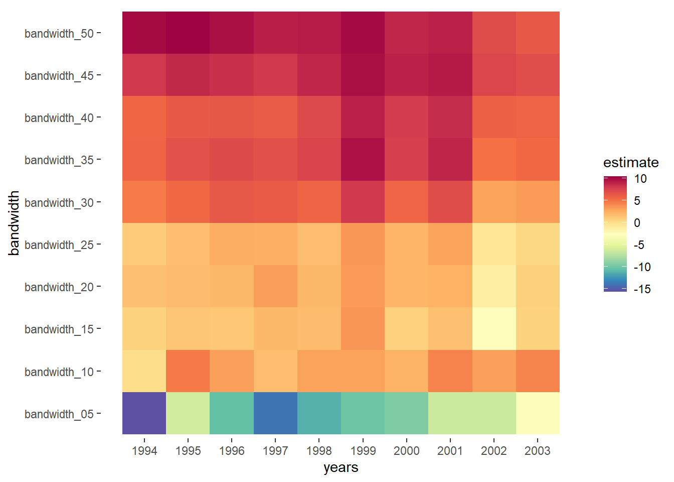
# Note to self: try to set the alpha of the scale_fill by de se'sThe heatmap follows the patterns of the base year covariates that we observed before, to some extent. Inside the 5% bandwidth, the base results of vote losers were much higher and this is reflected in the estimate of the model, which suggests that schools that remained under local government control performed better.
The best balance was achieved for a bandwidth of 10% or maybe 15%. Here the estimates are positive, which suggests independence benefited schools. The large estimates that Clark found are only achieved when we increase the bandwidth to above 30. For this bandwidth the covariates are seriously unbalanced though, as we saw. In particular, these estimates are almost certainly biased upwards.
All of this is irrelevant if the model is misspecified though. The linear plots were suspicious as we noted, because we saw in the plots of the raw data that they already suggested an effect for the year 1992, when it is unlikely that effects of independence could already have been felt. But if not linear, then how should we specify the model?
There is a lot of discussion about the best specification of regression discontinuity plots. Recent work suggests that higher order polynomials may introduce bias. A better alternative is kernel regression, which fits regression locally, where the weight that a point inside the local bandwidth depends on the method. We choose a “triangular” method, which weights central points more. We do so using the rdrobust package, which automatically picks the optimal bandwidth, according to this method. This time, we can include Clark’s covariates.
Let’s look at the plots first, where the points are averages of bins. We plot the discontinuity for both outcome measures for the year 2002, for which Clark found the biggest effect.
library(ggplotify)
gm_cent_2002 <- gm_cent %>% filter(year=="2002")
plot5_ac <- as.ggplot(~rdplot(x=gm_cent_2002$vote, y=gm_cent_2002$pt_gcse_5_a_c, c=50,
covs = cbind(gm_cent_2002$pt_gcse_5_a_c_base,
gm_cent_2002$school_type,
gm_cent_2002$gm_attempt1_ballot_year_term),
col.lines = "red", col.dots = "black",
kernel="triangular",
p=2)) + ggtitle("Kernel regression for gcse 5 classes")
plot_gcse <- as.ggplot(~rdplot(x=gm_cent_2002$vote, y=gm_cent_2002$n_gcse, c=50,
covs = cbind(gm_cent_2002$n_gcse_base,
gm_cent_2002$school_type,
gm_cent_2002$gm_attempt1_ballot_year_term),
col.lines = "red", col.dots = "black",
kernel="triangular",
p=2)) + ggtitle("Kernel regression for gcse")
patch <- plot5_ac + plot_gcse
patch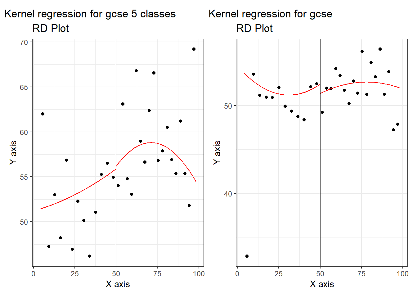 In both cases, the kernel specification also finds a discontinuous jump, where we would expect a smooth transition (if there were no effect of the election outcome coming out just above or just below 50%). Again the effect flips, depending on which outcome measure of student performance we pick.
The rdrobust picked an optimal bandwidth for us, but we can investigate the effect of different bandwidth by plotting estimates by bandwidth. First, we calculate the optimal bandwidth used in subsequent models for reference.
optimal_bw <- rdbwselect(y=gm_cent$pt_gcse_5_a_c,
         x=gm_cent$vote_cent,
         c=0,
         fuzzy = gm_cent$gm_school,
         covs = cbind(gm_cent$pt_gcse_5_a_c_base,
                      gm_cent$school_type,
                      gm_cent$gm_attempt1_ballot_year_term))
optimal_bw %>%
  summary()
## Call: rdbwselect
##
## Number of Obs. 708
## BW type mserd
## Kernel Triangular
## VCE method NN
##
## Number of Obs. 195 513
## Order est. (p) 1 1
## Order bias (q) 2 2
## Unique Obs. 193 510
##
## =======================================================
## BW est. (h) BW bias (b)
## Left of c Right of c Left of c Right of c
## =======================================================
## mserd 4.522 4.522 7.320 7.320
## =======================================================So the optimal bandwidth is about 4,5% on either side. We now want to show the effect of choosing a bandwidth on the estimated effect and standard error. Instead of the case of the heatmap, we now hold the year in which the outcome was measured constant - we pick 2002 again. This allows us to show the standard error band. We indicate the optimal bandwidth with a vertical dashed line.
# collect estimate of the intercept
h_coef <- as.vector(rep(NA,50))
for (i in 1:50){
h_coef[[i]] <- rdrobust(y=gm_cent$pt_gcse_5_a_c,
x=gm_cent$vote_cent,
c=0,
fuzzy = gm_cent$gm_school,
covs = cbind(gm_cent$pt_gcse_5_a_c_base,
gm_cent$school_type,
gm_cent$gm_attempt1_ballot_year_term),
h=i)$coef[[1]]
}
# collect standard errors
h_se <- as.vector(rep(NA,50))
for (i in 1:50){
h_se[[i]] <- rdrobust(y=gm_cent$pt_gcse_5_a_c,
x=gm_cent$vote_cent,
c=0,
fuzzy = gm_cent$gm_school,
covs = cbind(gm_cent$pt_gcse_5_a_c_base,
gm_cent$school_type,
gm_cent$gm_attempt1_ballot_year_term),
h=i)$se[[1]]
}
# create a data frame for plotting with lower and upper bands
h <- as.vector(1:50)
bandw_coefs <- data.frame(h, h_coef, h_se) %>%
mutate(lower = h_coef-1.96*h_se,
upper = h_coef + 1.96*h_se)
ggplot(bandw_coefs,aes(h,h_coef)) +
geom_point() +
#geom_line() +
geom_ribbon(aes(ymin=lower, ymax=upper), linetype=2, alpha=0.1) +
geom_hline(yintercept = 0, linetype="dashed") +
geom_vline(xintercept = optimal_bw$bws[1,1], linetype="dashed", color="grey") +
ggtitle("RD estimate of autonomy on gcse % passed for 5 courses in 2002") +
xlab("bandwidths") +
ylab("estimated effect")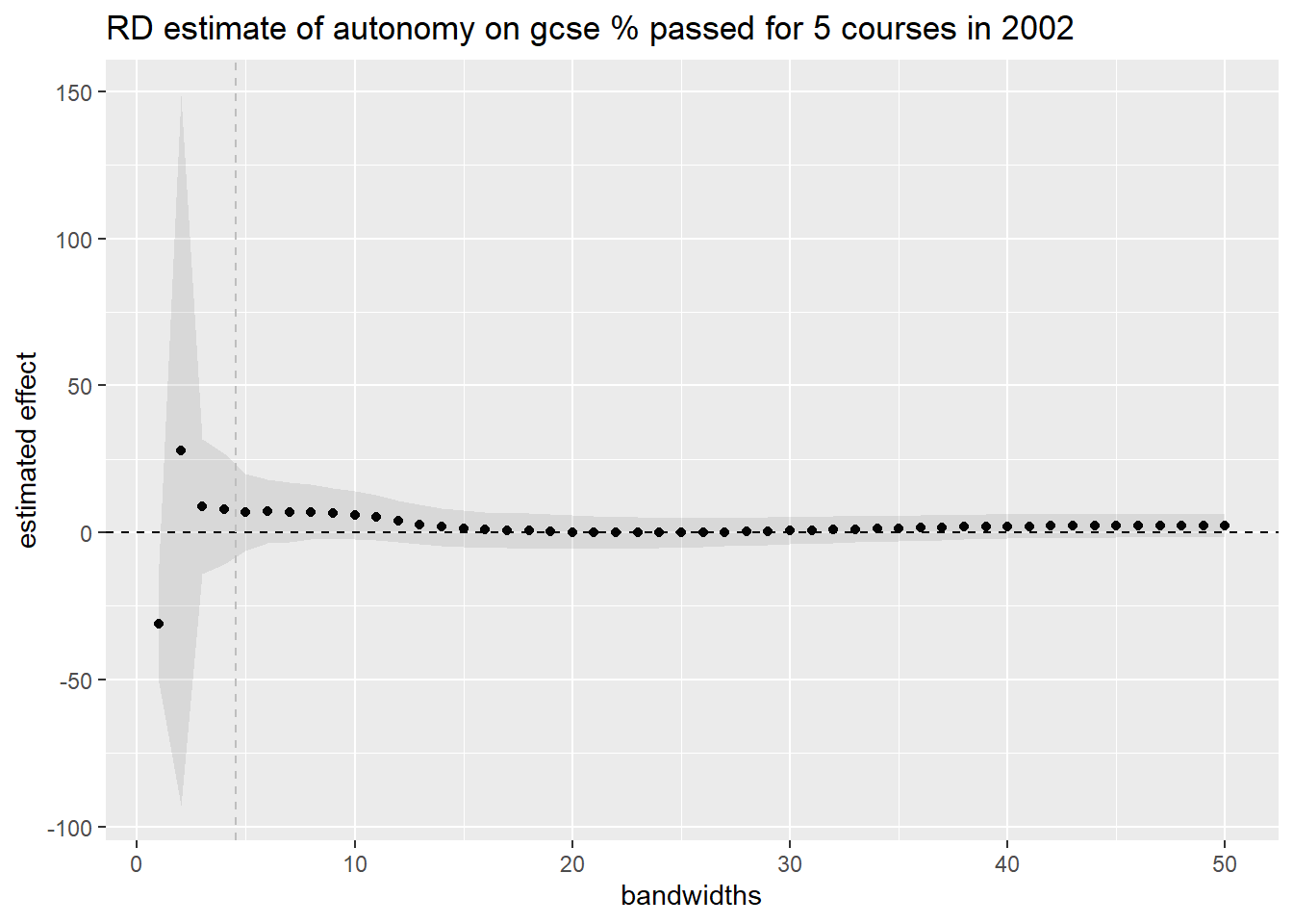 Within reasonable bandwidth ranges, around the optimum, there are too few observations to say anything meaningful. Hence, the standard error is too large to be able to estimate the size of the effect confidently. Hypothesis testing folks would say that the study is underpowered.
Let’s now run the kernel regression model again with optimal bandwidths (which it picks by default) for all 10 years.
# write a function that gives a table with coefs and se's, with outcome var (and its base) as input
table_fun <- function(var, base){
gm_cent_all <- gm %>% mutate(vote_cent = vote - 50)
years <- as.vector(1994:2003)
gm_cent_list <- list()
extract_coef <- function(i){
  gm_cent_list[[i]] <- gm_cent_all %>% filter(year==i)
  rdrobust(y=gm_cent_list[[i]][[var]],
           x=gm_cent_list[[i]]$vote_cent,
           c=0,
           fuzzy = gm_cent_list[[i]]$gm_school,
           covs = cbind(gm_cent_list[[i]][[base]],
                        gm_cent_list[[i]]$school_type,
                        gm_cent_list[[i]]$gm_attempt1_ballot_year_term))$coef[[1]]
}
# save the coefficients for every year
coefs <- sapply(years, extract_coef)

extract_se <- function(i){
  gm_cent_list[[i]] <- gm_cent_all %>% filter(year==i)
  rdrobust(y=gm_cent_list[[i]][[var]],
           x=gm_cent_list[[i]]$vote_cent,
           c=0,
           fuzzy = gm_cent_list[[i]]$gm_school,
           covs = cbind(gm_cent_list[[i]][[base]],
                        gm_cent_list[[i]]$school_type,
                        gm_cent_list[[i]]$gm_attempt1_ballot_year_term))$se[[1]]
}
# save se's per year
se <- sapply(years, extract_se)

table <- cbind(years, coefs, se)
table
}

table_fun("pt_gcse_5_a_c", "pt_gcse_5_a_c_base")
## years coefs se
## [1,] 1994 0.3306621 2.086661
## [2,] 1995 6.6479354 4.534590
## [3,] 1996 3.5650245 3.201972
## [4,] 1997 3.1413617 3.132609
## [5,] 1998 3.3516508 4.044473
## [6,] 1999 -4.1415224 6.127632
## [7,] 2000 3.9145027 4.476961
## [8,] 2001 7.6895275 4.428723
## [9,] 2002 7.7522733 8.273840
## [10,] 2003 9.2856245 4.428101Only in the last year does the estimate rise above the noise under these specifications. That is very different picture from the one Clark painted.
Under these same preferred specifications, the outcome variable n_gcse points towards a negative effect of school independence on students results.
table_fun("n_gcse", "n_gcse_base")## years coefs se
## [1,] 1994 -1.6051361 1.118432
## [2,] 1995 0.1672533 1.378747
## [3,] 1996 -1.8945941 1.677077
## [4,] 1997 -3.8324610 1.716323
## [5,] 1998 -6.8536956 2.216508
## [6,] 1999 -7.9398856 2.512850
## [7,] 2000 -5.9520124 3.710184
## [8,] 2001 -10.6567595 5.025297
## [9,] 2002 -7.6837240 4.696301
## [10,] 2003 -9.3552203 6.697215The standard errors are smaller (possibly because there is less variation in n_gcse) and now for later years estimates tends to rise above the noise. As gcse results are exam scores and hence the results of student learning over many years, as they move through the grades in a school, an impact towards the end of the time period is more in line with what we would expect. It could also be then that independent schools performed worse, or that government controlled schools upped their game.
Regression discontinuity regression is typically bolstered by running placebo regressions on variables for which we certainly don’t expect a jump at the cutoff. If there aren’t any, then we have a little more confidence in our model. In our case, we are dealing with so much noise that we are already quite uncertain to start with. But let’s run a placebo regression on base year student results anyway.
## Placebo using base gcse
rdrobust(y=gm_cent$n_gcse_base,
         x=gm_cent$vote_cent,
         c=0,
         fuzzy = gm_cent$gm_school,
         covs = cbind(gm_cent$school_type,
                      gm_cent$gm_attempt1_ballot_year_term)) %>%
  summary()
## Call: rdrobust
##
## Number of Obs. 711
## BW type mserd
## Kernel Triangular
## VCE method NN
##
## Number of Obs. 198 513
## Eff. Number of Obs. 43 50
## Order est. (p) 1 1
## Order bias (q) 2 2
## BW est. (h) 6.676 6.676
## BW bias (b) 16.898 16.898
## rho (h/b) 0.395 0.395
## Unique Obs. 196 510
##
## =============================================================================
## Method Coef. Std. Err. z P>|z| [ 95% C.I. ]
## =============================================================================
## Conventional -1.368 6.701 -0.204 0.838 [-14.502 , 11.766]
## Robust - - -0.136 0.892 [-15.071 , 13.112]
## =============================================================================We can be pretty sure that there is no jump in pre-election performance for schools at the 50% cutoff, which is comforting, but of course doesn’t affect our evaluation of the evidence too much.
Taking Stock and Looking Ahead
Once again in this replication we have experienced the extent of researcher degrees of freedom. Without getting to know the data and running through and extending the steps of the analysis, we would have had no idea of how uncertain the estimate in the Clark paper really are. We can be pretty sure that his estimates over too high. Using our preferred kernel regression method, with optimal bandwidth, gave no clear indication of the size of the presumed effect. Most of all, it gave us a lot of noise.
Clark may have driven down his standard errors by using the entire range of the bandwidth. We can’t check. In any case, a more promising way forward is to use more precise standard errors for regression discontinuity design, which are called ‘Honest’. The package RDHonest allows R users to benefit from these more precise estimates of uncertainty. See here for a helpful guide. This is the obvious next step in deepening our understanding of the effect of school autonomy on student performance.
The sign of the estimate of school autonomy even flipped when we considered an alternative outcome measure in the data set. It could be that it is an inferior measure for some reason, but that case is yet to be made.
The main conclusion then is that the Clark paper should not be used to make a case for school autonomy. The bigger point is the necessity of greater transparency in science. One trend in education science is to do yet another meta-analysis or even meta-meta-analyses. But unless open science criteria are used for selecting studies that go into the meta-analysis, we can expect it to echo researcher bias.
Edi Terlaak
I like to tell stories about statistics.