Causal Inference 2: Difference in Differences
In the previous post we explored the fixed effects approach to causal inference. Here we discuss the difference in differences approach, which is less widely applicable, but can make a stronger claim as to uncovering a cause. We first give some context of the study we replicate, then explain what the method is about and finally make some reservations about how convincing it is.
New School Buildings
Erecting a new school building is the dream of many a principal. There may be many good reasons for it, of which ventilation is certainly one, as the pandemic has made clear. But is the improvement of student results one of them as well?
That is what Ryan Thombs and Allen Prindle set out to investigate with the help of data on new school buildings that got a LEED certification, meeting criteria related to sustainability, from the state of Ohio. If there is an effect of new a building on student performance, then these school buildings are good candidates for showing it, according to the authors, because they are supposed to enhance the welfare of its users.
The authors selected 46 schools that were built using the LEED standards in 2012 and matched each one to a similar school, based on whether they competed in the same sports event, the percentage of economically disadvantaged students as well as the ethnic composition of the students. We are not able to reproduce this matching, as the data set contains only the matched 46 couples (amounting to 92 schools in total). The authors claim that they are confident that the control group of schools did not erect new buildings in the meantime. There are no data on the age of the school buildings in the control group. Adjusting for this variable would make the outcome a lot more convinving.
The first school was opened under the LEED program in 2009. However, the authors went for 2012 as the treatment year, because that is when most LEED schools opened. Schools that opened in different years are unfortunately not in the data set.
The Data
In order to get a quick overview of panel data, we use the handy panelView package. This tells us immediately if the treatment was given at the same point in time.
library(tidyverse)
library(haven)
library(estimatr)
library(naniar)
library(panelView)
library(ggsci)

leed <- read_dta("C:/R/edu/LEED schools/LEED.dta") %>%
  mutate(ln_SPI = log(SPI),
         ln_Female = log(Female),
         ln_PerPupilExpenditureClassroom = log(PerPupilExpenditureClassroom),
         ln_StudentsperTeacherFTEEnroll = log(StudentsperTeacherFTEEnroll),
         Post = LEED,
         Treat_time = LEED*Treatment)

plot1 <- panelView(ln_SPI ~ Treat_time + LEED + Treatment + ln_Female + ln_PerPupilExpenditureClassroom +           ln_StudentsperTeacherFTEEnroll,
          data = leed,
          index = c("school","Year"),
          xlab = "Year", ylab = "School",
          pre.post=T)
plot1 +
scale_y_continuous(labels=NULL)## Scale for 'y' is already present. Adding another scale for 'y', which will
## replace the existing scale.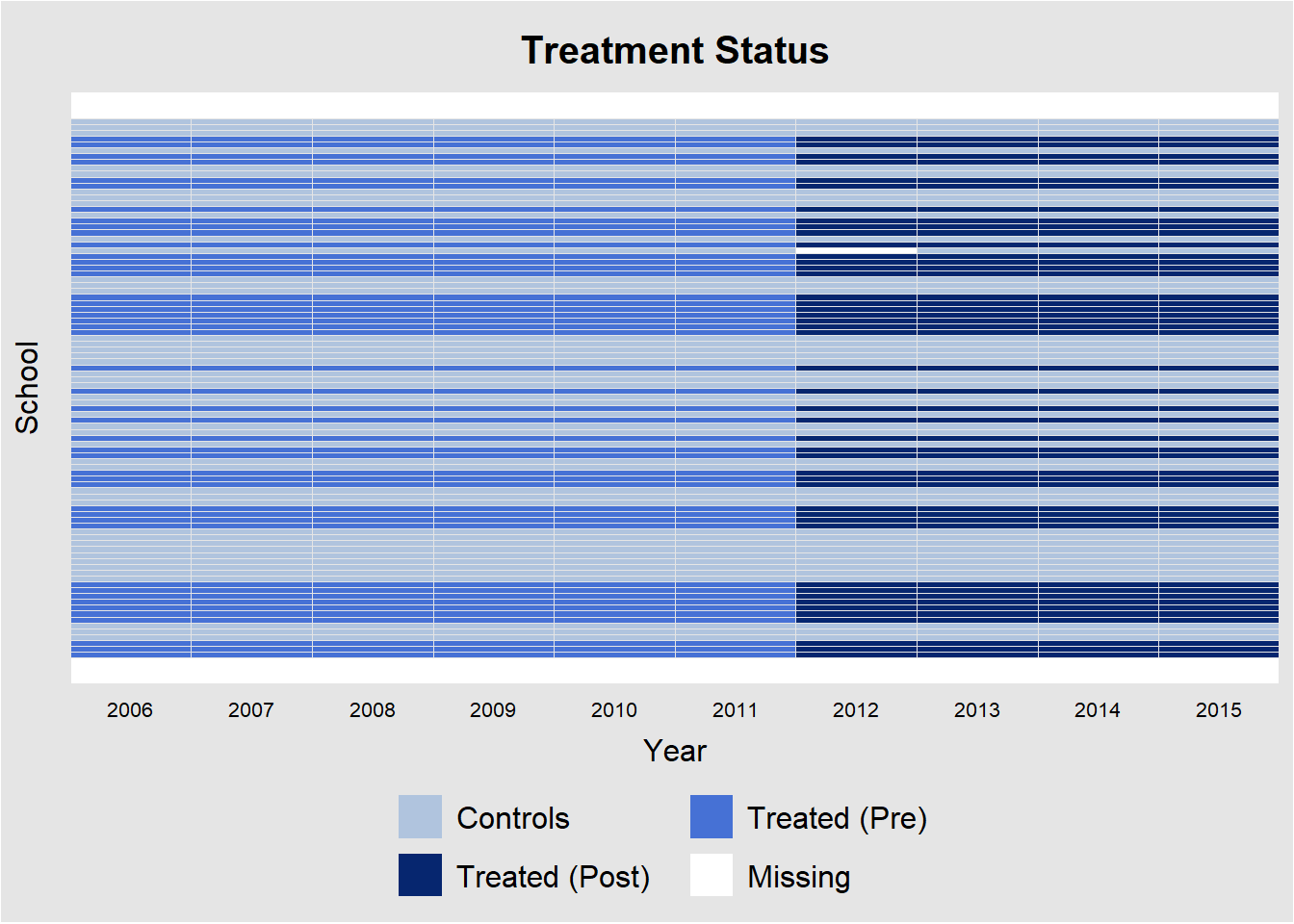
We observe that this is indeed the case. All treatments are assigned in 2012. The picture also confirms that there are about as many control as treatment units.
Another useful feature of the package is that we get a feel for the development of the dependent variable over time for control and treatment groups.
plot2 <- panelView(ln_SPI ~ Treat_time + LEED + Treatment + ln_Female + ln_PerPupilExpenditureClassroom +
          ln_StudentsperTeacherFTEEnroll,
          data = leed,
          index = c("School","Year"),
          type = "outcome",
          main = "log of SPI and LEED",
          ylim = c(3.75,4.75),
          xlab = "Year", ylab = "ln(SPI)",
          legend.labs = c("Control Schools","Treated Schools (before LEED)", "Treated Schools (after LEED)"),
          theme.bw = F)
plot2 +
scale_x_continuous(breaks = 2006:2015)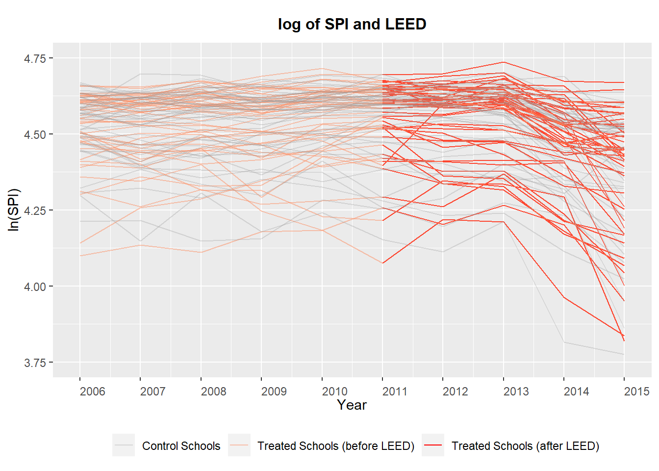
The variable LEED refers to the time periods before 2012 (0) and after (1), while Treatment refers to whether or not a school is in the group that would get a new building in 2012. The variable ln_SPI refers to the log of the mean student scores in a school. The authors decided to take the log of the scores, probably to improve the fit of the linear regression; we leave it that way here because it enhances the visibility of the plot. The plot is still a mess, because there is no clear improvement in scores for treated schools compared to the control group.
The natural next step is to take the average of each group before treatment and after treatment and to connect the averages of each group with a line segment. That way we get a much clearer picture. We do so by hand.
diff <- leed %>% group_by(Post, Treatment) %>%
  summarize(mean_SPI = mean(SPI, na.rm=T))

diff
## # A tibble: 4 x 3
## # Groups: Post [2]
## Post Treatment mean_SPI
## <dbl> <dbl> <dbl>
## 1 0 0 94.0
## 2 0 1 93.6
## 3 1 0 89.8
## 4 1 1 89.4before_control <- as.numeric(diff[1,3])
before_treat <- as.numeric(diff[2,3])
after_control <- as.numeric(diff[3,3])
after_treat <- as.numeric(diff[4,3])
alternative_outcome <- before_treat-(before_control - after_control)
ggplot(diff, aes(Post, mean_SPI, color=factor(Treatment))) +
geom_line(aes(group=factor(Treatment))) +
labs(color="treatment") +
annotate(geom="segment", x=0, xend=1,
y= before_treat, yend = alternative_outcome,
linetype="dashed") +
annotate(geom="segment", x=1, xend=1,
y= after_treat, yend = alternative_outcome,
linetype="dashed", size=1.5, color="red") +
xlab("Before and after") + ylab("SPI") +
theme(axis.ticks.x = element_blank(),
axis.text.x = element_blank()) +
scale_color_npg() 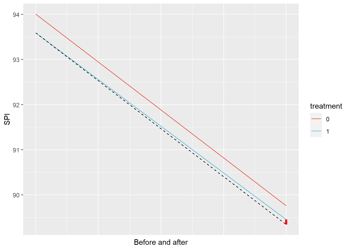
First of all, the mean before 2012 is higher for both groups than in the period after 2012. The best the intervention can hope for then is to have a slower decline in test scores.
In any case, the picture above shows what difference in differences is all about. The red line shows the change in mean before and after 2012 for the control group, while the blue line shows the decline for the intervention group. The dashed line is the crucial bit. It shows what would have happened in the intervention group if there had been no intervention - so if no new schools would have been built. This is the core of causality. You compare an outcome to what would have happened absent the presumed cause. If we compare the actual outcome with the counterfactual dashed line, we notice that there is a tiny improvement.
The crucial assumption of the difference in differences approach is that the treatment group would have moved along a similar trajectory as the control group. That is, we assume the dashed line (the counterfactual) is parallel to the red line. But that assumption is something we should make a case for. The plausibility of the causal claim rests on the strength of this case.
Before we get to that case, we plot the student results in both groups not by just connecting the means in the two periods, but with a locally weighted regression.
library("ggsci")
leed %>% ggplot(aes(Year, SPI, color=factor(Treatment))) +
geom_jitter(alpha=1) +
geom_smooth(method="loess", se=F) +
geom_vline(xintercept=2012, color="black", size=1, linetype="dashed") +
scale_x_continuous(breaks = 2006:2015) +
labs(color = "Treatment") +
scale_color_npg() 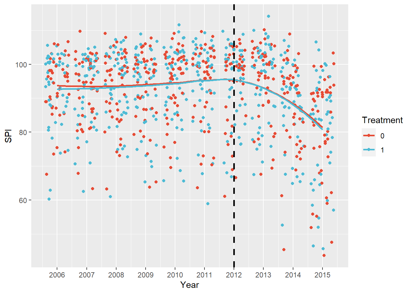 Visually, the case that the control and intervention group follow a similar trajectory before the intervention is strong with respect to the outcome variable. It seems reasonable then to assume parallel trends. However, we also see that they follow a very similar trajectory after the intervention!
So far, we drew pictures of the data. In doing so we didn’t include covariates that may influence the trajectory in both groups, and we didn’t calculate standard errors. However, given how small the possible gain in SPI is compared to the massive drop over the entire period, combined with the large variation and the modest n, we can be fairly confident that we will be unable to even tell if the SPI will decline or increase because of the intervention in general.
Difference in Differences Regression
Below we reproduce the author’s model in which only variables that were found to be significantly different between treatment and control were adjusted for.
dd_leed <- leed %>% lm_robust(ln_SPI ~ Post*Treatment + ln_Female + ln_PerPupilExpenditureClassroom + ln_StudentsperTeacherFTEEnroll, data = ., clusters = School)

summary(dd_leed)
##
## Call:
## lm_robust(formula = ln_SPI ~ Post * Treatment + ln_Female + ln_PerPupilExpenditureClassroom +
## ln_StudentsperTeacherFTEEnroll, data = ., clusters = School)
##
## Standard error type: CR2
##
## Coefficients:
## Estimate Std. Error t value Pr(>|t|) CI Lower
## (Intercept) 7.71380 0.56465 13.6611 3.004e-17 6.57509
## Post -0.03990 0.01071 -3.7265 5.386e-04 -0.06146
## Treatment -0.02307 0.01723 -1.3388 1.842e-01 -0.05732
## ln_Female 0.30049 0.18780 1.6001 1.168e-01 -0.07804
## ln_PerPupilExpenditureClassroom -0.36868 0.05300 -6.9564 9.929e-09 -0.47532
## ln_StudentsperTeacherFTEEnroll 0.10948 0.04718 2.3205 2.613e-02 0.01378
## Post:Treatment -0.00896 0.01442 -0.6213 5.360e-01 -0.03761
## CI Upper DF
## (Intercept) 8.85251 43.03
## Post -0.01834 45.13
## Treatment 0.01118 86.39
## ln_Female 0.67903 43.78
## ln_PerPupilExpenditureClassroom -0.26204 46.60
## ln_StudentsperTeacherFTEEnroll 0.20519 35.80
## Post:Treatment 0.01969 89.89
##
## Multiple R-squared: 0.3698 , Adjusted R-squared: 0.3656
## F-statistic: 18.45 on 6 and 91 DF, p-value: 6.42e-14There are small differences in the estimates of the coefficients compared to the original paper that I cannot account for. Maybe the authors did some processing of the data that they didn’t report. Broadly speaking, the picture is the same though.
The coefficient on Post (I renamed LEED) is negative (and has a small standard error), which means that on average all schools performed worse after 2012. We already saw that for the schools in the sample in the graphs. Treatment is negative as well, which means that schools that were to receive a new building performed worse than the control over the entire period (although we are not sure, because the standard error is relatively large).
The interesting part is the interaction of Post and Treatment. This coefficient signifies whether treatment schools performed better than they would have if they followed the trajectory of the control schools. We note that the coefficient is much smaller than it’s standard error. The sign is even negative, for what it’s worth. There is no evidence for a causal effect of the new buildings on school performance under this design then. We won’t even bother with more formal checks of parallel trends.
Let’s raise a critical point here and suppose that the standard error on the interaction of Post and Treatment were 0. Would that mean that we would be 100% confident that there is a causal effect of LEED certified school building on performance of -.00896 ?
We wouldn’t, because the standard error doesn’t capture all of the uncertainty. In fact, the main uncertainty revolves around the assumption that the schools with a new LEED building would have followed the counterfactual trajectory of the control schools. But the standard error only captures out uncertainty about the vertical distance that we colored red in our explanatory graph above. So the standard error assumes that the intervention group did follow the trajectory of the control group and does not incorporate uncertainty about the extent to which this is plausible. To delve deeper into this issue and what can be done about it, read Abadie et al (2020).
We end our analysis of the LEED schools data set here then. There are fancier techniques like generalized synthetic control we could use to get a more fine grained picture, but these require a longer pre-treatment period.
Assessment
Let us take stock regarding our exploration of causal identification techniques. The main challenge to these techniques are confounders - they are the main culprits that prevent us from drawing causal inference from ordinary regressions. In the Fixed effects approach, we knocked out confounders that did not change over time. That was progress, but left a lot of potential confounders unchecked. In the difference in differences approach, we knock out confounders in so far as they move along a similar linear path in the control group. This is the so called parallel trends assumption, which is quite inflexible. Because we do not observe confounders, it is difficult to check if the assumption holds. See here for some ways to do so though. For more flexibility in the parallel trends assumption, we turn to the more recently developed synthetic control method in the next post.
Edi Terlaak
I like to tell stories about statistics.