Causal Inference 1: Fixed Effects and a Modest Specification Curve
Over the past few decades, economists have been the main drivers of causal analysis in social science. The most influential text has probably been Angrist and Pischke’s Mostly Harmless Econometrics. Of course, if we want to identify a cause, we ideally would want to do experiments. But these are often too expensive or unethical. Angrist and Pischke therefore present three methods that can to differing extents approximate experiments using observational data.
- Difference-in-Differences
- Instrumental Variables
- Regression Discontinuity
In the next couple of blog posts, I will explore some of these methods, as well as interesting recent extensions of the difference-in-differences design, which go under the heading of synthetic control. Note also that the above techniques can be used together with different types of matching. We will touch on these as well. Finally, a topic that has recently garnered a lot of attention is the freedom researchers have to influence the outcomes of their studies by the decisions they make in the analysis. This topic is known under several names, such as multiverse analysis, researcher degrees of freedom or specification curve analysis. It’s all the same thing. We will make a very modest start with exploring this area of analysis in this post.
Before I get to the more involved designs in later posts, I will in this post discuss basic panel data and how it helps to discards some confounders (but not others). This type of analysis is what economists call fixed effects. More on the terminology later. The data set I work with here was pieced together by Eric Neumayer in order to investigate the effect of government polices on homicides.
The author identified several grand theories about crime, such as modernization or economic development, and selected two or three variables that he associated with each one of them. The aim was to figure out the support these theories receive from his data set. This is an ambitious project that I will not discuss here. I will focus only on his claim that policies that pacify the state lower homicide rates. The two variables associated with this theory are the death penalty and human rights violations per country. Before we discuss the strategy for identifying the causal impact of these policies we first turn to the data.
Exploring the data
The first thing to note is that there are a lot of missing data. Over 20% in fact.
library(haven)
library(tidyverse)
library(estimatr)
library(plm)
library(naniar)
library(specr)

setwd("C:/R/edu/Policy and crime fix eff")

crime <- read_dta("JPR homicide.dta") %>%
  mutate(name = as_factor(name))

miss_var_summary(crime)## # A tibble: 32 x 3
## variable n_miss pct_miss
## <chr> <int> <dbl>
## 1 robbery 967 77.9
## 2 robberyrate 967 77.9
## 3 theft 946 76.2
## 4 theftrate 946 76.2
## 5 giniwider 872 70.2
## 6 homrate 838 67.5
## 7 socialwelfareexp 645 51.9
## 8 homiciderate 598 48.1
## 9 humanrightsviol 338 27.2
## 10 polity 322 25.9
## # ... with 22 more rowsNo efforts will be made to impute data here, as the focus of this project is on the causal identification strategy. So let’s get to know the data straight away by plotting them.
# quickly plot the vars
crime_long <- crime %>%
  select(-c(starts_with("_Iperiod"), year, country, period)) %>%
  pivot_longer(where(is.numeric), names_to = "preds", values_to = "value")

ggplot(crime_long, aes(y=value)) +
  geom_histogram() +
  facet_wrap(~ preds, scales= "free") +
  coord_flip() +
theme_minimal()## Warning: Removed 9190 rows containing non-finite values (stat_bin).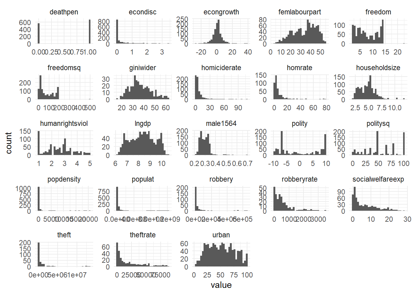 From the variable names, it requires little imagination to come up with the alternative explanations that are tested here (such as economic prosperity or inequality), and that will serve as controls in our analysis. The main explanatory variable in the analysis is the homicide rate, for which there are two variables:
 homiciderate and homrate. From the shape of the histograms we learn that they seem to be similar but are not the same. From the article we learn that the numbers come from different sources.
Let’s plot homiciderate per country to get a feel for where countries are at.
crime %>%
drop_na() %>%
ggplot(aes(homiciderate, fill = reorder(factor(name),homiciderate))) +
geom_boxplot(alpha=0.4) +
coord_flip() +
xlim(0,30) +
theme(axis.ticks.x = element_blank(),
axis.text.x = element_blank(),
legend.position = "bottom",
legend.title = element_blank()) +
ggtitle("Homicide rate per country in the period 1980 - 1995")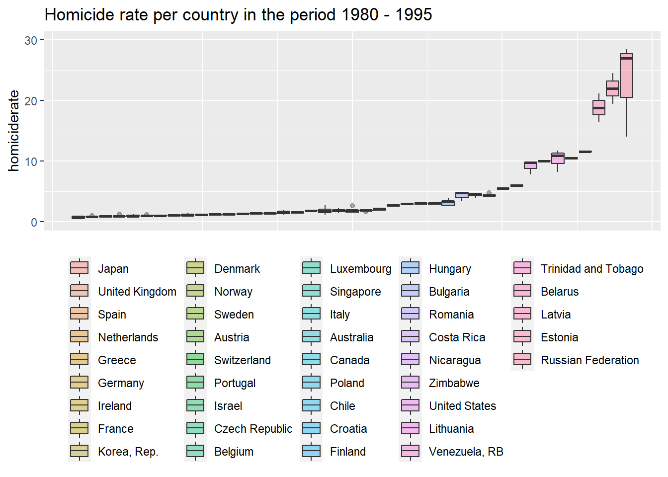 The most peaceful country in the bottom left of the graph is the inevitable Japan, followed by a bunch of Western European countries, while the most violent countries are Russia, some of its Western neighbours and South American countries. This is what we expected. The rank ordering of countries by
 homrate is the same (not shown here).
We move on to the independent variables. The first of which is the death penalty.
crime %>%
group_by(period, deathpen) %>%
summarize(mean = mean(homiciderate, na.rm=T)) %>%
drop_na() %>%
ggplot(aes(period, mean, color=factor(deathpen))) +
geom_line(show.legend = T, size=1) +
labs(color="death penalty") +
ylab("mean homiciderate") +
scale_color_manual(values = c("0" = "turquoise", "1" = "violetred1")) +
ggtitle("Homicide rate between countries with and without death penalty")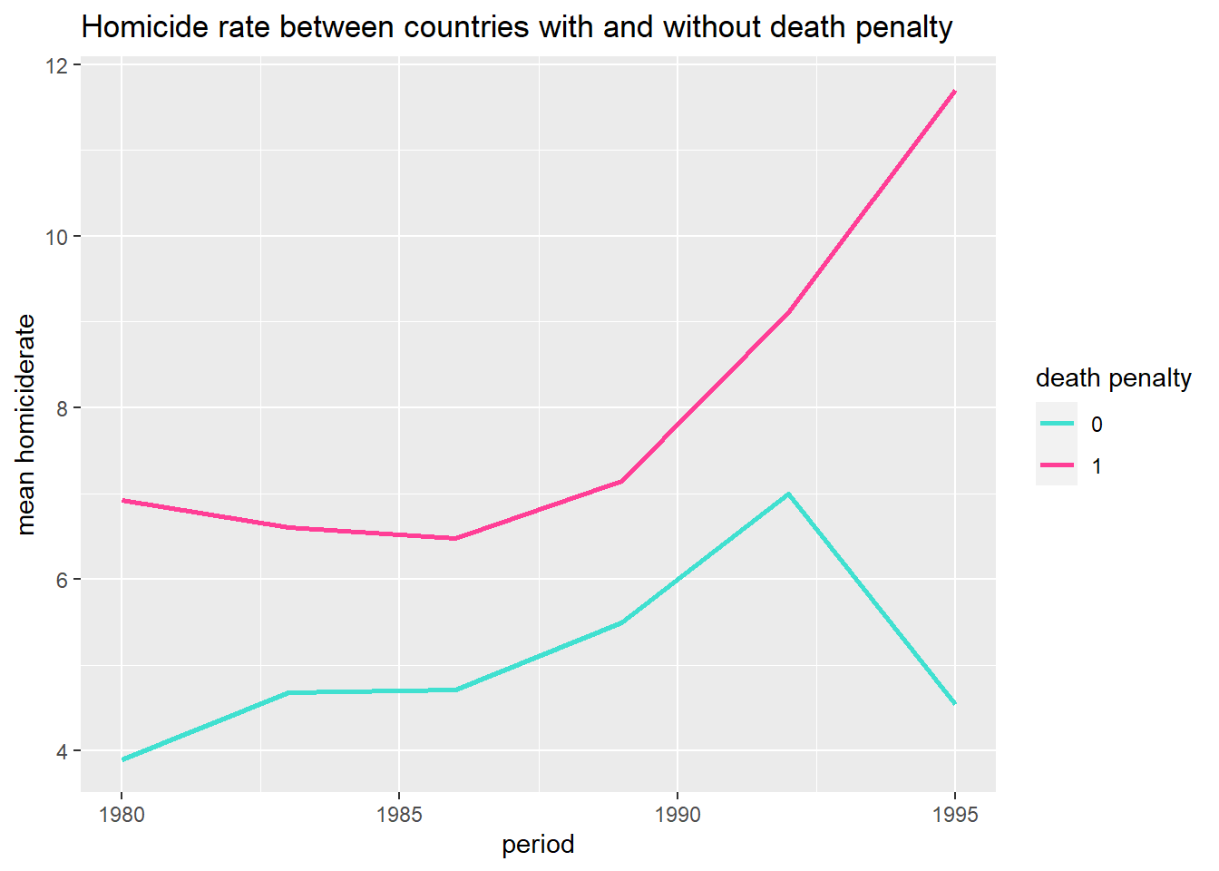 We see that in both groups of countries the mean of the homicide rate is increasing during the 1980s, but that countries without the death penalty experience a steep drop after 1990.
The plot below suggests the increase in homicides is not driven by a dramatic increase (or decrease) in the number of countries with the death penalty. In other words, it’s doesn’t seem to be the case that a bunch of peaceful countries abolish the death penalty around 1990 and so drive down the average homicide rate ‘from the outside’.
crime %>%
group_by(period, deathpen) %>%
summarize(number = n()) %>%
drop_na() %>%
ggplot(aes(period, number, color=factor(deathpen))) +
geom_line(show.legend = T, size=1) +
labs(color="death penalty") +
ylab("number of countries") +
scale_color_manual(values = c("0" = "turquoise", "1" = "violetred1")) +
ggtitle("Number of countries with or without death penalty")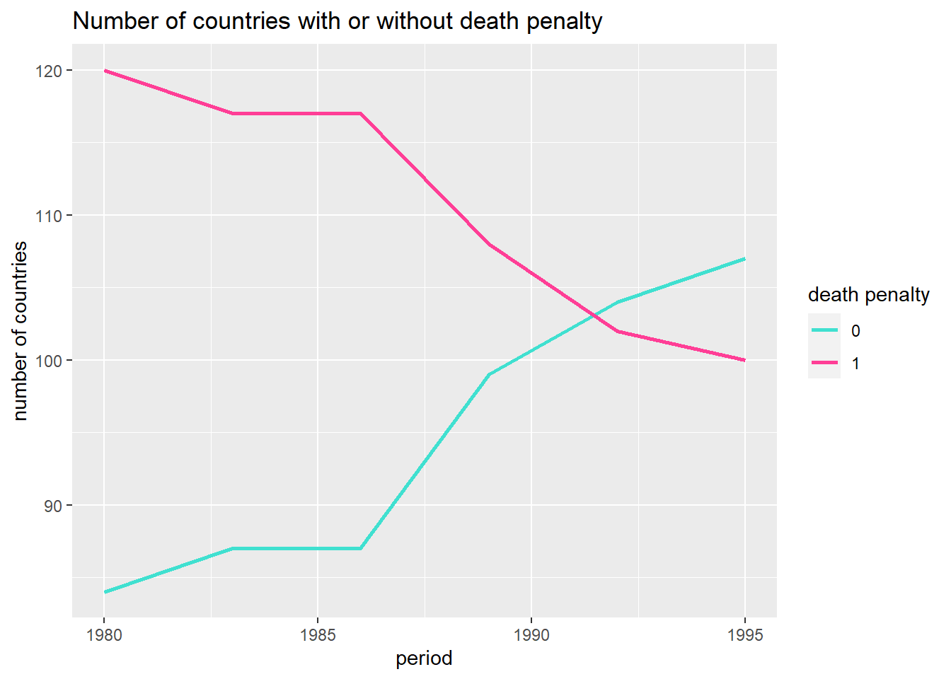 There are a lot of red flags when making the claim that abolishing the death penalty is the cause of fewer homicides (rather than abolishing the death penalty being a reaction to a lower homicide rate). The author of course is aware of this, but points to other studies that supposedly find evidence for thinking that the causal arrow points in the direction of the theory that says that a more pacified state causes less violence (supposedly because some of the violence in a society is a reaction to state brutality). I am personally rather skeptical about this whole line of reasoning, but I will refrain from further discussion on this issue, because it’s not the purpose of this post.
The other variable is human rights violations, which indeed have a positive correlation with homicide.
crime %>%
  ggplot(aes(humanrightsviol, homiciderate)) +
  geom_jitter(size=3, alpha=0.1) +
  geom_smooth(method="lm", color="violetred1", size=1) +
  ggtitle("Relation between homicide rate and human right violations")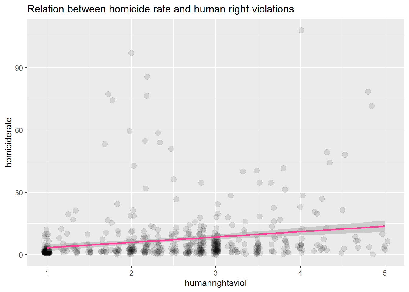
Fixed Effects
Before we fit a fixed effects regression model, we fit a pooled regression model for comparison. A pooled regression model ignores the groups that move through time and perceives them rather as one large pool.
crime_panel <- pdata.frame(crime, index=c("country", "year"))

formula <- as.formula("homiciderate ~ deathpen + femlabourpart + freedom + econgrowth + householdsize + lngdp + male1564 + humanrightsviol + urban + freedomsq + socialwelfareexp + popdensity + polity + politysq + giniwider")

# First a pooled model
crime_pool_mod <- plm(formula,
                    data = crime_panel,
                    index = c("country", "year"),
                    model = "pooling")
summary(crime_pool_mod)## Pooling Model
##
## Call:
## plm(formula = formula, data = crime_panel, model = "pooling",
## index = c("country", "year"))
##
## Unbalanced Panel: n = 62, T = 1-6, N = 213
##
## Residuals:
## Min. 1st Qu. Median 3rd Qu. Max.
## -14.85791 -3.27233 -0.31159 2.12941 49.65617
##
## Coefficients:
## Estimate Std. Error t-value Pr(>|t|)
## (Intercept) -3.1964e+00 1.8681e+01 -0.1711 0.864316
## deathpen 2.5076e+00 1.4815e+00 1.6925 0.092124 .
## femlabourpart 1.2263e-01 7.0733e-02 1.7336 0.084549 .
## freedom 1.5416e+00 1.2478e+00 1.2354 0.218137
## econgrowth -1.2404e-01 1.1169e-01 -1.1106 0.268074
## householdsize -1.2337e+00 9.2340e-01 -1.3360 0.183077
## lngdp 2.3702e-01 1.6272e+00 0.1457 0.884338
## male1564 -7.9197e+01 4.6260e+01 -1.7120 0.088473 .
## humanrightsviol 4.6820e+00 8.9786e-01 5.2145 4.641e-07 ***
## urban 5.1583e-02 4.8717e-02 1.0588 0.290973
## freedomsq -7.1621e-02 6.9399e-02 -1.0320 0.303334
## socialwelfareexp 5.0284e-02 1.2651e-01 0.3975 0.691448
## popdensity -8.8856e-04 9.9630e-04 -0.8919 0.373558
## polity 1.8920e-01 2.1474e-01 0.8811 0.379359
## politysq 5.6710e-03 3.0293e-02 0.1872 0.851692
## giniwider 2.6389e-01 8.7107e-02 3.0295 0.002778 **
## ---
## Signif. codes: 0 '***' 0.001 '**' 0.01 '*' 0.05 '.' 0.1 ' ' 1
##
## Total Sum of Squares: 15678
## Residual Sum of Squares: 9786.4
## R-Squared: 0.3758
## Adj. R-Squared: 0.32827
## F-statistic: 7.90684 on 15 and 197 DF, p-value: 8.239e-14Based on the pooled model there is some evidence for saying that the death penalty is associated with homicides, while there is strong evidence in the case of human rights violations. Even if we accept the pooled model, there is no evidence for a cuasal link though, because there can be confounders. This is where fixed effects models come in.
Confusingly, the term fixed effects appears in two context. The first is that of multilevel modeling, where a fixed effect refers to a coefficient on a variable that is not on a higher level (which is called a random effect). More precisely, random effects are modeled (that is, a prior probability distribution is set up for them), whereas fixed effects are not. In an earlier post I mentioned that Gelman and Hill argued for this reason that the terms fixed and random effects are unfortunate and should be replaced with “unmodeled” and “modeled”.
The second context is that of causal analysis on panel data. This is what we are dealing with here. The problem that a fixed effects analysis tries to solve is that of confounders. It succeeds in doing so for confounders that do not change over time. That is certainly not all of them, but every bit of progress is to be cherished, given the importance of causal questions.
The main idea is to look at change over time in the dependent variable. If there are confounders that do not change over time then they cannot explain the variation in the dependent variable over time. We can say the same thing using algebra.
Below, we start with a regression model for dependent variable Y that depends on variable X, which changes over time. The
The analysis is called fixed effects because subtracting the mean is the same thing as estimating fixed effects for the units - say, countries - over time. This is unintuitive, but check out the derivation here. We run the model with the plm package.
# Fixed effect model
crime_fe_mod <- plm(formula,
                    data = crime_panel,
                    index = c("country", "year"),
                    model = "within")
library(lmtest)
coeftest(crime_fe_mod, vcov. = vcovHC, type = "HC1")##
## t test of coefficients:
##
## Estimate Std. Error t value Pr(>|t|)
## deathpen 2.1250e+00 2.1042e+00 1.0099 0.31436
## femlabourpart 4.8327e-01 3.3151e-01 1.4578 0.14720
## freedom 1.6629e+00 1.0576e+00 1.5724 0.11818
## econgrowth -8.1145e-02 4.5027e-02 -1.8022 0.07374 .
## householdsize -2.2550e+00 2.2542e+00 -1.0003 0.31893
## lngdp -6.9104e+00 2.7298e+00 -2.5315 0.01250 *
## male1564 -3.1549e+01 4.8727e+01 -0.6475 0.51842
## humanrightsviol 1.5255e+00 1.0663e+00 1.4307 0.15480
## urban 1.9859e-01 1.3019e-01 1.5254 0.12948
## freedomsq -9.8220e-02 5.2384e-02 -1.8750 0.06294 .
## socialwelfareexp -2.1441e-01 1.8724e-01 -1.1451 0.25419
## popdensity -7.8814e-05 1.6823e-03 -0.0468 0.96270
## polity 1.9317e-01 1.1465e-01 1.6849 0.09430 .
## politysq 1.3848e-02 2.1958e-02 0.6307 0.52932
## giniwider -1.0381e-01 7.4830e-02 -1.3874 0.16760
## ---
## Signif. codes: 0 '***' 0.001 '**' 0.01 '*' 0.05 '.' 0.1 ' ' 1Notice that the intercept that was in the pooled regression is gone: like the unobserved fixed effects, it was canceled by subtracting the average on both sides. We notice furthermore that the estimated effects are lower across the board, so that there seem to have been fixed confounders that were eliminated. This is progress. The standard errors are robust by the way, which we discussed in a previous post, so they are a litter bigger than for the pooled regression.
Although we have ruled out confounders that are stable over time, we did not rule out confounders that change over time. So apart even from the issue of reverse causality, we are not confident that there is a causal effect of the death penality and human rights violations on homicide rates. To make more progress, we need different identification strategies that we turn to in future posts. For now, we cast yet more doubt on the results above.
A Modest Specification Curve
In the past two decades, a movement under the header of open science has raised awareness about the amount of subjective decisions that are involved in data analysis. Recently, this point was underlined when 29 teams of researchers were given the same data set and asked to figure out whether football players of color were more likely to get a red card for a similar offense. Results differed remarkably, which shows that esteemed research teams make different decisions in the same situation.
Simonsohn and colleagues offer the specification curve as a solution to this problem. In it, the researcher lays out effects for all the paths (in what Gelman calls the garden of forking paths) that he or she could have taken. Here, I will make modest steps in this direction with the help of the specr package. In our case, we have two dependent variables (homrate and homiciderate), we used two models, as well as two potential causes, while we could have chosen several control variables. The advantage of the specr package is that we can easily build a specification curve out of these decisions.
plm_within <- function(formula, data) {
coeftest(plm(formula,
data = crime_panel,
index = c("country", "year"),
model = "within"),
vcov. = vcovHC,
type = "HC1")
}
plm_pool <- function(formula, data) {
plm(formula,
data = crime_panel,
index = c("country", "year"),
model = "pooling")
}
# Run specification curve analysis
results <- run_specs(df = crime_panel,
y = c("homrate", "homiciderate"),
x = c("deathpen", "humanrightsviol"),
model = c("plm_within", "plm_pool"),
controls = c("femlabourpart", "freedom", "econgrowth", "householdsize", "lngdp", "male1564",
"humanrightsviol", "urban", "freedomsq", "socialwelfareexp", "popdensity",
"polity", "politysq", "giniwider"))
plot_specs(results)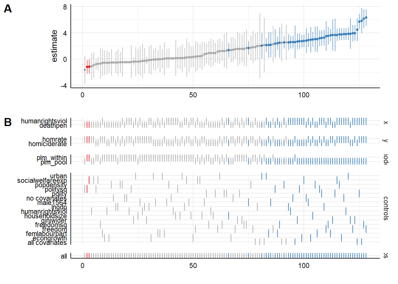 It takes a while to get used to these types of graphs, but what we see is coefficient sizes ordered from small to large. Below them are the options from which the paths are assembled. We see on the bottom of the graph that well over 100 paths are calculated. We also see that ‘significant’ effects (in blue) are mainly seen for
 humanrightsviolation for the pooled model. The idea of the specification curve is that this would lead the researched to highlight the decisions that had the greatest impact on the outcome and lay out the reasons for (and against) making that decision. In this case the pooled model is certainly not the best model.
There are a number of issues with the above version of a specification curve. First, the so called kitchen sink approach of including all predictors in the specification curve that we used is potentially misleading, because we could be including what Judea Pearl calls colliders into the analysis. By adjusting for a collider, we actually open a path through which information flows instead of closing it. This sounds abstract, so let’s attempt to clarify with an example. Suppose we are interested in the relation between height and skill at basketball and adjust for playing in the NBA. This is a bad idea, because arguably shorter players that still make it to the NBA must be more skilled, in order to compensate for their height. It may well be that we found a relation between height and skill in the model in which we adjust for playing in the NBA, while there is none in the population. Ultimately, scientific progress is made with the help of scientific models of the process we try to understand. We must use these models when we interpret a specification curve.
Second, we cannot currently instruct specr to specify all combinations of control variables. This would lead to a massive number of options to calculate, which the makers may be holding off on until they implemented support for parallel processing, which they are working on. We also cannot yet include decisions such whether to impute or row delete missing values or discard outliers. This can be done with Joachim Gassen’s rdfanalysis, which is introduced here. Implementing the steps in his package is a lot more work though. Alternatively, one can code up one’s own table of coefficient estimates with a bunch of for loops, which may or may not be more work. Having an exhaustive package with agreed upon options would be preferable though, because the problem of researcher degrees of freedom would otherwise enter again at the level of specification curve construction.
Edi Terlaak
I like to tell stories about statistics.