Do the Rich influence Policy More than the Poor? (part 2)
Analysis
In this second part on Schakel’s data, we turn to analysis. We replicate his findings with Bayesian tools, which is more work, but gives results that are both more useful and easier to interpret.
The logistic function
We will first check whether the levels of support of opinionated rich folks predict the policy pass rate better than the levels of support of the opinionated poor. The variable that we thus predict is pass, which takes on the values 0 or 1. We assume that the data were generated in a process with the parameter p, which is the probability of getting a 1 for pass. We also assume that the value of p shifts with the level of support for a policy. In order to stay within the range [0,1] of a probability, we slap a logit function on p.
\[logit(p)=log(\frac{p}{1-p})\]
This function takes in probabilities and can spit out numbers over the entire real number line. Let us call this output x. That is exactly the wrong way around for us, as we want a model where the outcome is a probability (here: the probability of pass). What we need then is the inverse of the logit function. Writing p in terms of x gives us exactly that.
\[logit^{-1}(x)=\frac{e^x}{1+e^x}\]
This so called ‘logistic’ function takes in real numbers and spits out values between 0 and 1. In our case, we model the probability that pass is 1, given the level of support x. In order to estimate the change in p, we add a slope a and an intercept b to x.
\[P(y_{i}=1)=\frac{e^{ax_{i}+b}}{1+e^{ax_{i}+b}}\]
Prior predictive checking
In a Bayesian analysis, before we estimate parameters, we constrain the model by using information about the process we are modeling in the form of a prior distribution. In this case, we must set priors for a and b. This is hard, because intuition does not tell us what happens to \(P(y_{i}=1)\) when we adjust a and b and shove it into the logistic function. We therefore simulate the graph of the model for several values of a and b.
As the following graph shows, an innocent looking prior of N(0,10) commits us to unrealistic beliefs about the probability of a policy passing, given the support of the 10th income percentile.
# we will simulate 100 curves
n <- 100
sim_i10_1 <-
tibble(i = 1:n,
a = rnorm(n, mean = 0, sd = 10),
b = rnorm(n, mean = 0, sd = 10)) %>%
expand(nesting(i, a, b),
x = seq(from = 0, to = 100, length.out = 100))
p1 <-
sim_i10_1 %>%
ggplot(aes(x = x, y = invlogit(a + b * x), group = i)) +
geom_line(size = 1/4, alpha = 0.1) +
coord_cartesian(xlim = c(0, 100),
ylim = c(0, 1)) +
theme_tufte()+
labs(x="policy support by the poor",
y= "proportion of pass")
p1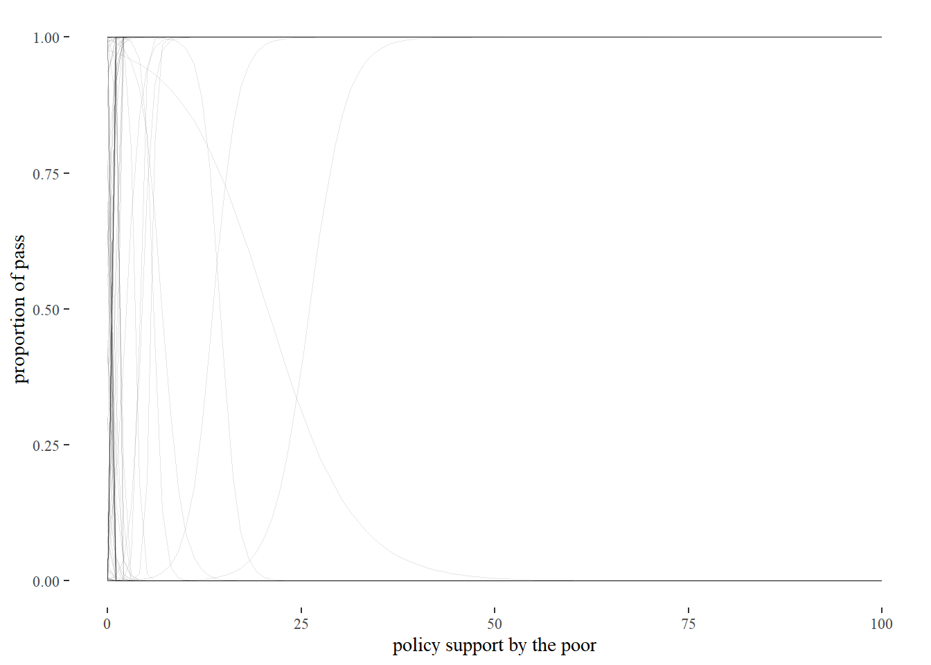 This prior implies that we think that if support is bigger than 10%, a policy is either 100% certain to be adopted or has 0% of being adopted. That is not realistic. We have therefore not constrained our model sufficiently. And so we continue to turn the knobs of our priors.
n <- 100
sim_i10_1 <-
tibble(i = 1:n,
a = rnorm(n, mean = 0, sd = 3),
b = rnorm(n, mean = 0, sd = 0.05)) %>%
expand(nesting(i, a, b),
x = seq(from = 0, to = 100, length.out = 100))
p2 <-
sim_i10_1 %>%
ggplot(aes(x = x, y = invlogit(a + b * x), group = i)) +
geom_line(size = 1/4, alpha = 0.1) +
coord_cartesian(xlim = c(0, 100),
ylim = c(0, 1)) +
theme_tufte()+
labs(x="policy support by the poor",
y= "proportion of pass")
p2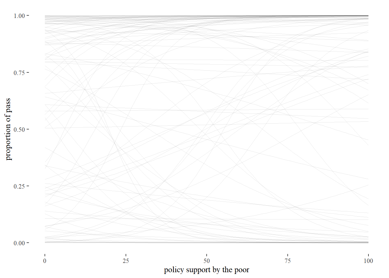 These more constrained values for the mean and standard deviation of a and b better align with what we can reasonable expect before seeing the data. We are uncommitted with regard to the probability of a law passing with 0% support as well with regard to the steepness of the curve. These priors are so conservative that we are even agnostic as to whether increased support will increase the probability of a policy being adopted. By setting these priors, we have simply limited our results to the realm of the practically possible.
Running the model
We now put these priors into the model for predicting pass, based on support by either i10 or i90. Out will come a posterior distribution, which reflects our beliefs about the intercepts a and b after seeing the data.
Throwing both income groups into one regression model would be uninformative, because the opinions of the two groups are so highly correlated that we would be unable to tell which group accounts for which percentage of explained variance. We build two models then, for which we use the brms package.
fit_i10_pr <-
  brm_multiple(data = Schakel_imp,
      family = binomial,
      pass | trials(1) ~ 1 + i10,
      prior = c(prior(normal(0, 3), class = Intercept),
                prior(normal(0, 0.05), class = b)),
      iter = 2000, warmup = 1000, chains = 4, cores = 4,
      sample_prior = TRUE,
      file = "fits/fit_i10_pr")

fit_i90_pr <-
  brm_multiple(data = Schakel_imp,
      family = binomial,
      pass | trials(1) ~ 1 + i90,
      prior = c(prior(normal(0, 3), class = Intercept),
                prior(normal(0, 0.05), class = b)),
      iter = 2000, warmup = 1000, chains = 4, cores = 4,
      file = "fits/fit_i90_pr")


plot(fit_i10_pr)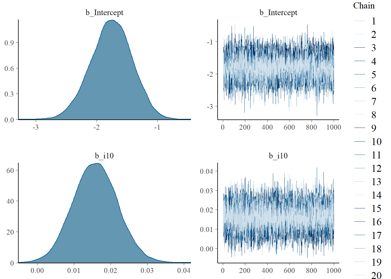
plot(fit_i90_pr)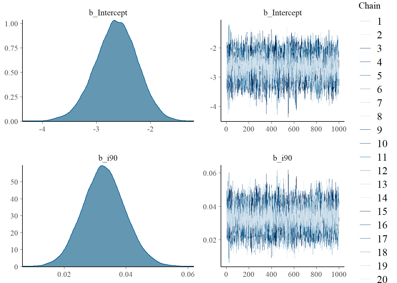
On the right, we see that the chains that estimate the posterior converged nicely. On the left, we can observe the power of Bayesian analysis. We see posterior distributions for the parameters that we estimated - the intercept and the slope. The marginal posterior distribution gives us the probability distribution of a parameter after we have learned from the data. In this sense, it is an update of our prior beliefs. This means that we do not have to give muddy formulations that we see in frequentist analysis. On the y-axis of the plots on the left, probability density is displayed. This means that probabilities are assigned to values of the parameter, such as the slope. Hence, we can do more than say whether a value is different from 0 (as in frequentist hypothesis testing). This is, after all, typically not very interesting. Instead, we want to know how big a parameter is with what probability. Bayesian analysis can do precisely that.
When we sample 100 intercepts and slopes from the posteriors and plug them into the logistic function we see what our model looks like.
post <- posterior_samples(fit_i10_pr) %>% select(b_Intercept, b_i10)
post_100 <- sample_n(post, 100)
post_100_x <- tibble(post_100, i = 1:100) %>%
expand(nesting(i, b_Intercept, b_i10),
x = seq(from = 0, to = 100, length.out = 100))
post_100_x %>%
ggplot(aes(x = x, y = invlogit(b_Intercept + b_i10 * x), group = i)) +
geom_line(size = 1/4, alpha = 0.1) +
coord_cartesian(xlim = c(0, 100),
ylim = c(0, 1)) +
theme_tufte() +
labs(x="policy support by the poor",
y= "proportion of pass")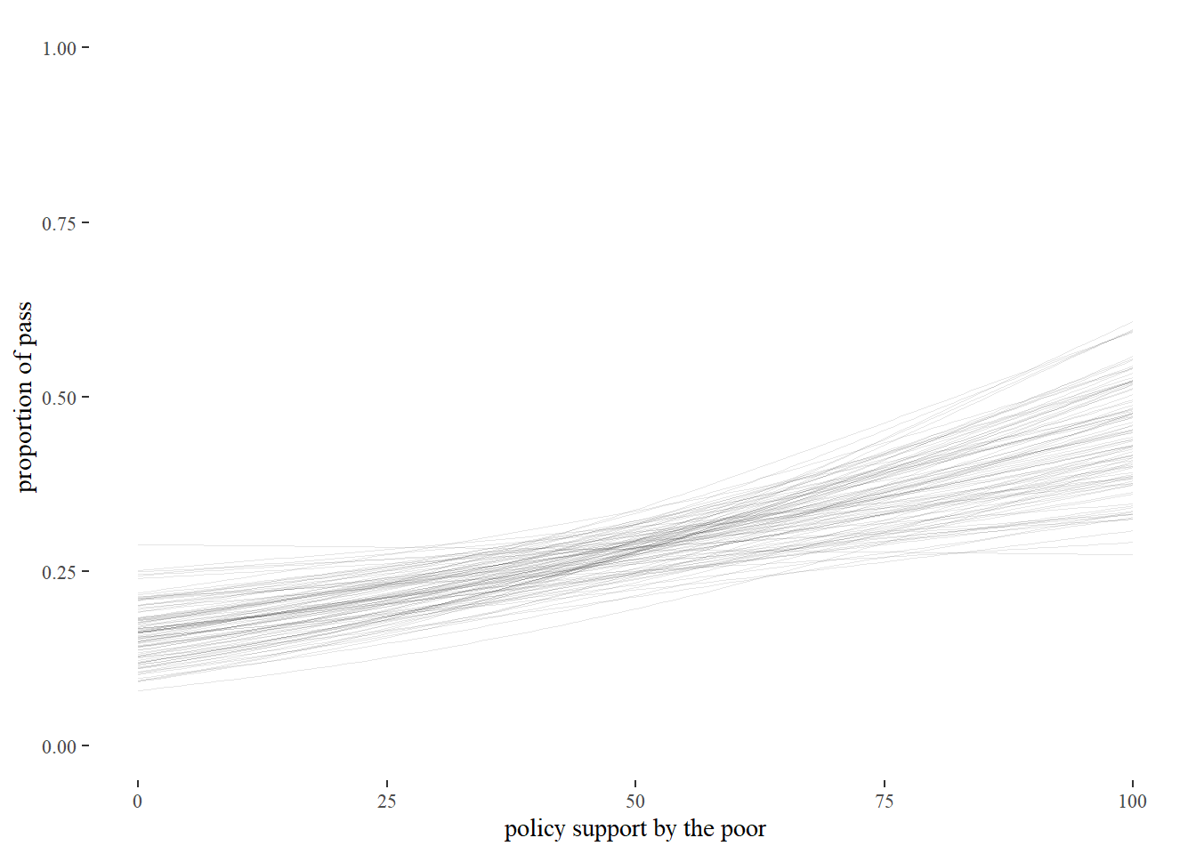 This graph shows what we believe after seeing the data. Darker areas indicate that lines are close together and therefore that these lines are more probable. There is significant uncertainty, especially towards the higher end of support. But if we compare this graph to the one that described our prior beliefs, we have definitely learned something from the data.
print(fit_i10_pr, digits = 3)## Family: binomial
## Links: mu = logit
## Formula: pass | trials(1) ~ 1 + i10
## Data: Schakel_imp (Number of observations: 305)
## Samples: 20 chains, each with iter = 2000; warmup = 1000; thin = 1;
## total post-warmup samples = 20000
##
## Population-Level Effects:
## Estimate Est.Error l-95% CI u-95% CI Rhat Bulk_ESS Tail_ESS
## Intercept -1.759 0.340 -2.444 -1.117 1.016 896 11510
## i10 0.016 0.006 0.004 0.028 1.008 5535 13777
##
## Samples were drawn using sampling(NUTS). For each parameter, Bulk_ESS
## and Tail_ESS are effective sample size measures, and Rhat is the potential
## scale reduction factor on split chains (at convergence, Rhat = 1).print(fit_i90_pr, digits = 3)## Family: binomial
## Links: mu = logit
## Formula: pass | trials(1) ~ 1 + i90
## Data: Schakel_imp (Number of observations: 305)
## Samples: 20 chains, each with iter = 2000; warmup = 1000; thin = 1;
## total post-warmup samples = 20000
##
## Population-Level Effects:
## Estimate Est.Error l-95% CI u-95% CI Rhat Bulk_ESS Tail_ESS
## Intercept -2.635 0.391 -3.429 -1.888 1.010 6798 11585
## i90 0.033 0.007 0.020 0.047 1.011 2616 12257
##
## Samples were drawn using sampling(NUTS). For each parameter, Bulk_ESS
## and Tail_ESS are effective sample size measures, and Rhat is the potential
## scale reduction factor on split chains (at convergence, Rhat = 1).The model output for i_10 is hard to interpret. We have to do some calculations before we can make sense of it. If 50% of people in the 10th percentile support a policy, then the probability of pass is \(logit^{-1}(-1.759 + 0.016 \cdot 50)\) = 0.2770785. When support for a policy increases to 90% we get \(logit^{-1}(-1.759 + 0.016 \cdot 90)\) = 0.4209195.
One could also calculate the so called ‘odds ratio’. The odds are defined as \(\frac{p}{1-p}\). Given that
\[P(y_{i}=0)=1-\frac{e^{ax_{i}+b}}{1+e^{ax_{i}+b}}\] some algebra tells us that this is equal to
\[log(\frac{P(y_{i}=1)}{P(y_{i}=0)})=a+bx_{i}\]
This means that we can graph the log of the odds as a line. The concept of the odds ratio goes one step further. It compares the odds for a given x with the odds of one unit more of x. Filling in x + 1 and exponentiating shows that \(e^{b}\) gives us the factor by which the odds of x chance when we add a unit to it. So in this case, the odds ratio is \(e^{0.016}=1.016\). This number tells us that the probability is increasing when x increases, but it is hard to say much beyond it. The odds ratio is two steps removed from what we care about - probability of pass. In what follows we will therefore stick mainly to the probability scale, which is more work to plot, but easier to interpret.
Model evaluation
In order to evaluate the models we proceed in two steps. First, we look at a model in isolation and check whether it fits the data. Second, we look at whether the model is expected to predict new cases well. This second approach is comparative.
We start then by inspecting models in isolation. By looking at a graph of the model where i10 predicts pass, we are reminded of the hopeless project we are involved in. We are trying to predict a binary value with a continuous predictor. Using measures such as \(R^{2}\) (the most popular version for logistic regression is pseudo \(R^{2}\) ) are for this reason not very informative.
fun_1 <- function(x){
  invlogit(fixef(fit_i10_pr)[1] + fixef(fit_i10_pr)[2]*x)
}

Schakel %>%
  ggplot(aes(y = pass, x = i10)) +
  geom_jitter(height=0.05, alpha=0.05) +
  stat_function(fun = fun_1) + xlim(0,100) + ylim(0,1) +
  theme_tufte() +
  labs(x="percentage support of 10th percentile",
       y = "probability of pass")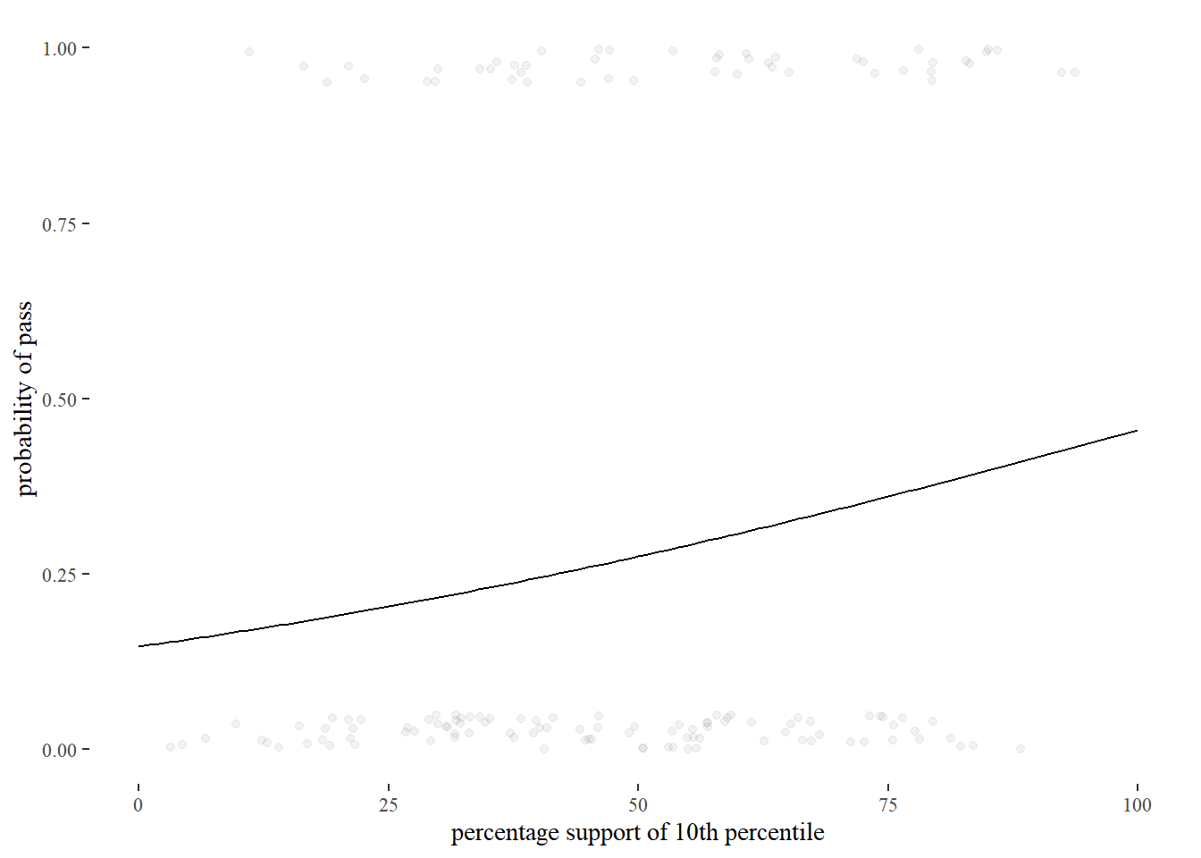
It can be useful however to bin values of the numeric variable. We can then take the average of the values within a bin, which will typically take us to a place between 0 and 1. These averages are displayed as red dots below.
K <- 10
bins <- as.numeric(cut(Schakel$i10, K))

x_bar <- rep(NA, K)
y_bar <- rep(NA, K)
res_i10 <- rep(NA, K)
for (k in 1:K){
  x_bar[k] <- mean(Schakel$i10[bins==k])
  y_bar[k] <- mean(Schakel$pass[bins==k], na.rm=TRUE)
  res_i10[k] <- y_bar[k] - invlogit(fixef(fit_i10_pr)[1] + fixef(fit_i10_pr)[2]*x_bar[k])
}

binned_i10 <- data.frame(x_bar, y_bar)
binned_res_i10 <- data.frame(x_bar, res_i10)

ggplot(Schakel, aes(x=i10)) +
  stat_function(fun = fun_1) +
  geom_point(aes(x=x_bar, y=y_bar),
             data=binned_i10,
             color="red") +
  theme_tufte()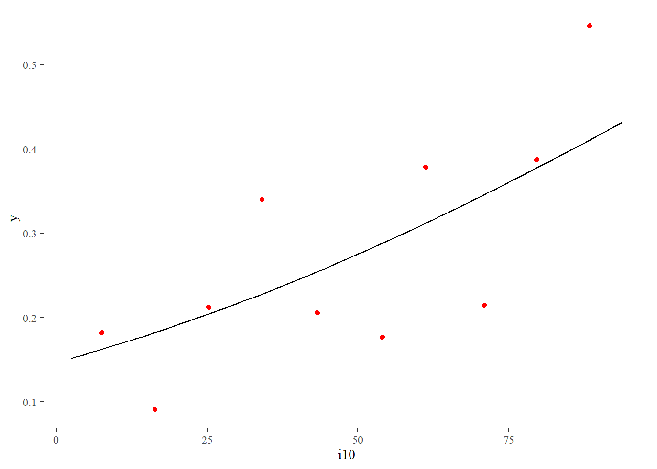
Our regression curve seems to fit the data reasonably well.
We therefore proceed with the next step, which is to evaluate how well the model would do for new data. This is typically the most relevant question. It is easy to fit a model to a bunch of data points that makes the residuals tiny. In that case we are modeling the data we have however, and not the data generating process we are really interested in. What we must do then is constrain our model to focus away from the random scatter of the data points and towards the key factors of the process that generated the data.
We can do so in three ways:
Use scientific knowledge to set a prior that constrains the impact of extreme data points on our posterior beliefs (that is, what we believe after we’ve seen the data). Unless the prior is 0 for certain values, its effect quickly fades as more data points are fed into the model.
Use scientific knowledge to build a mathematical model of the process that generates the data, so that its parameters can be estimated by the regression. In our case I don’t know of any model that describes policy preferences from first principles. Psychology is not that far advanced. And if it existed we surely wouldn’t have the necessary data in our data set.
Use cross validation. This involves leaving out some rows of the data set. After the model is fit, the predictors of the left out rows are fed into the model and compared to the explained values that also reside in these rows.
Because the first strategy is already deployed by us (and not very impactful given the number of observations) and the second is not feasible, we use ‘leave one out cross validation’ on both model fit_i10 and fit_i90. The loo package does this for us. It first calculates a so called elpd score for each model. To this end it calculates the log of the probability density of seeing a data point, given the parameters that are estimated based on the data set after leaving out one row. The sum of these probabilities is the elpd score. This score in itself is not informative. Only if we compare it to the elpd scores of other models do we learn something.
loo_i10 <- loo(fit_i10_pr)
loo_i90 <- loo(fit_i90_pr)

loo_compare(loo_i10, loo_i90)
## elpd_diff se_diff
## fit_i90_pr 0.0 0.0
## fit_i10_pr -9.8 4.0Comparing the elpd scores of the models tells us that the level of policy support of the rich is more predictive than that of the poor. The elpd score for the 10th income percentile is lower and more than just noise, given the comparatively low standard error.
Edi Terlaak
I like to tell stories about statistics.